 09-25-2013, 03:06 PM
|
#61
|
|
Franchise Player
|
Upload the PDF for people to play with.
For fun and for assistance!
LET THE HIVE MIND CONSTRUCT LOOSE!
|

|

|
|
09-25-2013, 03:15 PM
|
#62
|
|
Franchise Player
Join Date: Aug 2007
Location: Vancouver
|
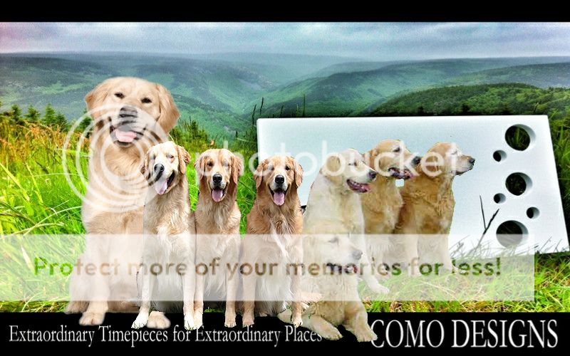
I like the rock photo much better than the grass one. The clocks look stretch horizontally, or is that how they actually look?
__________________

|
|
|
|
|
09-25-2013, 03:18 PM
|
#63
|
|
Monster Storm
Join Date: Apr 2007
Location: Calgary
|
The clock is a bit stretched, I can fix that with a better photo crop.
__________________
Shameless self promotion

|

|
|
|
09-25-2013, 03:35 PM
|
#64
|
|
First Line Centre
Join Date: Oct 2008
Location: Cambodia
|
Quote:
Originally Posted by surferguy

The clock is a bit stretched, I can fix that with a better photo crop.
|
I like this one, but definitely un-stretch the clock. As is, it looks like the hour and minute hands are the same length.
|
|
|
|
|
09-25-2013, 04:13 PM
|
#65
|
|
Franchise Player
Join Date: Feb 2010
Location: Calgary
|
Neither version tells the viewer what COMO DESIGNS does. This is a big negative. Your company name is not yet widely known and recognized to assume that people would know what you are advertising. Is is a novelty clock shop? Graphic design company? Custom clock design shop?
If this is going to be just a logo on a business card, then it's way too busy. So, I assume this is some kind of advertising to placed somewhere, correct?
Depending on where it is going to be posted, I suggest re-thinking your message to viewers. What do you want this sign to achieve? Boost name recognition? Have your future customers come visit your shop or website? Call you first? The answers would lead you to what textual information you need to supply along with the graphics to make this ad effective.
Good luck!
P.S. Just re-read that this is going to be a poster at your retail location. My suggestions still stand though.
|
|
|
|
|
The Following User Says Thank You to CaptainYooh For This Useful Post:
|
|
|
09-25-2013, 04:18 PM
|
#66
|
|
Franchise Player
|
Make sure the resolution is going to be high enough to print out at the size you want.
Blown up low resolution stuff looks terrible.
|
|
|
|
|
The Following User Says Thank You to Madman For This Useful Post:
|
|
|
09-25-2013, 04:32 PM
|
#67
|
|
Franchise Player
Join Date: Feb 2006
Location: Calgary, AB
|
I like the new design better.
Is it still for a poster? If so, I don't understand the use of the social media icons. They distract and detract from the overall image. I'd put your website address on the poster and make sure all your social media links are on the site.
If you're still looking for a tag line, how about something like: "Personal Time", "Time for Yourself", "The Time of Your Life", "Time to Relax"?
__________________
Turn up the good, turn down the suck!
|
|
|
|
|
The Following 3 Users Say Thank You to rayne008 For This Useful Post:
|
|
|
09-25-2013, 04:40 PM
|
#69
|
|
tromboner
Join Date: Mar 2006
Location: where the lattes are
|
Quote:
Originally Posted by surferguy
Thanks for the feedback yesterday. After sleeping on it I have decided to take another go at it.
I would also like to mention that my feelings are not hurt by your opinions. When you work on something you only have one point of view (your own) and what you think looks fine will be picked apart by others.
Here is my last round of attempts:
|
Something I didn't mention previously, but fixed in my edit, is the crooked horizon in this picture.
As far as the rest goes, I prefer the old template with the tagline. The social media icons are odd - a website URL would be better. Out of these two, top is better.
|
|
|
|
|
09-25-2013, 05:20 PM
|
#70
|
|
Franchise Player
Join Date: Feb 2006
Location: Calgary, AB
|
__________________
Turn up the good, turn down the suck!
|
|
|
|
|
The Following 2 Users Say Thank You to getbak For This Useful Post:
|
|
|
09-25-2013, 05:33 PM
|
#71
|
|
Franchise Player
|
I still contend that you need to recognize the context of your images. I think the tag line, Extraordinary time pieces for extraordinary places, is great, but you should try and connect your timepieces as great works of art or timeless designs. Like having a picture where your clock is hanging next to the Mona Lisa at the Louvre. Or your clock is a standardard outside the Guggenheim or the Sydney Opera House. I'd try and associate your work with recognized masterpieces. If you did watches I'd tell you to use the Creation of Adam from the Sistine Chapel and have your watches on the wrist of Adam and God. Use what people already associate with greatness to elevate your designs.
|
|
|
|
|
09-25-2013, 05:52 PM
|
#72
|
|
#1 Goaltender
Join Date: Jan 2009
Location: Calgary
|
I think, personally, this design by committee thing you're doing won't result in anything productive.
All my personal opinion obviously.
|
|
|
|
|
The Following User Says Thank You to _Q_ For This Useful Post:
|
|
|
09-25-2013, 06:12 PM
|
#73
|
|
Celebrated Square Root Day
|
Quote:
Originally Posted by surferguy
I do plan on getting some Alberta shots soon. Fall colors for the win!
|
You should probably get on this soon, as our fall season here is very quick. The leaves are already turning, and Calgary's already descending quickly into to that "ugly brown" phase we go into for 8 months of the year. 
|
|
|
|
|
09-25-2013, 07:33 PM
|
#74
|
|
Scoring Winger
Join Date: Apr 2006
Location: Calgary, Alberta, Canada aka Flames Country
|
I'm a little bit late with this, but here goes:
|
|
|
|
|
The Following 4 Users Say Thank You to Lucifer For This Useful Post:
|
|
|
09-25-2013, 07:55 PM
|
#75
|
|
Franchise Player
Join Date: Dec 2012
Location: On your last nerve...:D
|
Roflmao!
|
|
|
|
|
09-25-2013, 08:07 PM
|
#76
|
|
Lifetime Suspension
|
Quote:
Originally Posted by flameswin
You should probably get on this soon, as our fall season here is very quick. The leaves are already turning, and Calgary's already descending quickly into to that "ugly brown" phase we go into for 8 months of the year. |
Yeah, basically this weekend or you've missed the peak.
|
|
|
|
|
The Following User Says Thank You to MrMastodonFarm For This Useful Post:
|
|
|
09-25-2013, 09:10 PM
|
#77
|
|
Not a casual user
Join Date: Mar 2006
Location: A simple man leading a complicated life....
|
Quote:
Originally Posted by getbak
|


__________________

|
|
|
|
|
The Following 3 Users Say Thank You to Dion For This Useful Post:
|
|
|
09-25-2013, 09:22 PM
|
#78
|
|
Lifetime Suspension
|
I really like your designs but I hate this concept. Those super cool designs don't belong in a landscape scene, it just makes no sense to me. Get them out of those fields, get it away from the ocean and put it in a very modern kitchen or living room setting. Maybe have the house with a huge patio overlooking the beach or something but I can't wrap my head around what you're doing here.
I'm generally known as the team leader with the coolest stickers on my hard hat so I think my opinion carries some weight here.
|
|
|
|
|
09-25-2013, 09:46 PM
|
#79
|
|
tromboner
Join Date: Mar 2006
Location: where the lattes are
|
I like the concept. It makes it clear that the product is the clock, and makes the clock stand out. Put the clock in a modern room, and it could be a real estate ad. If you need the text to tell you what the ad is for, I feel that it's much less effective.
The "Extraordinary Timepieces for Extraordinary Places" version catches your eye a cool photo, the clock immediately catches your eye within that photo through contrast, and the tagline suggests that a clock like this would make your home an extraordinary place.
I'll also echo the comment that for a store in Alberta, it would be good to use an Alberta landscape.
|
|
|
|
|
The Following User Says Thank You to SebC For This Useful Post:
|
|
|
09-25-2013, 09:56 PM
|
#80
|
|
Lifetime Suspension
|
Quote:
Originally Posted by SebC
I like the concept. It makes it clear that the product is the clock, and makes the clock stand out. Put the clock in a modern room, and it could be a real estate ad. If you need the text to tell you what the ad is for, I feel that it's much less effective.
|
Sure but there are ways to isolate the clock and make it known what the ad is about.
The golden larches at Moraine Lake will be out in full this weekend... if you're going to do an Alberta landscape... get on it.
|
|
|
|
 Posting Rules
|
You may not post new threads
You may not post replies
You may not post attachments
You may not edit your posts
HTML code is Off
|
|
|
All times are GMT -6. The time now is 09:42 AM.
|
|


