 08-20-2013, 07:35 PM
|
#61
|
|
Franchise Player
Join Date: Mar 2002
Location: Calgary
|
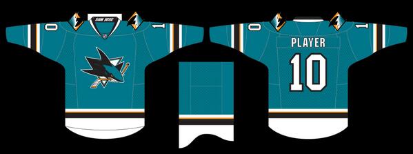
This is how they could've been tweaked, without looking unfinished:
From Sportslogos.net:
|

|

|
|
The Following 2 Users Say Thank You to browna For This Useful Post:
|
|
|
08-20-2013, 08:16 PM
|
#62
|
|
Celebrated Square Root Day
|
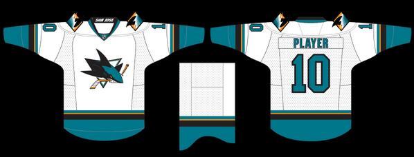
Wow, ****ing love it! Although, I'd probably just have the striping at the bottom of the home jersey and then have teal again underneath. I think the white bottom would look kind of weird with full equipment.
|
|
|
|
|
08-21-2013, 12:23 AM
|
#63
|
|
GOAT!
|
Quote:
Originally Posted by Puppet Guy

|
That looks awesome. I love the lack of striping on the bottom. Clean, simple, elegant. That's the way to go.
|
|
|
|
|
08-21-2013, 12:38 AM
|
#64
|
|
First Line Centre
Join Date: Jul 2013
Location: Calgary
|
looks like some kid made it in his basement with a teal long sleeve, an iron and some transferable printer paper
|
|
|
|
|
The Following 3 Users Say Thank You to shogged For This Useful Post:
|
|
|
08-21-2013, 03:34 AM
|
#65
|
|
Franchise Player
Join Date: Feb 2006
Location: Calgary, AB
|
It's kind of funny that when the Edge jerseys were introduced in 2007, only 9 teams had traditional horizontal stripes on the bottom of their primary jerseys (all of the original 6 teams except Toronto, plus Carolina, New Jersey, San Jose, and Vancouver).
At the time, teams like Edmonton, Florida, and Toronto were criticized for having jerseys that looked incomplete, like practice jerseys, or even like pajamas.
Since then, many of the other teams (Oilers, Islanders, Leafs, Flyers, etc) have changed to more traditional stripes, and now the Sharks are going the other way.
One thing that may work better for the Sharks is that their dark jersey is a different colour from their pants, so that should break up the pajama effect that the Leafs and Oilers had with uninterrupted blue.
__________________
Turn up the good, turn down the suck!
|
|
|
|
|
The Following User Says Thank You to getbak For This Useful Post:
|
|
|
08-21-2013, 11:37 AM
|
#66
|
|
Lifetime Suspension
|
Quote:
Originally Posted by strombad
Try being a soccer fan.
|
Why anyone would buy a soccer Jersey so they can advertise a Brand of televisions and a gas station is mind boggling. They should hand them out free with a fill for all then free advertising the fans provide.
I guess if you really like Samsung TV's.... A LOT... it makes sense.
|
|
|
|
|
The Following User Says Thank You to pylon For This Useful Post:
|
|
|
08-21-2013, 11:42 AM
|
#67
|
|
Jordan!
Join Date: Jul 2009
Location: Chandler, AZ
|
These look amazing imo. Love the teal.
|
|
|
|
|
08-21-2013, 12:20 PM
|
#68
|
|
Franchise Player
Join Date: Nov 2006
Location: Supporting Urban Sprawl
|
First look I thought they looked ok, and I liked the simplicity.
Then when I saw it on the person, I thought it looked far to much like a practice jersey.
__________________
"Wake up, Luigi! The only time plumbers sleep on the job is when we're working by the hour."
|
|
|
|
|
The Following 4 Users Say Thank You to Rathji For This Useful Post:
|
|
|
08-21-2013, 12:54 PM
|
#69
|
|
Scoring Winger
Join Date: Aug 2005
Location: Down by the sea, where the watermelons grow, back to my home, I dare not go...
|
Without the bottom striping they now have room to put a huge SAN JOSE across the bottom. It would have completed the look while adding a touch of class, much like the current Canucks jersey *giggles*
|
|
|
|
|
08-21-2013, 12:58 PM
|
#70
|
|
Powerplay Quarterback
Join Date: Jul 2013
Location: Calgary
|
There still a good jersey I think it would be a lot better if there was something on the bottom
__________________
Go Flames Go
|
|
|
|
|
08-21-2013, 10:22 PM
|
#71
|
|
Powerplay Quarterback
|
Is it just me or is the Sharks logo place in the same area as the Canes Logo on their jersey? Around the Chest area and not in the middle of the Jersey?
__________________
 CPHL Dallas Stars
|
|
|
|
|
08-21-2013, 10:33 PM
|
#72
|
|
Franchise Player
Join Date: Feb 2004
Location: Maple Ridge, BC
|
Love jersey threads. I'm not a huge jersey guy myself but I love listening and reading people react to jerseys. The detail people go into when dissecting these things are hilarious. The striping, the thread, the whatever.
Love the passion, just can't get on board personally. To me, it's just a shirt.
|
|
|
|
|
The Following User Says Thank You to VANFLAMESFAN For This Useful Post:
|
|
|
08-22-2013, 01:00 AM
|
#73
|
|
Lifetime Suspension
|
That's a passive-aggrssive post. Why don't you just say "I'm smarter than you because I find jersey aesthetics trivial."
|
|
|
|
|
The Following User Says Thank You to Magnum PEI For This Useful Post:
|
|
|
08-22-2013, 02:03 AM
|
#74
|
|
Lifetime Suspension
|
Quote:
Originally Posted by Magnum PEI
That's a passive-aggrssive post. Why don't you just say "I'm smarter than you because I find jersey aesthetics trivial."
|
I didn't read it that way it all. SOMEONE is being a little sensitive about their love of fashion...
|
|
|
|
|
08-22-2013, 05:11 AM
|
#75
|
|
Franchise Player
Join Date: May 2004
Location: Helsinki, Finland
|
Quote:
Originally Posted by Locke
Agreed, but also, do you really need the number in 4 places?
|
Personally I like having numbers visible from many angles.
Heck, I'm kinda waiting for the day when my TV asks me if I want player name graphics on the live feed, EA sports style. Shouldn't take too long.
|

|
|
|
08-22-2013, 07:35 AM
|
#76
|
|
In the Sin Bin
|
These are barely better than the Oilers practice jersies were, and only then because they completed the striping around the arms.
Pretty lame, but at least given how the Sharks operate, they'll probably change it up again in about 18 months.
|
|
|
|
|
08-22-2013, 10:26 AM
|
#77
|
|
Franchise Player
Join Date: Feb 2004
Location: Maple Ridge, BC
|
Quote:
Originally Posted by Magnum PEI
That's a passive-aggrssive post. Why don't you just say "I'm smarter than you because I find jersey aesthetics trivial."
|
Didn't mean it like that at all. Just not a jersey guy but I really do enjoy reading these threads.
|
|
|
|
|
The Following User Says Thank You to VANFLAMESFAN For This Useful Post:
|
|
|
08-22-2013, 12:43 PM
|
#78
|
|
Jordan!
Join Date: Jul 2009
Location: Chandler, AZ
|
They aren't far off from the Coyotes current design, except teal vs red.
I really hope that we do get more to our Arizona Coyotes possible re-design. Add an additional color, shoulder yoke, ect.
These Sharks uni's are boring but nice.
|
|
|
|
|
08-22-2013, 12:46 PM
|
#79
|
|
Lifetime Suspension
|
Quote:
Originally Posted by Bouw N Arrow
They aren't far off from the Coyotes current design, except teal vs red.
I really hope that we do get more to our Arizona Coyotes possible re-design. Add an additional color, shoulder yoke, ect.
These Sharks uni's are boring but nice.
|
I'm actually excited for a redesign on the Coyotes. They have a real chance here to kind of "restart" the whole franchise with a new name, updated logo, new jerseys. I don't know, I think it could be really good for the team.
|
|
|
|
|
08-22-2013, 02:31 PM
|
#80
|
|
Franchise Player
Join Date: Jun 2011
Location: STH since 2002
|
The Sharks jersey looks more like a long sleeved NFL jersey now.
__________________

|
|
|
|
 Posting Rules
|
You may not post new threads
You may not post replies
You may not post attachments
You may not edit your posts
HTML code is Off
|
|
|
All times are GMT -6. The time now is 03:34 PM.
|
|


