|
View Poll Results: Are you happy Blasty is back?
|
|
Yes
|
   
|
275 |
72.56% |
|
No
|
  
|
104 |
27.44% |
 11-16-2020, 09:52 AM
|
#761
|
|
Franchise Player
Join Date: May 2016
Location: ATCO Field, Section 201
|
The 'Blasty' jersey is gorgeous. The Flames will look sharp as hell this year.
|

|

|
|
11-16-2020, 09:53 AM
|
#762
|
|
Franchise Player
Join Date: Dec 2011
Location: Calgary
|
|
|
|
|
|
The Following User Says Thank You to N-E-B For This Useful Post:
|
|
|
11-16-2020, 09:54 AM
|
#763
|
|
Powerplay Quarterback
|
I like it.
|
|
|
|
|
11-16-2020, 09:55 AM
|
#764
|
|
First round-bust
Join Date: Feb 2015
Location: speculating about AHL players
|
Quote:
Originally Posted by getbak

You answered your own question. It's the only Flames logo to be primarily yellow.
|
That's a good thing!
__________________
2026 World Junior Pool Champion
|

|
|
|
11-16-2020, 09:55 AM
|
#765
|
|
Scoring Winger
Join Date: Jul 2008
Location: New York, NY
|
Quote:
Originally Posted by Erick Estrada
Just my opinion but I don't understand why anyone would want the "A" at all. Atlanta is a crap hockey market and doesn't deserve any promotion or links to this organization and I'm not buying into the "A" for Alberta thing.
|
Just my opinion, but I don't understand why anyone would ignore the history of the franchise and where the Flames came from. They never changed the name. They embraced the flaming "A" for alternate captains. It does not have to be anything about Alberta.
I think a black version of the flaming "A" >>>> dusting off Blasty
|
|
|
|
|
The Following User Says Thank You to Domoic For This Useful Post:
|
|
|
11-16-2020, 09:55 AM
|
#766
|
|
Backup Goalie
Join Date: Aug 2004
Exp: 
|
Great news now I have No excuse to buy another Jersey. I still have mine from 2000
|
|
|
|
|
The Following User Says Thank You to keeper34 For This Useful Post:
|
|
|
11-16-2020, 09:55 AM
|
#767
|
|
Powerplay Quarterback
Join Date: Nov 2003
Location: Slightly right of left of center
|
Wow, the wild's is by far the best, that is a slick jersey. Like the Jets too. Also, anything Whalers is great
I do like blasty back, I regret selling mine to Newsboy from X929 when I was reducing my jersey collection.
__________________
It is the mark of an educated mind to be able to entertain a thought without accepting it.
- Aristotle
|
|
|
|
|
11-16-2020, 09:57 AM
|
#768
|
|
First Line Centre
Join Date: Oct 2009
Location: Reppin' the C in BC
|
Quote:
Originally Posted by sureLoss
|
Should've gone white skates too.
__________________
"There are no asterisks in this life, only scoreboards." - Ari Gold
12 13 14 2 34
|
|
|
|
|
11-16-2020, 09:57 AM
|
#769
|
|
Franchise Player
Join Date: Mar 2006
Location: Shanghai
|
Most of the new jerseys around the league look good. Some look really good.
Versions posted in this thread look better than what the Flames chose. The outlines are really odd. Seeing the logo, the captain's C and the numbers all with different outline colors looks off. This jersey is the one step back following the two steps forward of the move to full red and white retros.
Oh well, the red and white retros are still a great move.
__________________
"If stupidity got us into this mess, then why can't it get us out?"
|
|
|
|
|
The Following 3 Users Say Thank You to JohnnyB For This Useful Post:
|
|
|
11-16-2020, 09:59 AM
|
#770
|
|
Franchise Player
Join Date: Jan 2018
Location: Alberta
|
I never liked Blasty, but I actually think the striping on this one is slick. Next year do this motif with the shoulder patch from the wordmark jerseys in white on the front instead of blasty and I think you have a really killer modern 3rd.
|
|
|
|
|
11-16-2020, 10:00 AM
|
#771
|
|
Franchise Player
|
Quote:
Originally Posted by Reign of Fire
Should've gone white skates too.
|
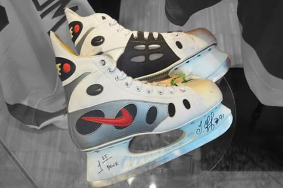
Federov Special
|
|
|
|
|
The Following User Says Thank You to CroFlames For This Useful Post:
|
|
|
11-16-2020, 10:00 AM
|
#772
|
|
Franchise Player
Join Date: Jan 2018
Location: Alberta
|
Quote:
Originally Posted by Reign of Fire
Should've gone white skates too.
|
They'll be invisible lol how will they show up on TV?
|
|
|
|
|
11-16-2020, 10:01 AM
|
#773
|
|
Franchise Player
Join Date: Mar 2006
Location: Shanghai
|
Quote:
Originally Posted by Monahammer
I never liked Blasty, but I actually think the striping on this one is slick. Next year do this motif with the shoulder patch from the wordmark jerseys in white on the front instead of blasty and I think you have a really killer modern 3rd.
|
That logo definitely deserves some more use.
__________________
"If stupidity got us into this mess, then why can't it get us out?"
|
|
|
|
|
11-16-2020, 10:02 AM
|
#774
|
Join Date: Mar 2006
Location: Now world wide!
|
Those jerseys are a swing and a miss for me. Well, maybe a bunt and a miss really.
The black hems make it look like a black blasty cape is being worn over a black shirt.
I think these look like "university graduation jerseys", if that was a thing. Plus the logo looks too big.
Basically they're as good (or bad) as the original snot-horse jerseys.
Edit: the more I look at it, the more I notice details like the mismatched outlines around the numbers, captain's "C", and logo, and the more it gives the whole package a distinctly Wal-Martian or dodgy-tourist-shop kind of vibe.
Last edited by flylock shox; 11-16-2020 at 10:10 AM.
|
|
|
|
|
11-16-2020, 10:03 AM
|
#775
|
|
Pent-up
Join Date: Mar 2018
Location: Plutanamo Bay.
|
Quote:
Originally Posted by JohnnyB
That logo definitely deserves some more use.
|
Its nice, but its sooooooooo boring.
|
|
|
|
|
11-16-2020, 10:04 AM
|
#776
|
|
Franchise Player
Join Date: Nov 2009
Location: Kelowna, BC
|
Quote:
Originally Posted by getbak
I don't hate the Canucks green-blue gradient.
I don't like the logo choice the Leafs made...
It looks very oversized and doesn't match with the logo on the 1970 version of their jersey. |
i've never understood why the 'N' in TOROnTO is lower case 
and yea - that front logo looks massive!
__________________
"...and there goes Finger up the middle on Luongo!" - Jim Hughson, Av's vs. 'Nucks
|
|
|
|
|
The Following User Says Thank You to bc-chris For This Useful Post:
|
|
|
11-16-2020, 10:06 AM
|
#777
|
|
Franchise Player
Join Date: Feb 2006
Location: Calgary
|
Like: Kings, Avs, Devils, Bruins, Wild, Canes.
Dislike: Pens, Sabres, Rangers, Jets, Sharks.
Fugly: Canucks, Leafs, Stars, Ducks.
Boring: Wings, Isles, Oilers.
|
|
|
|
|
11-16-2020, 10:06 AM
|
#778
|
|
Pent-up
Join Date: Mar 2018
Location: Plutanamo Bay.
|
Quote:
Originally Posted by bc-chris
i've never understood why the 'N' in TOROnTO is lower case
and yea - that front logo looks massive! |
That and the use of Leafs..... theyre the worst.
|
|
|
|
|
The Following User Says Thank You to Scroopy Noopers For This Useful Post:
|
|
|
11-16-2020, 10:06 AM
|
#779
|
|
Resident Videologist
Join Date: Mar 2002
Location: Calgary
|
If they were going to take the original and slightly change the stripes, then adding white was the way to go IMO. I think all 3 of these are better:

I also made the captain's C match the numbers with the yellow.
|
|
|
|
|
The Following 41 Users Say Thank You to AC For This Useful Post:
|
Ashasx,
bc-chris,
bdubbs,
Bill Bumface,
browna,
btimbit,
ComixZone,
CroFlames,
DaQwiz,
devo22,
Domoic,
edn88,
Fighting Banana Slug,
FlatLandFlamesFan,
flylock shox,
foofighter15,
getbak,
GreenLantern2814,
jayswin,
Jetfire,
JohnnyB,
JT45,
Leondros,
Magnum PEI,
Mazrim,
Mustache,
Pellanor,
Reaper,
Redliner,
Ring of Fire,
Rubber Ducky,
Scroopy Noopers,
Skaloper,
socalwingfan,
SuperMatt18,
Tbull8,
Textcritic,
The Fisher Account,
Winsor_Pilates,
Yamer,
zztim81
|
|
11-16-2020, 10:07 AM
|
#780
|
|
Franchise Player
|
Quote:
Originally Posted by flylock shox
Those jerseys are a swing and a miss for me. Well, maybe a bunt and a miss really.
The black hems make it look like a black blasty cape is being worn over a black shirt.
I think these look like "university graduation jerseys", if that was a thing. Plus the logo looks too big.
Basically they're as good (or bad) as the original snot-horse jerseys.
|
Don't be sour grapes.
We have the sacred retros as full time home and away jerseys. All Flames fans can agree this was the right move and we should be happy.
For limited one-off 3rds, they can go with anything and this time it's a reverse retro Blasty. There's obviously a segment of the fanbase that fell in love with them back in the day, and most of those people now have money. These will sell like mad.
I hope they continue to crank out modern/retro/mashup 3rds on a regular basis, and just leave the retros as they are, full time.
|
|
|
|
 Posting Rules
|
You may not post new threads
You may not post replies
You may not post attachments
You may not edit your posts
HTML code is Off
|
|
|
All times are GMT -6. The time now is 08:08 PM.
|
|


