 12-05-2022, 01:25 PM
|
#641
|
|
Franchise Player
Join Date: Oct 2006
Location: San Fernando Valley
|
Without the pedestal IMO they are by far the best looking Flames jerseys ever with the exception of the retro red. The white and yellow flaming "C" looks amazing on black.
|

|

|
|
The Following User Says Thank You to Erick Estrada For This Useful Post:
|
|
|
12-05-2022, 02:18 PM
|
#642
|
|
GOAT!
|
My ideal setup is what we currently have...
...but with Blasty using the same template (for lines and trim etc) as the home and away.
|
|
|
|
|
The Following 4 Users Say Thank You to FanIn80 For This Useful Post:
|
|
|
12-05-2022, 02:20 PM
|
#643
|
|
Franchise Player
|
I love our home, away, and alternate (Blasty). That's a great core 3 jerseys.
Cycling in these Reverse Retros or whatever else annually is fun. It gives the team a fresh look every season, and then maybe you absolutely nail one of them and you can then cycle Blasty out and whatever special jersey you designed one year into being your normal 3rd jersey.
|
|
|
|
|
The Following User Says Thank You to ComixZone For This Useful Post:
|
|
|
12-05-2022, 02:33 PM
|
#644
|
|
Franchise Player
Join Date: Sep 2002
Location: I'm right behind you
|
Quote:
Originally Posted by TheRealPepman

|
I think these would look awesome; maybe even a good look with red helmets, pants, and gloves from the current set.
__________________
Don't fear me. Trust me.
|
|
|
|
|
12-05-2022, 03:09 PM
|
#645
|
|
Franchise Player
Join Date: Jul 2009
Location: Calgary
|
I'm really surprised we haven't had either a yellow jersey, or some weird grey/slate/silver jersey.
I think either would be bad. But that's kind of why I'm surprised it hasn't happened.
I guess the Winter Classic striped ones could be argued to be half yellow, and those were gloriously hideous.
Wonder what we get next time - are they doing another round of reverse retros or whatever odd moniker they call them next season?
|
|
|
|
|
12-05-2022, 03:26 PM
|
#646
|
|
Franchise Player
Join Date: Mar 2015
Location: Pickle Jar Lake
|
Quote:
Originally Posted by Icon
I'm really surprised we haven't had either a yellow jersey, or some weird grey/slate/silver jersey.
I think either would be bad. But that's kind of why I'm surprised it hasn't happened.
I guess the Winter Classic striped ones could be argued to be half yellow, and those were gloriously hideous.
Wonder what we get next time - are they doing another round of reverse retros or whatever odd moniker they call them next season?
|
They should do reverse classics, with the logo on the back and numbers on the front.
|
|
|
|
|
12-05-2022, 03:31 PM
|
#647
|
|
Franchise Player
Join Date: Jul 2009
Location: Calgary
|
Quote:
Originally Posted by Fuzz
They should do reverse classics, with the logo on the back and numbers on the front.
|
oooo nice 
|
|
|
|
|
12-05-2022, 04:27 PM
|
#648
|
|
Franchise Player
Join Date: Aug 2007
Location: Vancouver
|
Quote:
Originally Posted by Icon
I'm really surprised we haven't had either a yellow jersey, or some weird grey/slate/silver jersey.
I think either would be bad. But that's kind of why I'm surprised it hasn't happened.
I guess the Winter Classic striped ones could be argued to be half yellow, and those were gloriously hideous.
Wonder what we get next time - are they doing another round of reverse retros or whatever odd moniker they call them next season?
|
Im guessing its a year or two before theres another jersey. My hope is a return of the 2004.
__________________

|
|
|
|
|
The Following User Says Thank You to Coach For This Useful Post:
|
|
|
12-05-2022, 05:27 PM
|
#649
|
|
Franchise Player
Join Date: Sep 2002
Location: I'm right behind you
|
Quote:
Originally Posted by Coach
I’m guessing it’s a year or two before there’s another jersey. My hope is a return of the 2004.
|
The 2004 jersey returns as an alternate next season, and the Flames opt to wear them as their dark jersey for the entire playoffs which culminates in the 20th anniversary of Darryl being robbed the cup being avenged? Deal. Make it happen.
__________________
Don't fear me. Trust me.
|
|
|
|
|
12-05-2022, 05:33 PM
|
#650
|
|
damn onions
|
Quote:
Originally Posted by TheRealPepman
|
Swap the red and yellow striping on this and it'd look good I bet.
|
|
|
|
|
12-05-2022, 06:00 PM
|
#651
|
|
GOAT!
|
Quote:
Originally Posted by FanIn80
My ideal setup is what we currently have...
...but with Blasty using the same template (for lines and trim etc) as the home and away. |
Just to better elaborate on my post... Blasty should just be a black version of the home jersey that uses the striping from the road jersey (with the Blasty crest). That's it. Super simple, fits perfectly in with our overall scheme and would look really really sharp. (same thing with the pants and socks... just use a black version of the home ones, with the striping from the road ones)
|
|
|
|
|
The Following User Says Thank You to FanIn80 For This Useful Post:
|
|
|
12-07-2022, 08:50 AM
|
#652
|
|
Jordan!
Join Date: Jul 2009
Location: Chandler, AZ
|
Quote:
Originally Posted by Reaper
The 2004 jersey returns as an alternate next season, and the Flames opt to wear them as their dark jersey for the entire playoffs which culminates in the 20th anniversary of Darryl being robbed the cup being avenged? Deal. Make it happen.
|
Jeezus... 20 years.. how has it been that long?
|
|
|
|
|
12-07-2022, 08:59 PM
|
#653
|
|
Franchise Player
Join Date: Mar 2002
Location: Calgary
|
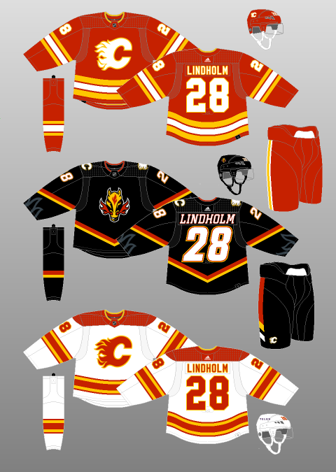
Shame this is the second to last time the reverse retros are worn vs all the times Blasty will be worn. Since the pedestal really isn't noticeable in action the red shoulders, white crest and numbers, and pants/sock combo looks miles better than the Blasty set.
|
|
|
|
|
12-07-2022, 09:03 PM
|
#654
|
|
Franchise Player
|
Blasty is definitely better than the pedestal retros.
__________________
Oliver Kylington is the greatest and best player in the world
|
|
|
|
|
12-07-2022, 09:04 PM
|
#655
|
|
Resident Videologist
Join Date: Mar 2002
Location: Calgary
|
Quote:
Originally Posted by browna
Shame this is the second to last time the reverse retros are worn vs all the times Blasty will be worn. Since the pedestal really isn't noticeable in action the red shoulders, white crest and numbers, and pants/sock combo looks miles better than the Blasty set.
|
My biggest issue with the blasty jerseys is the lack of a white stripe at the bottom hem, I think it would have really helped the overall look even if the originals didn't have it. They had a more prominent red stripe at the bottom which did a lot of the heavy lifting since I think these current ones don't look great on TV.
Like this:

The pedestal RRs look really good actually, again I think because of the white stripe at the bottom.
|
|
|
|
|
The Following 6 Users Say Thank You to AC For This Useful Post:
|
|
|
12-07-2022, 09:05 PM
|
#656
|
|
Franchise Player
|
If I had to rank them, I'd go
-Reverse Retro Blasty
-Reverse Retro pedestal
-Current Blasty third
|
|
|
|
|
12-07-2022, 09:11 PM
|
#657
|
|
Franchise Player
Join Date: Mar 2002
Location: Calgary
|
Quote:
Originally Posted by AC
My biggest issue with the blasty jerseys is the lack of a white stripe at the bottom hem, I think it would have really helped the overall look even if the originals didn't have it. They had a more prominent red stripe at the bottom which did a lot of the heavy lifting since I think these current ones don't look great on TV.
Like this:
The pedestal RRs look really good actually, again I think because of the white stripe at the bottom. |
Yeah, it's the pop of contrast of white on the RR and yes that above Blasty would do that. But also the amount of red on the pedestal RR is more on brand and also provides that contrast.
Pants and socks too, with that white, match better on pedestal than Blasty.
|
|
|
|
|
12-07-2022, 11:32 PM
|
#658
|
|
#1 Goaltender
|
Quote:
Originally Posted by AC
My biggest issue with the blasty jerseys is the lack of a white stripe at the bottom hem, I think it would have really helped the overall look even if the originals didn't have it. They had a more prominent red stripe at the bottom which did a lot of the heavy lifting since I think these current ones don't look great on TV.
Like this:
The pedestal RRs look really good actually, again I think because of the white stripe at the bottom. |
Theres enough white contrast on the jersey from the logo, shoulder logos, and name/number. They have talked about going for a blackout type look. That white stripe is just over designing IMO. Makes it more busy and doesnt really accomplish anything
|
|
|
|
|
12-07-2022, 11:46 PM
|
#659
|
|
First round-bust
Join Date: Feb 2015
Location: speculating about AHL players
|
The Flames will definitely be getting a new jersey next season for the outdoor game. A one-off. #confirmed
__________________
Host of the FlamesNation Warmies and Afterburner shows.
2026 World Junior Pool Champion
|
|
|
|
|
The Following 2 Users Say Thank You to TheScorpion For This Useful Post:
|
|
|
12-07-2022, 11:47 PM
|
#660
|
|
Celebrated Square Root Day
|
I'm fully converted after two games of the reverse pedestal jersey. Way more fun and neat to watch on TV than blasty, 100%.
They really jump out in a cool way on TV, where Blasty is alright, but looks any other black jersey ensemble in the league. Funny thing is in terms of fans wearing them, blasty looks way better.
|
|
|
|
 Posting Rules
|
You may not post new threads
You may not post replies
You may not post attachments
You may not edit your posts
HTML code is Off
|
|
|
All times are GMT -6. The time now is 02:29 AM.
|
|


