 12-04-2022, 11:56 AM
|
#601
|
|
#1 Goaltender
|
Quote:
Originally Posted by Bingo

I'd love to see the black version of the classic reds ... same striping and white C
|
That should be the full time jersey next year IMO
|

|

|
|
12-04-2022, 11:58 AM
|
#602
|
|
Owner
Join Date: Dec 2001
Location: Calgary
|
Quote:
Originally Posted by Burning Beard
That should be the full time jersey next year IMO
|
I still like the red.
But full time third jersey or next reverse retro for sure.
|
|
|
|
|
The Following User Says Thank You to Bingo For This Useful Post:
|
|
|
12-04-2022, 12:21 PM
|
#603
|
|
First Line Centre
Join Date: Oct 2001
Location: Calgary
|
I'd love to never see another black jersey again. I think the Blasty jersey looks good on tv even though I'm not a fan.
I think the reverse retros are just awful.
I'd like to see a black version of the current reds though.
|

|
|
|
The Following 5 Users Say Thank You to AFireInside For This Useful Post:
|
|
|
12-04-2022, 12:26 PM
|
#604
|
|
Franchise Player
Join Date: Mar 2006
Location: Shanghai
|
Quote:
Originally Posted by Bingo
I'd love to see the black version of the classic reds ... same striping and white C
|
I don't like either Blasty or the reverse retros, and would prefer no black jerseys, but if they're going to go with anything black then a black version of the classic reds is what I would like to see.
__________________
"If stupidity got us into this mess, then why can't it get us out?"
|
|
|
|
|
The Following 2 Users Say Thank You to JohnnyB For This Useful Post:
|
|
|
12-04-2022, 01:36 PM
|
#605
|
|
Franchise Player
|
Quote:
Originally Posted by Bingo
I'd love to see the black version of the classic reds ... same striping and white C
|
Are there any renderings of this?
|
|
|
|
|
12-04-2022, 01:40 PM
|
#606
|
|
First round-bust
Join Date: Feb 2015
Location: speculating about AHL players
|
Hmmmm. I almost feel like it might be better with white striping replacing the yellow ... but then I think you start to look like the Carolina Hurricanes.
__________________
Host of the FlamesNation Warmies and Afterburner shows.
2026 World Junior Pool Champion
|
|
|
|
|
12-04-2022, 01:45 PM
|
#607
|
|
First round-bust
Join Date: Feb 2015
Location: speculating about AHL players
|
Oh wait. Nevermind. White and yellow striping on a black jersey? With a white logo?
That could be really cool. Wonder if you'd have any red on there as an accent colour.
__________________
Host of the FlamesNation Warmies and Afterburner shows.
2026 World Junior Pool Champion
|
|
|
|
|
12-04-2022, 01:46 PM
|
#608
|
|
Franchise Player
|
I thought that the reverse retros looked good live. I’m probably biased since I was wearing one as well.
|
|
|
|
|
12-04-2022, 01:47 PM
|
#609
|
|
Franchise Player
Join Date: Apr 2014
Location: Indiana
|
I dislike it when the Flames take out the yellow on any of their designs.
There's a ton of red/white/black teams in the league.
The yellow is what makes the Flames the Flames (other than the red).
|
|
|
|
|
12-04-2022, 01:55 PM
|
#610
|
|
Owner
Join Date: Dec 2001
Location: Calgary
|
Quote:
Originally Posted by TheScorpion
Oh wait. Nevermind. White and yellow striping on a black jersey? With a white logo?
That could be really cool. Wonder if you'd have any red on there as an accent colour.
|
Actually good point. It's not the same as Chicago because we are introducing a new colour in black.
The Hawks could do a full inverse.
The Flames would have to have red in it I would think, but three colour striping (including black and white as colours) may make it busy
|
|
|
|
|
12-04-2022, 01:59 PM
|
#611
|
|
First round-bust
Join Date: Feb 2015
Location: speculating about AHL players
|
I think you do white and yellow striping against the black to differentiate against Chicago and Carolina. White logo for sure, but maybe you put a red outline on it as well? It'd be very interesting to mock up.
As it is, I think the two black jerseys the Flames already have are nothing short of outstanding.
__________________
Host of the FlamesNation Warmies and Afterburner shows.
2026 World Junior Pool Champion
|
|
|
|
|
12-04-2022, 03:18 PM
|
#612
|
|
Jordan!
Join Date: Jul 2009
Location: Chandler, AZ
|
The reverse retros last night were the best looking on ice jersey the flames have ever worn. Imo.
Surpassed the 2004 reds imo.
Recency bias I guess. They’re just sharp as hell and the font is so good!
|
|
|
|
|
12-04-2022, 04:15 PM
|
#613
|
|
Scoring Winger
Join Date: Jul 2018
Location: 403
|
Quote:
Originally Posted by Manhattanboy
Are there any renderings of this?
|
Quote:
Originally Posted by TheScorpion
Oh wait. Nevermind. White and yellow striping on a black jersey? With a white logo?
That could be really cool. Wonder if you'd have any red on there as an accent colour.
|
Quote:
Originally Posted by TheScorpion
I think you do white and yellow striping against the black to differentiate against Chicago and Carolina. White logo for sure, but maybe you put a red outline on it as well? It'd be very interesting to mock up.
As it is, I think the two black jerseys the Flames already have are nothing short of outstanding.
|

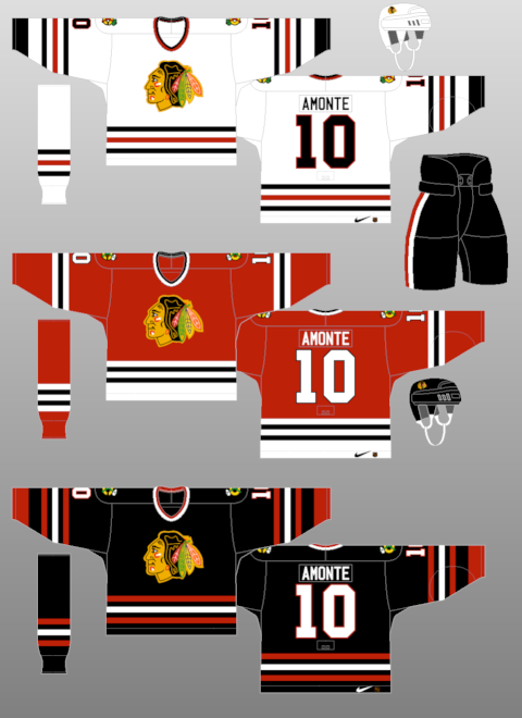
Here's my first attempt. Text looks busy but it's better than white with yellow outline alone.
|
|
|
|
|
12-04-2022, 04:23 PM
|
#614
|
|
Lifetime Suspension
|
Next reserve retro needs to be white or red blasty. Enough pretending there are some strict rules to this.
The jerseys looked much better on ice with the full uniform. Weird they're only wearing them four times, you'd figure they'd put them on for a post Christmas appearance since they'll be under the tree for some people, including myself. Sigh.
|
|
|
|
|
12-04-2022, 04:33 PM
|
#615
|
|
First Line Centre
Join Date: Oct 2001
Location: Calgary
|
Quote:
Originally Posted by TheScorpion
I think you do white and yellow striping against the black to differentiate against Chicago and Carolina. White logo for sure, but maybe you put a red outline on it as well? It'd be very interesting to mock up.
As it is, I think the two black jerseys the Flames already have are nothing short of outstanding.
|
Don't forget Ottawa, or Vegas!
This is the perfect reason black jerseys should go away. There are too many that look alike already. It's just incredibly boring.
Last edited by AFireInside; 12-04-2022 at 04:37 PM.
|
|
|
|
|
12-04-2022, 04:34 PM
|
#616
|
|
First Line Centre
|
The RR font is top notch. My favorite part.
Also never been complimented for wearing a jersey at the dome. But the Iggi #24 was a huge hit.
|
|
|
|
|
12-04-2022, 04:56 PM
|
#617
|
|
Powerplay Quarterback
Join Date: Dec 2009
Location: Tokyo, Japan
|
Quote:
Originally Posted by Reaper
Blasty black jerseys (original or reverse retro) have never had white striping.
|
True. I should have said they added more white and could have added a white stripe to match the pants when they took away the extra red. They had more red in the chevron striping for the original Blastys. Someone mocked it up with a white stripe added last year and it was way better imo. The pants striping doesn't match the new striping regardless. I don't know why the Flames designs often have striping that isn't standardized within the jersey and uniform.
|
|
|
|
|
12-04-2022, 04:57 PM
|
#618
|
|
Scoring Winger
|
Quote:
Originally Posted by Bingo
yeah that's me too.
I thought they were a little busy when they came out, and that seam looked pretty sketchy.
But with the helmets, pants, glove and pants they look pretty sharp.
The team looks a lot bigger in the black as well.
Pretty sure I like them more as a change than loving them on their own, but not as gaudy as I expected them to be.
|
The good thing about the reverse retro ones is, they have red on the sleeves, this should help keep the C of red when they are worn by fans
|
|
|
|
|
12-04-2022, 05:02 PM
|
#619
|
|
First round-bust
Join Date: Feb 2015
Location: speculating about AHL players
|
I don't think we'll ever see Reverse Retro again after this year. It's an Adidas brand, there isn't currently another line planned, and Adidas isn't renewing its contract with the NHL.
__________________
Host of the FlamesNation Warmies and Afterburner shows.
2026 World Junior Pool Champion
|
|
|
|
|
The Following User Says Thank You to TheScorpion For This Useful Post:
|
|
|
12-04-2022, 05:14 PM
|
#620
|
|
Franchise Player
Join Date: Sep 2002
Location: I'm right behind you
|
Quote:
Originally Posted by TheRealPepman
Here's my first attempt. Text looks busy but it's better than white with yellow outline alone. |
My suggestion is to use the Red Flaming C on the jersey. 3 colours with the outline being white like on the Flames black media backdrop. Make the numbers 3 colours to match the Flaming C and make the names white on red.
__________________
Don't fear me. Trust me.
|
|
|
|
 Posting Rules
|
You may not post new threads
You may not post replies
You may not post attachments
You may not edit your posts
HTML code is Off
|
|
|
All times are GMT -6. The time now is 04:20 PM.
|
|


