03-22-2013, 12:19 PM
|
#581
|
|
First Line Centre
Join Date: Aug 2010
Location: Calgary
|
Quote:
Originally Posted by Flames in 07

I don't know, I'm not big on this and I certianly don't get the 'somebody had the balls to try something like this' comment. It seems to me looking around the league everybody has the balls to try something like this.
Isn't every single third jersey made now have this circle with the team logo inside it? St Louis, Columbus, Florida, Minnesota, Pittsburgh.
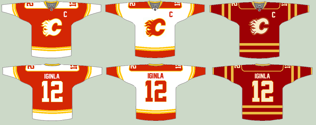
That Jones one a few posts earlier is the best tweak of a Flames jersey I have ever seen.
|
Yea I made one with that logo a few days back. Even I knew it had been done before.
|

|

|
|
03-22-2013, 03:44 PM
|
#582
|
|
Franchise Player
Join Date: Dec 2003
Location: Calgary
|
Quote:
Originally Posted by bc-chris
ok - so tonight i was working on a couple of baby blankets (my wife is preggers with our first child!!). i decided that on the red side of the blanket i wanted to do a 3-colour flaming c... white inside, then red, then yellow.
i made up the patch and thought, 'man... that looks really sweet.... i wonder what it would look like on the retro jerseys?!?!?' so i grabbed a jersey and i think i actually squealed with delight! this pic has the logo on the back of the jersey since the patch i made for the blanket is smaller than the patch on the front of the jersey - but you'll get the idea....

personally, i love it - i think it looks sweet. i should just make my version of the logo bigger and replace the front patch on my jersey..... hmmmm  |
That's awesome, and I the blanket sounds awesome!
|
|
|
|
|
03-22-2013, 03:54 PM
|
#583
|
|
Lifetime Suspension
Join Date: Oct 2011
Location: Cool Ville
|
We need a team to be able to put jerseys on.
|
|
|
|
|
03-22-2013, 03:57 PM
|
#584
|
|
Franchise Player
Join Date: Nov 2009
Location: Kelowna, BC
|
Quote:
Originally Posted by FlamesKickAss
That's awesome, and I the blanket sounds awesome!
|
thanks.... and here's my little girl at about and hour old....

(any excuse i have to post a pic of her!!)
 
__________________
"...and there goes Finger up the middle on Luongo!" - Jim Hughson, Av's vs. 'Nucks
|
|
|
|
|
The Following 4 Users Say Thank You to bc-chris For This Useful Post:
|
|
|
03-22-2013, 04:01 PM
|
#585
|
|
Franchise Player
Join Date: Aug 2007
Location: Ontario
|

Thanks a ton guys! That was pretty fun to work on.
Pretty much agree with most of the critiques on here and I know how my next free-time will be spent  .
I adore the idea of the 3rd where the Reebok logo was (I was the guy who PSd the idea earlier) but left it out of this concept considering the Reebok logo move is just a rumour. I actually even tried it on the yellow band on the elbow but it looked far too busy. I'm all about clean shoulders though.
I did purposely leave the 2-thick banded waist on purpose to be a different theme than the arms. I love the tension it brings to the jersey and the clean front-facing appearance. I tried a thin band when I added it to the arms and didn't like it as much (though it did still look good). I'll post a version with that when I tweak it around again.
That font is Phoenix. I can't unsee that now. The font was changed immediatly 
Edit: And maybe I'll post up a concept without strings... but I absolutely adore them so I hope our next jersey keeps them 
Last edited by Split98; 03-22-2013 at 04:04 PM.
|
|
|
|
|
The Following User Says Thank You to Split98 For This Useful Post:
|
|
|
03-22-2013, 07:02 PM
|
#586
|
|
Franchise Player
Join Date: Aug 2007
Location: Ontario
|
So I think I'm finally pretty happy with the concept. After playing around with the nameplate font, I found that I really did just love the clean (though Coyote's-esque) simple sans font. I also still never dug adding the extra band to the waist and included here is the neck-placement alternate logo that would be a great place if Reebok does end up allowing their branding relocation. I also retained the tie-ups, but decided on a jersey coloured thread to blend while keeping the (IMO) great look of a tie-up. Blends, avoids the clutter that bothered some people and adds that classic tie-up touch.
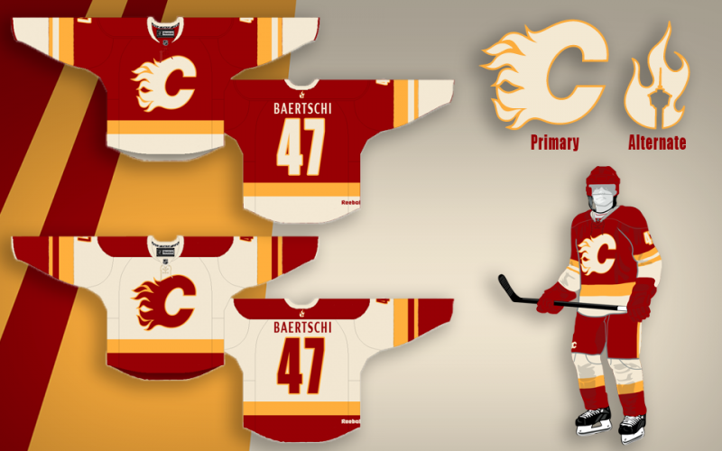
Thanks a lot for the positive response guys, this was definitely something I've had a ton of fun working on.
Last edited by Split98; 03-23-2013 at 03:20 AM.
|
|
|
|
|
The Following 10 Users Say Thank You to Split98 For This Useful Post:
|
|
|
03-22-2013, 07:06 PM
|
#587
|
|
Franchise Player
Join Date: Nov 2003
Location: Calgary, AB
|
Great job man! ^^^
Only comment would be that the socks look a bit off. The tops should probably be red for color consistency and flow, but that's just my opinion.
|
|
|
|
|
03-22-2013, 07:08 PM
|
#588
|
|
Crash and Bang Winger
Join Date: Mar 2010
Location: Calgary
|
I like the socks. I wish I could buy this jersey right now.
|
|
|
|
|
03-22-2013, 07:27 PM
|
#589
|
|
Franchise Player
Join Date: Aug 2007
Location: Ontario
|
Quote:
Originally Posted by Tyler
Great job man! ^^^
Only comment would be that the socks look a bit off. The tops should probably be red for color consistency and flow, but that's just my opinion.
|
Yeah, the socks are striking for sure.
I tried a white bottom but personally wasn't a fan. The white to the skate looked odd, and the red at the top created too much of a red block from the pants to the knees (where I had a yellow band).
I'm also a bit of a fan (a huge fan actually) of visual tension. Things that look a BIT off (though still attractive) is something I typically strive to design. The socks (and waste band) seem to accomplish that from the reviews I've gotten so far
|
|
|
|
|
03-22-2013, 07:27 PM
|
#590
|
|
Franchise Player
Join Date: Aug 2007
Location: Ontario
|
Quote:
Originally Posted by davidus_49
I like the socks. I wish I could buy this jersey right now.
|
Me too 
|
|
|
|
|
The Following User Says Thank You to Split98 For This Useful Post:
|
|
|
03-22-2013, 09:49 PM
|
#592
|
|
Lifetime Suspension
Join Date: Oct 2012
Location: Halifax
|
Quote:
Originally Posted by Split98
So I think I'm finally pretty happy with the concept. After playing around with the nameplate font, I found that I really did just love the clean (though Coyote's-esque) simple sans font. I also still never dug adding the extra band to the waist and included here is the neck-placement alternate logo that would be a great place if Reebok does end up allowing their branding relocation. I also retained the tie-ups, but decided on a jersey coloured thread to blend while keeping the (IMO) great look of a tie-up. Blends, avoids the clutter that bothered some people and adds that classic tie-up touch.
Thanks so much for the positive response guys, this was definitely something I've had a ton of fun working on. |
These are definitely the best new jersey concept I've come across (excluding Zamler's Retro one).
|
|
|
|
|
03-22-2013, 11:47 PM
|
#593
|
|
#1 Goaltender
Join Date: Oct 2011
Location: Perth Australia
|
Quote:
Originally Posted by Split98
So I think I'm finally pretty happy with the concept. After playing around with the nameplate font, I found that I really did just love the clean (though Coyote's-esque) simple sans font. I also still never dug adding the extra band to the waist and included here is the neck-placement alternate logo that would be a great place if Reebok does end up allowing their branding relocation. I also retained the tie-ups, but decided on a jersey coloured thread to blend while keeping the (IMO) great look of a tie-up. Blends, avoids the clutter that bothered some people and adds that classic tie-up touch.
Thanks so much for the positive response guys, this was definitely something I've had a ton of fun working on. |
Great work! Love the jersey!
|
|
|
|
|
03-23-2013, 12:41 AM
|
#594
|
|
Powerplay Quarterback
|
There should be a Home and Away Jersey of Kipper and Iginla because thats what the Identity of this team is.... Its not the Flames, its about Kipper and Iginla.
|
|
|
|
|
03-23-2013, 07:52 AM
|
#595
|
|
Scoring Winger
|
Quote:
Originally Posted by $ven27
These are definitely the best new jersey concept I've come across (excluding Zamler's Retro one).
|
I agree......lets all send in a request to the flames. Great job on these!!!!
|
|
|
|
|
03-23-2013, 10:57 AM
|
#596
|
|
#1 Goaltender
|
Quote:
Originally Posted by Split98
So I think I'm finally pretty happy with the concept. After playing around with the nameplate font, I found that I really did just love the clean (though Coyote's-esque) simple sans font. I also still never dug adding the extra band to the waist and included here is the neck-placement alternate logo that would be a great place if Reebok does end up allowing their branding relocation. I also retained the tie-ups, but decided on a jersey coloured thread to blend while keeping the (IMO) great look of a tie-up. Blends, avoids the clutter that bothered some people and adds that classic tie-up touch.
Thanks a lot for the positive response guys, this was definitely something I've had a ton of fun working on. |
Amazing job. One of the best jersey concepts I've ever seen, period. And personally, I love the socks.
|
|
|
|
|
04-24-2013, 03:44 PM
|
#597
|
|
Crash and Bang Winger
Join Date: May 2009
Location: Calgary
|
 Sorry for the bump...
...I just came across this:

Appears over at http://www.hockeyjerseyconcepts.com/...ing-kings.html
Don't like it much myself, but I think it's the first on this thread to attempt something like what they've done here.
__________________
The Doctor is in
Last edited by Dr. Pepper; 04-24-2013 at 03:46 PM.
|
|
|
|
|
04-24-2013, 03:45 PM
|
#598
|
|
Crash and Bang Winger
Join Date: May 2009
Location: Calgary
|
 Third Jersey Unveil at the draft?
What do people think of the likelihood of unveiling a new 3rd jersey design at the draft? Would be pretty sweet advertising with the 3 1st rounders...
__________________
The Doctor is in
|
|
|
|
|
04-25-2013, 12:52 AM
|
#599
|
|
First Line Centre
Join Date: Jan 2011
Location: Fort St. John, BC
|
Quote:
Originally Posted by Split98
So I think I'm finally pretty happy with the concept. After playing around with the nameplate font, I found that I really did just love the clean (though Coyote's-esque) simple sans font. I also still never dug adding the extra band to the waist and included here is the neck-placement alternate logo that would be a great place if Reebok does end up allowingy their branding relocation. I also retained the tie-ups, but decided on a jersey coloured thread to blend while keeping the (IMO) great look of a tie-up. Blends, avoids the clutter that bothered some people and adds that classic tie-up touch.
Thanks a lot for the positive response guys, this was definitely something I've had a ton of fun working on. |
Just saw this up on Icethetics! Good work
|
|
|
|
|
04-25-2013, 10:30 AM
|
#600
|
|
First Line Centre
|
Split98, your jersey designs are awesome! May I ask you to try out a black and a yellow 3rd jersey designs using the same template and see how they pan out?
|

|
|
 Posting Rules
|
You may not post new threads
You may not post replies
You may not post attachments
You may not edit your posts
HTML code is Off
|
|
|
All times are GMT -6. The time now is 03:17 PM.
|
|