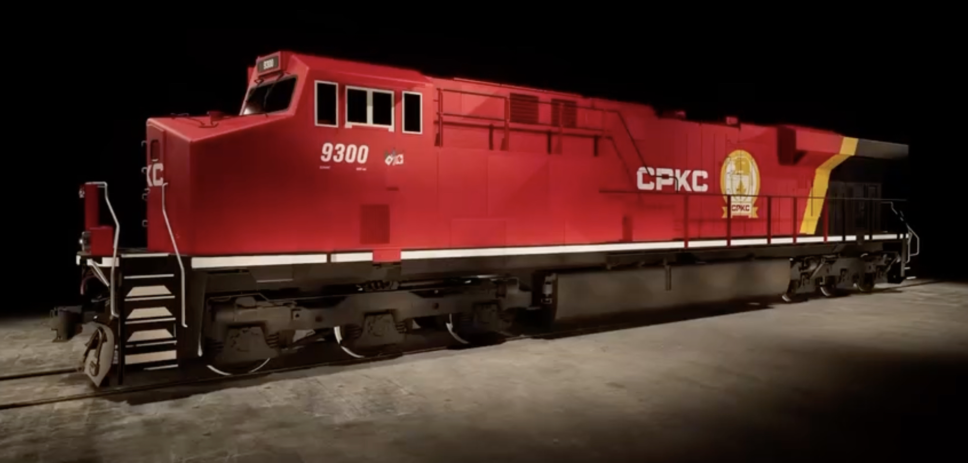
So the new livery came out today and while it's got lots of critics, personally I think it's pretty solid. I would have dropped the white wordmark on the sides and center the logo instead, but other than that I really like it.
 https://www.trains.com/trn/news-revi...motive-livery/
I think it's going to look exceptionally sharp on coal trains that have only 1 lead unit, and generally when you've got the typical two unit leaders with the second locomotive reversed, the visual impression of red/gold/black/gold/red will be pretty cool.
In the post-dual flags era I'd rate this below the original golden beaver with solid sill stripe, on par with the most recent reinterpretation of the golden beaver in solid yellow, and well above the cherry red with wordmark of the Hunter Harrison era. Good job CPKC!!