10-13-2013, 01:01 PM
|
#41
|
|
Lifetime Suspension
|
Oh hey I just realised the "D" is a duck foot. Fun.
|

|

|
|
The Following 2 Users Say Thank You to strombad For This Useful Post:
|
|
|
10-13-2013, 01:29 PM
|
#42
|
|
Franchise Player
|
Mighty Ducks > Ducks
Forever and always
|
|
|
|
|
10-13-2013, 01:49 PM
|
#43
|
|
Franchise Player
Join Date: Dec 2005
Location: back in the 403
|
Quote:
|
Originally Posted by Poe969
just for the record, a saints fan is saying that the black and gold jerseys are boring and lame....
|
Haha, actually wondered afterwards if that would come up. It's not the colours, but more the way they're used. It's like a practice jersey
Posted from Calgarypuck.com App for Android
|
|
|
|
|
10-13-2013, 01:51 PM
|
#44
|
|
One of the Nine
Join Date: Jul 2007
Location: Space Sector 2814
|
Wasn't there a goalie that used to have Darkwing Duck on his helmet?
__________________
"In brightest day, in blackest night / No evil shall escape my sight / Let those who worship evil's might / Beware my power, Green Lantern's light!"
|
|
|
|
|
10-13-2013, 01:56 PM
|
#45
|
|
Franchise Player
Join Date: Jun 2011
Location: Austria, NOT Australia
|
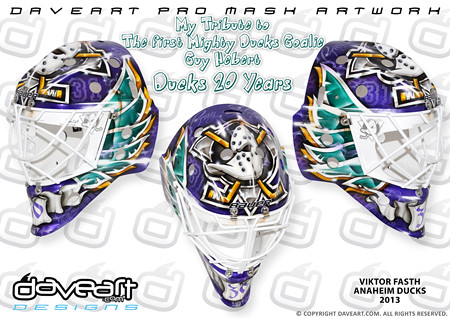
Quote:
Originally Posted by MrMastodonFarm

Jonas Hiller's throwback mask
|
Viktor Fasth has one as well:
|
|
|
|
|
10-13-2013, 02:08 PM
|
#46
|
|
Franchise Player
|
Quote:
Originally Posted by jaydorn
I gotta admit that Duck's logo has held up pretty well over the years, especially when you stick it next to the other "cutting edge" logos from that time.

Say what you will about the Disney tie-in and the "mighty" name, they had some solid designers working on the Duck's branding. |
I'm not sure how you can say that when the Ducks completely did away with their original logo, while the Sharks and Lightning are essentially still using the same ones they debuted with (with a few tweaks)
|
|
|
|
|
10-13-2013, 02:19 PM
|
#47
|
|
In the Sin Bin
|
I always thought it was stupid for a professional hockey team to be named after a Disney movie and thought the jersey and logo was ridiculous, even as a kid.
That being said, I like this throwback for the nostalgia and think its cool that they are embracing a quirky part of their history.
|
|
|
|
|
10-13-2013, 02:41 PM
|
#48
|
|
Powerplay Quarterback
|
I love the mighty ducks jerseys, also loving the throwback masks of both goalies.. can't wait to watch this game.
__________________
 CPHL Dallas Stars
|
|
|
|
|
10-13-2013, 05:15 PM
|
#49
|
|
Franchise Player
Join Date: Feb 2013
Location: Boca Raton, FL
|
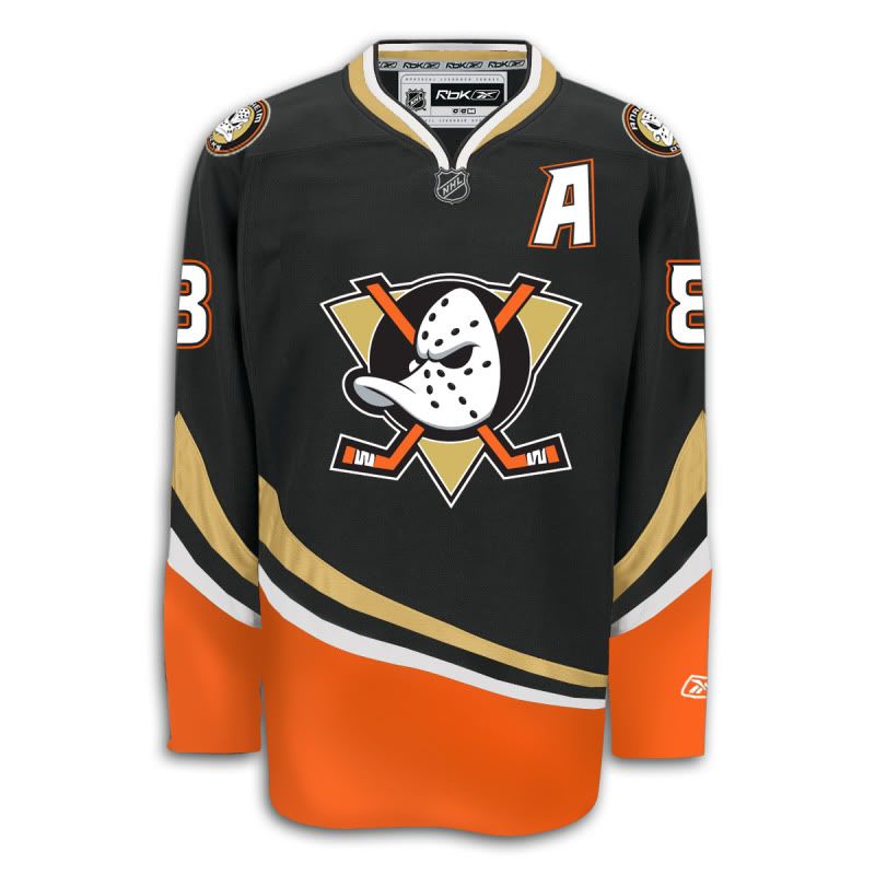
Ok, purple and gold is ok, but purple and any other colour is terrible.
I stand by what I said, I like the new Ducks jerseys.

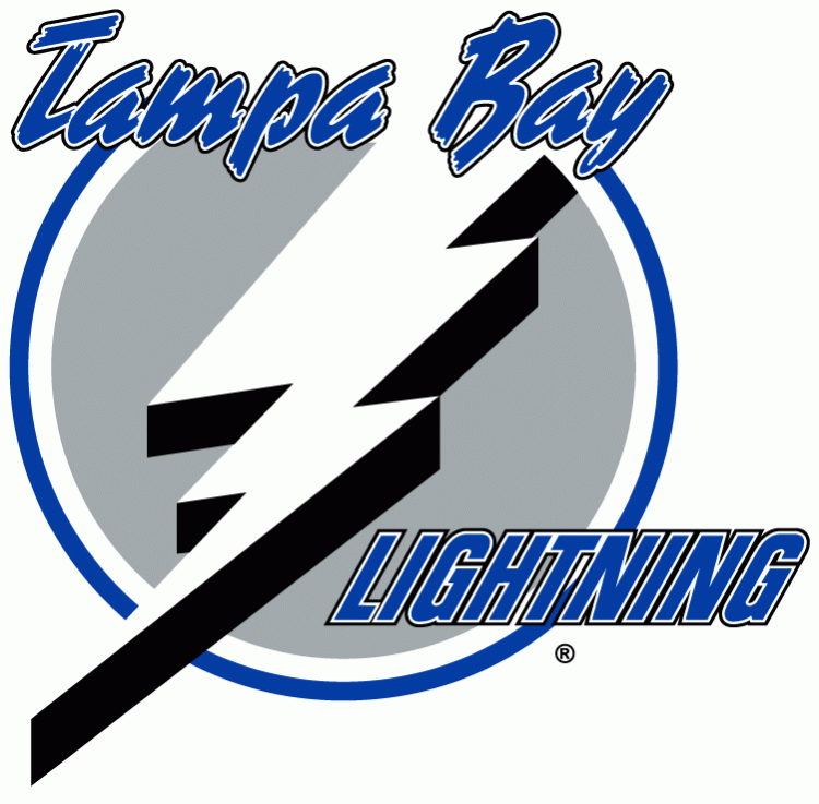
Is that better or worse than this? (Check out that shade of purple)

Or this?
Or maybe everyone just loves the logo over the colour scheme, so if we need a compromise, here's a happy medium.
__________________
"You know, that's kinda why I came here, to show that I don't suck that much" ~ Devin Cooley, Professional Goaltender
|
|
|
|
|
The Following 4 Users Say Thank You to Cali Panthers Fan For This Useful Post:
|
|
|
10-13-2013, 05:59 PM
|
#50
|
|
Backup Goalie
Join Date: Oct 2013
Location: Detroit
Exp: 
|
+1 on that compromise jersey ¯\_(ツ)_/¯
|
|
|
|
|
10-13-2013, 06:06 PM
|
#51
|
|
First Line Centre
Join Date: Sep 2012
Location: Calgary AB
|
eggplant, green, same old duck goaltender mask, but with good better stripes and more historic hockey jersey style. thats a winner.
|
|
|
|
|
10-13-2013, 06:12 PM
|
#52
|
|
NOT breaking news
Join Date: Jan 2007
Location: Calgary
|
even pink jerseys can be nice  I agree, just own your colours and don't change!

I own one of these
__________________
Watching the Oilers defend is like watching fire engines frantically rushing to the wrong fire

|
|
|
|
|
The Following User Says Thank You to djsFlames For This Useful Post:
|
|
|
10-13-2013, 06:35 PM
|
#54
|
|
Lifetime Suspension
|
I actually just like the colour combo. Not a fan of the logo.
|
|
|
|
|
10-13-2013, 07:01 PM
|
#55
|
|
Lifetime Suspension
|
Quote:
Originally Posted by GirlySports
even pink jerseys can be nice I agree, just own your colours and don't change!
I own one of these |
That's not a jersey but a ladies' golf shirt.
|
|
|
|
|
10-13-2013, 07:04 PM
|
#56
|
|
Franchise Player
Join Date: Jun 2009
Location: Thunder Bay Ontario
|
I thought it was the nucks practice jersey....
As for the ducks, I think most will agree that their new design and "logo" (it's not really a logo, more of just a print out of the word) is just terrible.
__________________
Fan of the Flames, where being OK has become OK.
|

|
|
|
The Following User Says Thank You to Poe969 For This Useful Post:
|
|
|
10-13-2013, 07:24 PM
|
#57
|
|
Franchise Player
Join Date: Jul 2009
Location: Red Deer
|
Quote:
Originally Posted by Cali Flames Fan
Or maybe everyone just loves the logo over the colour scheme, so if we need a compromise, here's a happy medium.
|
Wow, that's pretty sharp.
__________________
"It's a great day for hockey."
-'Badger' Bob Johnson (1931-1991)
"I see as much misery out of them moving to justify theirselves as them that set out to do harm."
-Dr. Amos "Doc" Cochran
|
|
|
|
|
10-13-2013, 07:26 PM
|
#58
|
|
Franchise Player
Join Date: Jun 2009
Location: Thunder Bay Ontario
|
I'm actually not a fan of the orange on the bottom, I love the old logo though. Maybe if the orange was either the green or the purple it would look better. I do like the design though.
__________________
Fan of the Flames, where being OK has become OK.
|
|
|
|
|
10-13-2013, 07:44 PM
|
#59
|
|
First Line Centre
|
Sens are playing like it's '93.
|
|
|
|
|
10-13-2013, 07:55 PM
|
#60
|
|
Celebrated Square Root Day
|
Quote:
Originally Posted by Cali Flames Fan
Ok, purple and gold is ok, but purple and any other colour is terrible.
I stand by what I said, I like the new Ducks jerseys.
Is that better or worse than this? (Check out that shade of purple)
Or this?
Or maybe everyone just loves the logo over the colour scheme, so if we need a compromise, here's a happy medium.
|
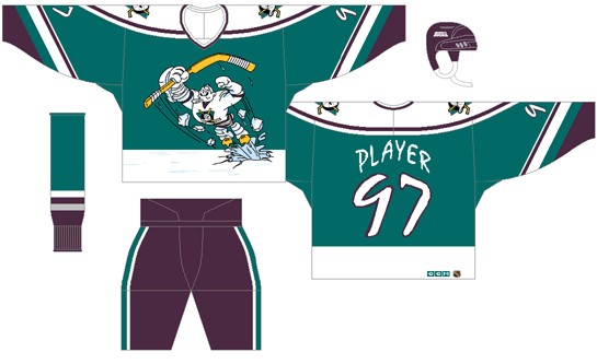
The new Ducks jerseys are just awful. Their logo looks like it was designed using Microsoft Wordart, and the jersey colours and design sound good in theory, but the result is very plain and boring.
The combination of teal, white and purple is just so sharp. The dark version is a little less sharp, but still as a set, the Mighty Ducks jerseys are the best they've ever had. Also, when you said "check out that shade of purple", you were conveniently using a very off-looking computer generated template version. The real thing looks fine.


So awesome.
|
|
|
|
 Posting Rules
|
You may not post new threads
You may not post replies
You may not post attachments
You may not edit your posts
HTML code is Off
|
|
|
All times are GMT -6. The time now is 10:01 PM.
|
|