 09-24-2013, 05:15 PM
|
#41
|
|
Franchise Player
Join Date: Oct 2001
Location: NYYC
|

Well, here's my professional opinion if you're still looking. I'll try to cover a couple of things not mentioned.
I don't mind the idea of juxtaposing something industrial with something organic (contrasting materials is always a nice way to draw attention), however with your tagline it sends a mixed message. The tagline is implying that these are the places your clocks are made for...which isn't the case. Now if these were landscapes that inspired the clocks (ie, we see some shapes that mimic your holes) than we would see a connection. Ie. If these are "extraordinary clocks inspired by extraordinary places" then I can see it working.
A good way to measure success of something fairly subjective like design, is to compare it to the expectations of your audience, and to understand where you position yourself in the market. With my design students, I always start off by asking "who is your audience?", because that is a huge driver whether something is successful or not. Otherwise we are just dealing in opinions.
Are these high end art pieces? Are they precision clocks? Are they lower/mid-range accessory pieces meant as decoration? The higher end these pieces are, the more you need to make sure it's presented professionally. If this is something you can use for a long time, considering setting up a professional photoshoot....ideally in a beautiful home/office setting, or at least something that feels a little more high end. HDR is not high end. High end industrial design is all about details and quality.
But again, it all depends on who you are talking to with these.
|

|

|
|
The Following 5 Users Say Thank You to Table 5 For This Useful Post:
|
|
|
09-24-2013, 05:18 PM
|
#42
|
|
Monster Storm
Join Date: Apr 2007
Location: Calgary
|
Quote:
Originally Posted by KTrain

You might want to include your website address on the poster.
Also, you have a logo. You should be consistent in using it on all your marketing materials.
|
I have been looking at switching up my logo to set of linear bubbles but figured that would make things look a bit busy by adding them to the picture, especially when the focus of the clock in the photo is also the bubbles.
__________________
Shameless self promotion

|

|
|
|
09-24-2013, 05:28 PM
|
#43
|
|
Monster Storm
Join Date: Apr 2007
Location: Calgary
|
Quote:
Originally Posted by Table 5
Well, here's my professional opinion if you're still looking. I'll try to cover a couple of things not mentioned.
I don't mind the idea of juxtaposing something industrial with something organic (contrasting materials is always a nice way to draw attention), however with your tagline it sends a mixed message. The tagline is implying that these are the places your clocks are made for...which isn't the case. Now if these were landscapes that inspired the clocks (ie, we see some shapes that mimic your holes) than we would see a connection. Ie. If these are "extraordinary clocks inspired by extraordinary places" then I can see it working.
A good way to measure success of something fairly subjective like design, is to compare it to the expectations of your audience, and to understand where you position yourself in the market. With my design students, I always start off by asking "who is your audience?", because that is a huge driver whether something is successful or not. Otherwise we are just dealing in opinions.
Are these high end art pieces? Are they precision clocks? Are they lower/mid-range accessory pieces meant as decoration? The higher end these pieces are, the more you need to make sure it's presented professionally. If this is something you can use for a long time, considering setting up a professional photoshoot....ideally in a beautiful home/office setting, or at least something that feels a little more high end. HDR is not high end. High end industrial design is all about details and quality.
But again, it all depends on who you are talking to with these.
|
Thank you very much for this. Very good points.
__________________
Shameless self promotion
|
|
|
|
|
09-24-2013, 05:56 PM
|
#44
|
|
tromboner
Join Date: Mar 2006
Location: where the lattes are
|
Okay here are my takes. I know I've kind of ruined the skies with these edits but in better hands that wouldn't happen.

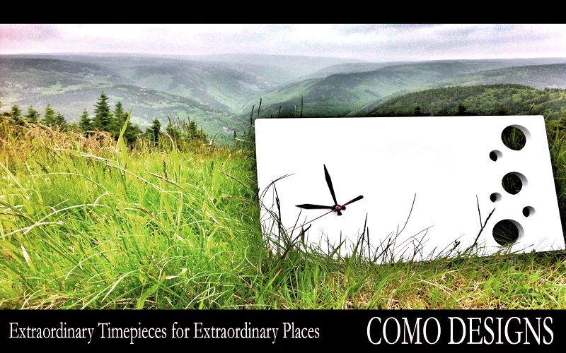
Every time I open Photoshop, I am reminded how much I suck at it. Anyways, these should give you a rough idea. What I'm trying to convey is that the landscapes look a lot better if they're not glowing, and cleaning up the clocks makes your product look better. I would seriously recommend hiring someone who knows what they're doing for this though (edit: or get Psychenet). I know you're a DIY kind of guy but this is perhaps not the place for that.
Last edited by SebC; 09-24-2013 at 05:59 PM.
|
|
|
|
|
The Following User Says Thank You to SebC For This Useful Post:
|
|
|
09-24-2013, 06:06 PM
|
#45
|
|
Lifetime Suspension
Join Date: Apr 2004
Location: Market Mall Food Court
|
You are on a Flames board. Please spell it correctly.
Comeau Designs
|
|
|
|
|
09-24-2013, 06:07 PM
|
#46
|
|
Franchise Player
Join Date: Dec 2012
Location: On your last nerve...:D
|
I took my glasses off because they are bothering my eyes, and logged in, saw the thread title and thought it said "Porno poster - critique please."
Glasses back on now.
Anyway, I like what Table5 has to say. Following his line of thinking, if you're going for 'extraordinary places' as part of the tagline, why not use some of our province's extraordinary places as background art? Have the sight lines such that interesting parts of the background are seen through the holes in the timepiece in your poster?
|
|
|
|
|
09-24-2013, 06:08 PM
|
#47
|
|
tromboner
Join Date: Mar 2006
Location: where the lattes are
|
Also are your clocks intended to have a right-side-up? Or is it upside down in one of the shots?
|
|
|
|
|
The Following User Says Thank You to SebC For This Useful Post:
|
|
|
09-24-2013, 06:23 PM
|
#48
|
|
Monster Storm
Join Date: Apr 2007
Location: Calgary
|
Quote:
Originally Posted by Minnie
I took my glasses off because they are bothering my eyes, and logged in, saw the thread title and thought it said "Porno poster - critique please."
Glasses back on now.
Anyway, I like what Table5 has to say. Following his line of thinking, if you're going for 'extraordinary places' as part of the tagline, why not use some of our province's extraordinary places as background art? Have the sight lines such that interesting parts of the background are seen through the holes in the timepiece in your poster?
|
I do plan on getting some Alberta shots soon. Fall colors for the win!
__________________
Shameless self promotion
|
|
|
|
|
09-24-2013, 06:23 PM
|
#49
|
|
Monster Storm
Join Date: Apr 2007
Location: Calgary
|
Quote:
Originally Posted by SebC
Also are your clocks intended to have a right-side-up? Or is it upside down in one of the shots?
|
No right side up. East-West-North-South all will work.
__________________
Shameless self promotion
|
|
|
|
|
The Following User Says Thank You to surferguy For This Useful Post:
|
|
|
09-24-2013, 06:30 PM
|
#50
|
|
Not a casual user
Join Date: Mar 2006
Location: A simple man leading a complicated life....
|
How about this idea?

__________________
|
|
|
|
|
The Following 25 Users Say Thank You to Dion For This Useful Post:
|
Żoso,
Azure,
bc-chris,
Bertuzzied,
Boblobla,
CaptainCrunch,
chalms04,
CofR,
Cuz,
DownhillGoat,
fotze,
gargamel,
greyshep,
Hockey_Ninja,
jayswin,
KTrain,
M*A*S*H 4077,
Minnie,
MrMastodonFarm,
NSFL,
Rathji,
rayne008,
REDVAN,
surferguy,
Table 5
|
|
09-24-2013, 06:40 PM
|
#51
|
|
Lifetime Suspension
Join Date: Apr 2004
Location: Market Mall Food Court
|
hahahhahaha. oh crap. i can't stop laughing right now. hahahahahaha
|
|
|
|
|
09-24-2013, 07:40 PM
|
#52
|
|
Norm!
|
Its always tough to critique this because you come across like a jerk at times.
I agree that the font isn't the right font, its not really an elegant font and makes it look like an afterthought. You know I'm tired and almost done I'll just use San Sarif.
I don't like the shadowing behind the clock. It just has a really fake look to it. Like you laid the clock on a picture instead of putting the clock in the field.
The placement of the grass on the front of the clock is actually really distracting, not good if your clock is the key part of your marketing concept.
For some reason the hazy background markets really break up the background in a bad way. Its like the Jay and Silent Bob scene when they run into a scenic panic and complain that Hollywood is so fake.
I'm wondering what your theme is here? In terms of doing anything from a marketing standpoint or branding standpoint, you need to be able to tell us why? If its just that you think that a clock in a grasslands is cool then great. But it just looks a little forced.
Maybe lighten up the tinging on the clock. Right now with the bright white behind the hands and the the tinging around it just makes your clock look dirty.
The overly green grass distracts from the clock. Don't get me wrong its a very nice clock, but the stuff around it really distracts from the clock so that it becomes secondary.
Not to be mean, but as an artistic piece in a abstract concept its ok, as a marketing piece I'm not sure its the direction that I would go in.
Sorry.
__________________
My name is Ozymandias, King of Kings;
Look on my Works, ye Mighty, and despair!
|
|
|
|
|
09-24-2013, 08:34 PM
|
#53
|
|
Self-Retirement
|
The clocks should be set for 10:10. All clock/watch ads do this.
|
|
|
|
|
09-24-2013, 09:23 PM
|
#54
|
|
Not a casual user
Join Date: Mar 2006
Location: A simple man leading a complicated life....
|
Okay surferguy....
I took the logo from your main page and put it above the clock. I also changed the font at the bottom to add some colour and script type lettering. Let me know what you think of the changes 

__________________
|
|
|
|
|
The Following 2 Users Say Thank You to Dion For This Useful Post:
|
|
|
09-24-2013, 09:47 PM
|
#55
|
|
First Line Centre
Join Date: Oct 2008
Location: Cambodia
|
Quote:
Originally Posted by fotze
Actually that gives me an idea. The clock set in terrible places making them better.
Clock on the wall of a Thai brothel.
Clock on the wall of one of those rooms in the movie Hostel.
Clock on the wall of Table5's living room as he reads this thread in the background and bristles.
|
Wait, did you just imply that a Thai brothel is a terrible place? Sounds more like an extraordinary place for an extraordinary timepiece to me.
|
|
|
|
|
09-24-2013, 09:48 PM
|
#56
|
|
Monster Storm
Join Date: Apr 2007
Location: Calgary
|
Quote:
Originally Posted by Dion
Okay surferguy....
I took the logo from your main page and put it above the clock. I also changed the font at the bottom to add some colour and script type lettering. Let me know what you think of the changes
|
This might be a winner!
__________________
Shameless self promotion
|
|
|
|
|
09-24-2013, 10:52 PM
|
#57
|
|
Scoring Winger
|
Not a professional opinion, but here it goes.
Definitely the wrong font, especially for such a contemporary piece. When in doubt, go with Helvetica.
Also, way too much going on in the background. Again, for such a modern item, you'd be much better off going with a clean/minimalist background.
Just my 2 cents.
|
|
|
|
|
09-24-2013, 11:42 PM
|
#58
|
|
Crash and Bang Winger
|
Take it a step further ^^ Helvetia is the way to go. Simple big font covering most of the image, white with a 60 percent opacity...maybe play around with it?
|
|
|
|
|
09-25-2013, 04:44 AM
|
#59
|
|
Franchise Player
Join Date: Nov 2009
Location: Kelowna, BC
|
Quote:
Originally Posted by Dion
Okay surferguy....
I took the logo from your main page and put it above the clock. I also changed the font at the bottom to add some colour and script type lettering. Let me know what you think of the changes
|
Dion - you missed with the font.... you should have used 'comic sans'!  
__________________
"...and there goes Finger up the middle on Luongo!" - Jim Hughson, Av's vs. 'Nucks
|
|
|
|
|
The Following User Says Thank You to bc-chris For This Useful Post:
|
|
|
09-25-2013, 02:58 PM
|
#60
|
|
Monster Storm
Join Date: Apr 2007
Location: Calgary
|
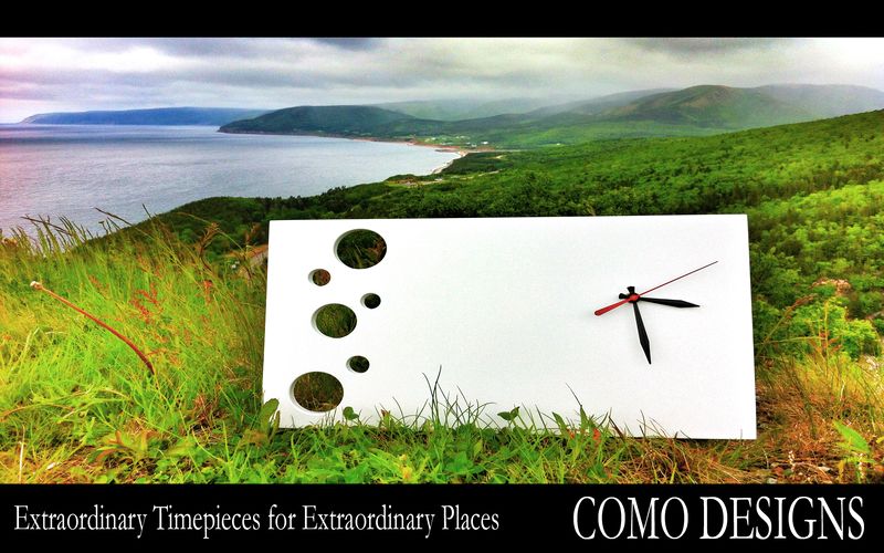
Thanks for the feedback yesterday. After sleeping on it I have decided to take another go at it.
I would also like to mention that my feelings are not hurt by your opinions. When you work on something you only have one point of view (your own) and what you think looks fine will be picked apart by others.
Here is my last round of attempts:


__________________
Shameless self promotion
|
|
|
|
 Posting Rules
|
You may not post new threads
You may not post replies
You may not post attachments
You may not edit your posts
HTML code is Off
|
|
|
All times are GMT -6. The time now is 05:48 PM.
|
|


