 09-05-2013, 10:55 PM
|
#41
|
|
Franchise Player
|
Quote:
Originally Posted by MissTeeks

They have the ugly fake laces
 |
Who is that lady?
__________________
I hate just about everyone and just about everything.
|

|

|
|
09-05-2013, 11:33 PM
|
#42
|
|
Powerplay Quarterback
Join Date: Oct 2001
Location: Edmonton
|
Don't really like at all. Just looks weird with the fake laces and plastic look.
|
|
|
|
|
09-06-2013, 12:16 AM
|
#43
|
|
In the Sin Bin
|
Quote:
Originally Posted by BACKCHECK!!!
You know what, the Internet is a strange place sometimes.
|
I googled "disgust gif" and "wtf gif".
That one was the best.
|
|
|
|
|
09-06-2013, 12:21 AM
|
#44
|
|
Scoring Winger
|
Who designed these, The Bay?
Sent from my Nexus 7 using Tapatalk 4
|
|
|
|
|
09-06-2013, 12:27 AM
|
#45
|
|
Franchise Player
Join Date: Jun 2002
Location: The Pas, MB
|
Those are as bad as the Flames' McDonalds Heritage Classic jerseys.
|
|
|
|
|
09-06-2013, 12:47 AM
|
#46
|
Join Date: Dec 2010
Location: Cleveland, OH (Grew up in Calgary)
|
Quote:
Originally Posted by BACKCHECK!!!
You know what, the Internet is a strange place sometimes.
|
Sometimes?
__________________
Just trying to do my best
|
|
|
|
|
09-06-2013, 12:47 AM
|
#47
|
|
#1 Goaltender
Join Date: Aug 2011
Location: Not cheering for losses
|
Oh god. Terrible! The 2010 ones are awesome. They on sale anywhere?
|
|
|
|
|
09-06-2013, 12:58 AM
|
#48
|
|
Franchise Player
|
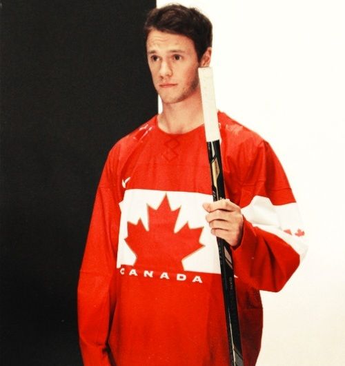
The look on Toews' face pretty much sums up how I feel about these jerseys. Awful.
|
|
|
|
|
09-06-2013, 02:28 AM
|
#49
|
|
First Line Centre
Join Date: Oct 2009
Location: Calgary
|
Its basically the Canadian flag with the Hockey Canada wordmark on the bottom. Go Canada Go
|
|
|
|
|
09-06-2013, 02:28 AM
|
#50
|
|
Powerplay Quarterback
Join Date: Jul 2013
Location: Calgary
|
Better than buffalos new jersey
__________________
Go Flames Go
|
|
|
|
|
09-06-2013, 02:35 AM
|
#51
|
|
First Line Centre
Join Date: Dec 2009
Location: Haparanda
|
Honestly the ugliest jersey I've ever seen.
|
|
|
|
|
09-06-2013, 02:58 AM
|
#52
|
|
Powerplay Quarterback
Join Date: Mar 2009
Location: The frozen surface of a fireball
|
Meh, better than the stupid textured leaf on the 2010 jerseys IMO, whatevs.
The whole cashing in on Heida art and inukshuks really pissed me off.
__________________
'When I use a word,' Humpty Dumpty said, in rather a scornful tone, 'it means just what I choose it to mean neither more nor less.'
Quote:
Originally Posted by Icon
dear god is he 14?
|
|
|
|
|
|
09-06-2013, 03:29 AM
|
#53
|
|
#1 Goaltender
|
Just like Team USA's they are awesome jerseys except the fake stitching and reflective shoulders. Remove the reflective shoulders and get some real laces on there and those jerseys would be awesome. Clean.
__________________
|
|
|
|
|
The Following 2 Users Say Thank You to Temporary_User For This Useful Post:
|
|
|
09-06-2013, 05:39 AM
|
#54
|
|
Franchise Player
Join Date: Mar 2004
Location: Chilliwack, B.C
|
I maybe one of the few but I like the new look jersey nice to see standard colours being red and white, like the logo look as well, fake laces look stupid, but looks like all the jerseys will have that image. I feared our jersey would be too similar to the states, glad they are complete opposites.
|
|
|
|
|
09-06-2013, 06:03 AM
|
#55
|
|
First Line Centre
Join Date: Oct 2009
Location: Calgary
|
Those look terrible. I think the arm band looks kind of neat by why is it only on one arm? I like the shade of red but the whole thing looks way too simple.
|
|
|
|
|
09-06-2013, 07:57 AM
|
#56
|
|
Scoring Winger
Join Date: Feb 2012
Location: YYC-ish
|
That jersey is just god awful.
Even though it's not some big anniversary of it, can Canada please go in with the same style jerseys as the 1972 summit series and just use them for any and all games against Russia.
Just to piss em off.
|
|
|
|
|
09-06-2013, 08:17 AM
|
#57
|
|
Lifetime Suspension
|
These are absolutely awful just like the US ones. Fake laces, weird applique patches on the shoulders... F. Everyone who thought this was a good idea is dumb. It should be pretty obvious by now that all those ironed-on details are a huge "NO" for hockey sweaters, and this is ostensibly one that they wanted to have looking sorta "vintage" so it makes even less sense than usual.
Kill it with fire etc.
|
|
|
|
|
09-06-2013, 08:49 AM
|
#58
|
|
Franchise Player
Join Date: Feb 2007
Location: Calgary, AB
|
Quote:
Originally Posted by HOWITZER
That jersey is just god awful.
Even though it's not some big anniversary of it, can Canada please go in with the same style jerseys as the 1972 summit series and just use them for any and all games against Russia.
Just to piss em off.
|
Funny thing is we all like the 72' Summit Series jerseys because of their history but I guarantee that had CP been around when those things were launched the majority would have hated them. Would have been lots of "WTF are those things, doesn't even look like a maple leaf".
The Canada Cup jerseys are the best Canada jerseys IMO.
|
|
|
|
|
09-06-2013, 09:22 AM
|
#60
|
|
Powerplay Quarterback
Join Date: Sep 2007
Location: Behind enemy lines!
|
Looks too plain. Maybe it will look better with names and numbers on them.
Also wonder if that white stripe across the chest goes around the back too, Montreal Canadiens style.
Guess anything will look good with a gold medal around the collar!
|
|
|
|
 Posting Rules
|
You may not post new threads
You may not post replies
You may not post attachments
You may not edit your posts
HTML code is Off
|
|
|
All times are GMT -6. The time now is 09:47 PM.
|
|


