 06-04-2013, 02:03 PM
|
#41
|
|
Franchise Player
Join Date: Feb 2006
Location: Calgary
|
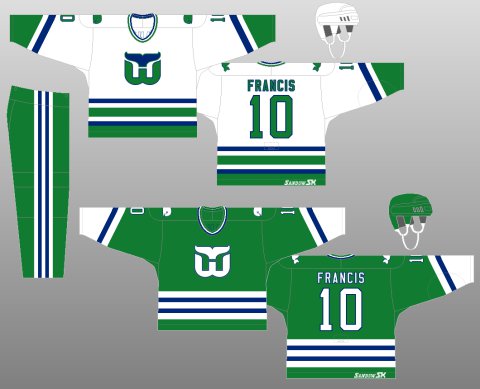
I've always thought horizontal stripping on the Edge jerseys look awful. It looks bad on the Nucks uniform, and it looks awful here. It just doesn't work when the bottom of the jersey is curved. It makes the whole thing look like an apron or a bib, especially on the white away jerseys.
|

|

|
|
The Following User Says Thank You to The Yen Man For This Useful Post:
|
|
|
06-04-2013, 02:18 PM
|
#42
|
|
Franchise Player
Join Date: May 2004
Location: Helsinki, Finland
|
Could be worse, could be better, will forget this change ever happened in a week.
|
|
|
|
|
06-04-2013, 02:25 PM
|
#43
|
|
NOT breaking news
Join Date: Jan 2007
Location: Calgary
|
should be this:
__________________
Watching the Oilers defend is like watching fire engines frantically rushing to the wrong fire

|

|
|
|
The Following 5 Users Say Thank You to GirlySports For This Useful Post:
|
|
|
06-04-2013, 02:42 PM
|
#44
|
|
Franchise Player
Join Date: Oct 2001
Location: Kalispell, Montana
|
when are they going to scrap that awful logo in favor of the much cooler hurricane flag that they used for the shoulder patch?
__________________
I am in love with Montana. For other states I have admiration, respect, recognition, even some affection, but with Montana it is love." - John Steinbeck
|
|
|
|
|
The Following User Says Thank You to Displaced Flames fan For This Useful Post:
|
|
|
06-04-2013, 03:01 PM
|
#45
|
|
Franchise Player
Join Date: Aug 2007
Location: Calgary
|
Love the Away jersey
__________________

Last edited by Nammer403; 06-04-2013 at 03:05 PM.
|
|
|
|
|
06-04-2013, 03:50 PM
|
#46
|
|
#1 Goaltender
Join Date: Jan 2009
Location: Calgary
|
Incredible set, though I agree with some of you, the away jersey looks better. I wish they incorporated black into the home jersey a bit more. Still, a very nice, classic looking set. Well done Hurricanes.
Now it's just down to Flames, Sens, Penguins and Ducks for having the worst jerseys in the NHL.
|
|
|
|
|
06-04-2013, 03:54 PM
|
#47
|
|
First Line Centre
Join Date: Jan 2011
Location: Fort St. John, BC
|
Ha, "new and different"
Looks just like team Canada to me
|
|
|
|
|
The Following User Says Thank You to doctajones428 For This Useful Post:
|
|
|
06-04-2013, 05:45 PM
|
#49
|
|
Lifetime Suspension
Join Date: Oct 2012
Location: Halifax
|
Quote:
Originally Posted by Erick Estrada

I like them. One of those rare occurances where the away 'white' jerseys look better than the home ones.
|
Really? I can't name too many Home jerseys I like better then Away ones.
|
|
|
|
|
The Following User Says Thank You to $ven27 For This Useful Post:
|
|
|
06-04-2013, 05:47 PM
|
#50
|
|
Lifetime Suspension
Join Date: Oct 2012
Location: Halifax
|
Quote:
Originally Posted by _Q_
Incredible set, though I agree with some of you, the away jersey looks better. I wish they incorporated black into the home jersey a bit more. Still, a very nice, classic looking set. Well done Hurricanes.
Now it's just down to Flames, Sens, Penguins and Ducks for having the worst jerseys in the NHL.
|
Add in the Avs there too, awful awful jerseys.
|
|
|
|
|
The Following User Says Thank You to $ven27 For This Useful Post:
|
|
|
06-04-2013, 06:42 PM
|
#51
|
|
Jordan!
Join Date: Jul 2009
Location: Chandler, AZ
|
On second look, that white one is really sharp. The Red uni should have more black on it though.
|
|
|
|
|
06-04-2013, 08:10 PM
|
#52
|
|
Franchise Player
Join Date: Mar 2004
Location: Chilliwack, B.C
|
I like them hope the Flames are taking notice
|
|
|
|
|
06-04-2013, 08:11 PM
|
#53
|
|
Lifetime Suspension
|
Without this thread, I never would have noticed.
|
|
|
|
|
The Following 4 Users Say Thank You to TurnedTheCorner For This Useful Post:
|
|
|
06-04-2013, 08:15 PM
|
#54
|
|
Franchise Player
|
Quote:
Originally Posted by the-rasta-masta
Is it really necessary to have the logo that high? The captains C and the logo almost touch and there is a bunch of room underneath. Took a unique uniform idea and made it look too generic.
|
same height as it was in the past actually. you can tell by the C or A on the jerseys. The striping finishes lower on the torso now so it makes the logo look higher.
|
|
|
|
|
The Following 2 Users Say Thank You to Alberta_Beef For This Useful Post:
|
|
|
06-04-2013, 08:44 PM
|
#55
|
|
damn onions
|
The red I think is identical to team Canada except the pants is it not? Like to the point of copyright infringement, it literally looks like they just took Canada jerseys and switched logos...
Hideous.
|
|
|
|
|
The Following 2 Users Say Thank You to chalms04 For This Useful Post:
|
|
|
06-04-2013, 09:37 PM
|
#57
|
|
Lifetime Suspension
|
Quote:
Originally Posted by doctajones428
Ha, "new and different"
Looks just like team Canada to me
|
Canadiens is what thought.
|
|
|
|
|
06-04-2013, 10:35 PM
|
#58
|
|
Scoring Winger
Join Date: Nov 2006
Location: Calgary, AB
|
I've always thought the Carolina team should be re-named the Crew Chiefs as a nod to the NASCAR fans in the area. The new jerseys aren't bad, but I don't like the chest high logo..they must've done this on purpose, but why?
|
|
|
|
|
06-04-2013, 11:02 PM
|
#59
|
|
Powerplay Quarterback
|
Quote:
Originally Posted by calgaryred
I like them hope the Flames are taking notice
|
With a management group with Feaster/King and maybe the Owners, I can almost guarantee the jersey still being the worst in the NHL seeing as how I wasn't a fan of the 2 Flags on the shoulder patches.
Again, I know everyone has stressed this out many times but they should have stuck with the 04 jersey.
__________________
 CPHL Dallas Stars
|
|
|
|
|
06-05-2013, 08:49 AM
|
#60
|
|
Franchise Player
Join Date: Dec 2005
Location: back in the 403
|
Quote:
Originally Posted by dammage79
Hopefully the Flames have a similar idea for theirs. Removing all the tacky piping on their regular home and aways.
|
Agreed, and remove all that tacky black too, while we're at it.
I actually like the new Canes jerseys, subtle change with an old-school look. At least they're not busting out chrome helmets or something.. I wish you guys never mentioned the smaller, too high logo though. Didn't even notice it before, now its bugging me too.
|
|
|
|
 Posting Rules
|
You may not post new threads
You may not post replies
You may not post attachments
You may not edit your posts
HTML code is Off
|
|
|
All times are GMT -6. The time now is 04:42 PM.
|
|


