I like the old-style Als logo (and the wings logo too) much better than the noisy cartoon logo they had been using. Should be able to see what it is from a distance.
I agree, their helmets look great now.
__________________
Quote:
Originally Posted by Back2Back
The Oilers are very close on becoming a powerhouse team.
I like the old-style Als logo (and the wings logo too) much better than the noisy cartoon logo they had been using. Should be able to see what it is from a distance.
Quote:
Originally Posted by CofR
I agree, their helmets look great now.
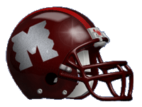
The Als are wearing different helmet logos every month for the first four months of this season. In August they will be sporting the delta logo: