 11-18-2022, 10:11 PM
|
#561
|
|
Taking a while to get to 5000
|
Bizarro world Flames
|

|

|
|
11-18-2022, 10:20 PM
|
#562
|
|
Franchise Player
Join Date: Feb 2006
Location: Calgary, AB
|
Quote:
Originally Posted by RM14

Edit: we will be wearing the Regular Red home jerseys vs. The Habs on Dec 1st.
|
Did that change recently? That was announced as an alternate game.
https://twitter.com/user/status/1579876593291653120
In fact, they're supposed to wear black for every home game between now and Christmas. The 3rds for Florida, Montreal, and St. Louis and the RR for the other 4 games.
__________________
Turn up the good, turn down the suck!
|
|
|
|
|
The Following User Says Thank You to getbak For This Useful Post:
|
|
|
11-18-2022, 10:26 PM
|
#563
|
|
First Line Centre
Join Date: Oct 2001
Location: Calgary
|
Quote:
Originally Posted by jlh2640
Incorrect, Black 100000% belongs. I am all for the retros being our home and away unis. But there is a place for Blasty as a 3rd, and the C of Red jersey from 2004 is the best uniform the franchise ever wore. That uniform needs to be back next year in some form.
|

|
|
|
|
|
11-18-2022, 10:47 PM
|
#564
|
|
Franchise Player
Join Date: Mar 2002
Location: Calgary
|

Quote:
Originally Posted by rohara66
They're amazing in person.... I think they're going to look awesome on the ice.
My Iginla #24 RR just showed up today.

 |
Nice choice for name and number.
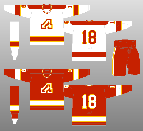
Not sure why the Flames can't get little things right or consistent. They do it fine on the primary set and even the Western alternates had details consistent. This looks like a hodge podge of trim looks like it was thrown together from peices left over from the equipment room.
Name bar - red outline.
Numbers on back - red and yellow outline.
Crest on front - yellow (and black negative space) outline.
Shoulder numbers - black outline.
Ok, the 1995 originals had a black trim on name, yellow and black number trim, yellow crest trim and black shoulder number trim. A mess as well. Again though, this doesn't have to be some exact duplicate of that, Flames can change these details to look proper.
Of course, for this jersey they are simply and lazily using the same name and numbers on the back as the Blasty jersey, but the Blasty jersey suffers from the same inconsistency.
Blasty has same name bar and numbers as the RR, but yellow and red outlined numbers on the shoulders. No outline on Blasty crest. Black outline on white shoulder C.
To fix the RR, crest and shoulder numbers fine. Make the name bar and numbers with the same yellow (and black negative space) outline as the front crest. Cleaner, more consistent looking.
Or, at very least for consistently, outline the numbers just in red, not yellow and red, to match the name bar.
Last edited by browna; 11-18-2022 at 10:52 PM.
|
|
|
|
|
The Following User Says Thank You to browna For This Useful Post:
|
|
|
11-19-2022, 12:07 AM
|
#565
|
|
Scoring Winger
Join Date: Nov 2017
Location: YYZ
|
Comparatively ours are top 5, top 3 without the pedestal. Top 3 Kings, Blues, Ducks.
|
|
|
|
|
11-19-2022, 12:31 AM
|
#566
|
|
First round-bust
Join Date: Feb 2015
Location: speculating about AHL players
|
Quote:
Originally Posted by browna
Nice choice for name and number.
Not sure why the Flames can't get little things right or consistent. They do it fine on the primary set and even the Western alternates had details consistent. This looks like a hodge podge of trim looks like it was thrown together from peices left over from the equipment room.
Name bar - red outline.
Numbers on back - red and yellow outline.
Crest on front - yellow (and black negative space) outline.
Shoulder numbers - black outline.
Ok, the 1995 originals had a black trim on name, yellow and black number trim, yellow crest trim and black shoulder number trim. A mess as well. Again though, this doesn't have to be some exact duplicate of that, Flames can change these details to look proper.
Of course, for this jersey they are simply and lazily using the same name and numbers on the back as the Blasty jersey, but the Blasty jersey suffers from the same inconsistency.
Blasty has same name bar and numbers as the RR, but yellow and red outlined numbers on the shoulders. No outline on Blasty crest. Black outline on white shoulder C.
To fix the RR, crest and shoulder numbers fine. Make the name bar and numbers with the same yellow (and black negative space) outline as the front crest. Cleaner, more consistent looking.
Or, at very least for consistently, outline the numbers just in red, not yellow and red, to match the name bar.
|
With respect to the outlines ... it is typical on many NHL uniforms for small characters to be outlined in one colour and large characters to be outlined in two. The Boston Bruins recently streamlined the outlines on their smaller characters because the previous double-outline format made the names more difficult to read.
As for the different outlines between the small characters on the back and the arms ... that is because those characters are on different-coloured backgrounds. Red outline against black, black outline against red. Makes sense.
These letters and numbers are actually in a completely different font than the one on the back of the Blasty jersey. This is a much less rounded sans serif font. They're both italic fonts, but they're absolutely different.
__________________
Host of the FlamesNation Warmies and Afterburner shows.
2026 World Junior Pool Champion
|
|
|
|
|
11-19-2022, 02:11 AM
|
#567
|
|
Scoring Winger
Join Date: Nov 2006
Location: Calgary, AB
|
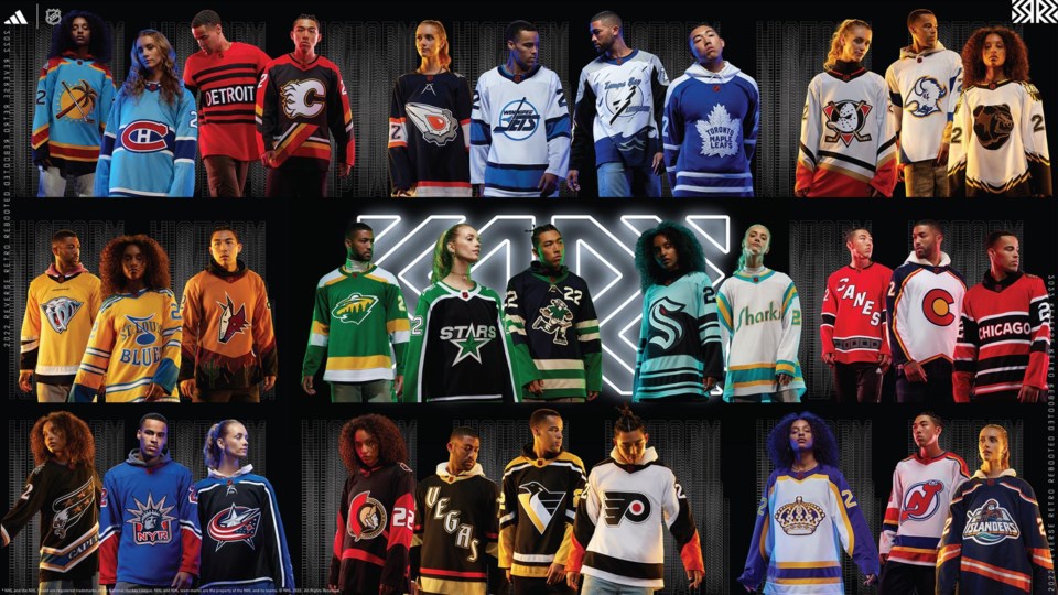
Flames new reverse retro jersey thread
|
|
|
|
|
The Following 12 Users Say Thank You to goodyear For This Useful Post:
|
bc-chris,
btimbit,
calgaryboy,
Hockey_Ninja,
Jetfire,
Jordan!,
Jore,
nixon45,
rohara66,
Scroopy Noopers,
Stillman16,
tknez16
|
|
11-19-2022, 08:59 AM
|
#568
|
|
First Line Centre
Join Date: Oct 2002
Location: Turner Valley
|
Quote:
Originally Posted by browna
Of course, for this jersey they are simply and lazily using the same name and numbers on the back as the Blasty jersey, but the Blasty jersey suffers from the same inconsistency.
|
The numbers and name bars are a different font style than on Blasty.
http://www.nhluniforms.com/2022-23/Flames.html
Last edited by the-rasta-masta; 11-19-2022 at 09:02 AM.
Reason: Beaten to it by Scorp
|
|
|
|
|
The Following User Says Thank You to the-rasta-masta For This Useful Post:
|
|
|
11-19-2022, 09:35 AM
|
#569
|
|
Franchise Player
Join Date: Mar 2002
Location: Calgary
|
Fair enough, I'm wrong, they are subtly different italic fonts, but the trim colors (red for name, red yellow for numbers) remains the same.
Shoulder numbers, sure, case can be made in there for a single trim there on the RR beause of the background (though if they used with a yellow line not black, it may still be fine), and that's fine.
Point stands about the outlining inconsistency. I understand no double color trim for the names for legibility, but adding that to back numbers does nothing but distracts from consistently.
Our primary sets, some of the best in the league, designed in 1972, doesn't have this unnecessary noise. Name bar, numbers (back and arms) and front crest all have the same consistent trim color.
Again, I think the RR with a single yellow trim around the rear letters and rear numbers, matching the front crest, would look a lot cleaner and consistent...and they could do something similar to the 3rd alternate, though the Blasty crest doesn't have an outline (but could be updated).
Last edited by browna; 11-19-2022 at 09:39 AM.
|
|
|
|
|
11-19-2022, 11:10 AM
|
#570
|
|
First round-bust
Join Date: Feb 2015
Location: speculating about AHL players
|
It's funny — the much more common approach in the NHL these days is to have a one-colour outline around the big characters and then no outline at all around the names. Just a straight colour. Curious to hear your thoughts on that.
__________________
Host of the FlamesNation Warmies and Afterburner shows.
2026 World Junior Pool Champion
|
|
|
|
|
11-19-2022, 12:37 PM
|
#571
|
|
Franchise Player
|
Quote:
Originally Posted by rohara66
They're amazing in person.... I think they're going to look awesome on the ice.
My Iginla #24 RR just showed up today.
|
I call jersey foul.
|
|
|
|
|
The Following 4 Users Say Thank You to CroFlames For This Useful Post:
|
|
|
11-19-2022, 02:03 PM
|
#572
|
|
First Line Centre
|
Quote:
Originally Posted by CroFlames
I call jersey foul.
|
Reverse retro are the only exception to jersey fouls IMO haha.
Especially considering it’s tagged as a 1995 RR on the collar, which was Jarome’s rookie year.
|
|
|
|
|
The Following 8 Users Say Thank You to rohara66 For This Useful Post:
|
|
|
11-19-2022, 06:34 PM
|
#573
|
|
Franchise Player
Join Date: Mar 2002
Location: Calgary
|
Quote:
Originally Posted by rohara66
Reverse retro are the only exception to jersey fouls IMO haha.
Especially considering it’s tagged as a 1995 RR on the collar, which was Jarome’s rookie year.
|
Anyone who was on the 1995 to 2000 Flames and wore the red and white version of this jersey is fair game to be put on this jersey.
Dave Gagner
Joe Nieuwendyk
Brathwaite
Steve Smith
Ken Wregget
Housely
Roberts
Wes Walz
Sheldon Kennedy
Len Esau
McCarthy
Kruse
Etc
Or anyone who was in the league in 1995 that have last played as a Flame:
Jagr
Also, was at the Flames store earlier, there are crested versions with Huberdeau along with blanks.
Sizing seems to be a bit smaller than the Adidas versions of the last Adidas home flag jersey.
Last edited by browna; 11-19-2022 at 06:38 PM.
|
|
|
|
|
11-19-2022, 06:43 PM
|
#574
|
|
Franchise Player
|
Quote:
Originally Posted by browna
Sizing seems to be a bit smaller than the Adidas versions of the last Adidas home flag jersey.
|
Is this something new with the Primegreen jerseys? I have a size 52 in the regular Adidas jerseys which I ordered online; decided to try on a size 50 (which was a Primegreen) in store and it was TINY. I think Cali Flames fan mentioned something in the GDT about the sizing being off for him as well.
|
|
|
|
|
11-19-2022, 06:44 PM
|
#575
|
|
Crash and Bang Winger
|
Quote:
Originally Posted by Backstop
Comparatively ours are top 5, top 3 without the pedestal. Top 3 Kings, Blues, Ducks.
|
The Oilers' fried egg jersey is hilarious. There's certainly not much consistency in the style of these reverse retros - some of them barely look that different from normal jerseys while others definitely have a much more retro look.
|
|
|
|
|
The Following 2 Users Say Thank You to delayedreflex For This Useful Post:
|
|
|
11-19-2022, 09:20 PM
|
#576
|
|
Jordan!
Join Date: Jul 2009
Location: Chandler, AZ
|
Quote:
Originally Posted by rohara66
They're amazing in person.... I think they're going to look awesome on the ice.
My Iginla #24 RR just showed up today.
|
So tempted to buy a Bure #8 jersey
|
|
|
|
|
The Following User Says Thank You to Jordan! For This Useful Post:
|
|
|
11-20-2022, 08:16 PM
|
#577
|
|
Franchise Player
Join Date: Dec 2005
Location: back in the 403
|
Yeah that logo is slick on those, I actually like them
|
|
|
|
|
11-21-2022, 07:04 PM
|
#578
|
|
Franchise Player
|
Quote:
Originally Posted by browna
Our primary sets, some of the best in the league, designed in 1972, doesn't have this unnecessary noise. Name bar, numbers (back and arms) and front crest all have the same consistent trim color.
|
Technically, 1973. The 72-73 Atlanta Flames had slightly different striping.
I would love to see some takeoff of the above, though, one day in a limited run.
|
|
|
|
|
11-22-2022, 09:18 AM
|
#579
|
|
Scoring Winger
Join Date: Jul 2011
Location: at home
|
Quote:
Originally Posted by Sidney Crosby's Hat
Technically, 1973. The 72-73 Atlanta Flames had slightly different striping.
I would love to see some takeoff of the above, though, one day in a limited run. |
This wouldn't work well IMHO and there's a reason why different striping pattern was chosen for the Flames uniforms. For example, those reds would look almost exactly like Red Wings uniforms ingame. It's all about contrast - white and yellow/gold blend together in smaller scales or when seen from the distance. This is, by the way, the reason why I'd rank current (otherwise perfect) Flames retro set 9/10 only - the crest and numbers need a gentle separation between those two colors. Especially the red flaming C looks too "thin" and the white flaming C too "thick" to me when watching games (most of the time).
What I'd suggest is not that thick outline that we used before, just make it very thin - for a road uniforms maybe just red outer stitching would be enough to separate the crest from white. This is a quick and dirty photoshop, note that I intentionally made those images small and little blurry to made
them look like "ingame". Also, for shoulder numbers and nameplates I'd remove outline completely, it's an unnecessary detail for small lettering and to me it looks much sharper without it. It could be improved but you get the idea...

|
|
|
|
|
The Following User Says Thank You to playmaker For This Useful Post:
|
|
|
11-22-2022, 11:59 AM
|
#580
|
|
Franchise Player
|
Quote:
Originally Posted by playmaker
This wouldn't work well IMHO and there's a reason why different striping pattern was chosen for the Flames uniforms. For example, those reds would look almost exactly like Red Wings uniforms ingame. It's all about contrast - white and yellow/gold blend together in smaller scales or when seen from the distance. This is, by the way, the reason why I'd rank current (otherwise perfect) Flames retro set 9/10 only - the crest and numbers need a gentle separation between those two colors. Especially the red flaming C looks too "thin" and the white flaming C too "thick" to me when watching games (most of the time).
What I'd suggest is not that thick outline that we used before, just make it very thin - for a road uniforms maybe just red outer stitching would be enough to separate the crest from white. This is a quick and dirty photoshop, note that I intentionally made those images small and little blurry to made
them look like "ingame". Also, for shoulder numbers and nameplates I'd remove outline completely, it's an unnecessary detail for small lettering and to me it looks much sharper without it. It could be improved but you get the idea...
|
That's a good point and I actually really like the look you have there.
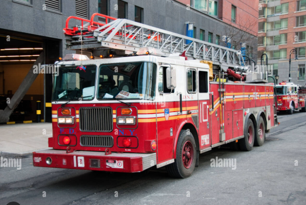
Another thing I've always wondered is, what came first: Atlanta Flames 1973 road uniform or New York City firetruck striping?
|
|
|
|
|
The Following User Says Thank You to Sidney Crosby's Hat For This Useful Post:
|
|
 Posting Rules
|
You may not post new threads
You may not post replies
You may not post attachments
You may not edit your posts
HTML code is Off
|
|
|
All times are GMT -6. The time now is 06:44 AM.
|
|


