08-17-2014, 08:46 PM
|
#541
|
|
Lifetime Suspension
|
 Design a Calgarypuck Logo!
Quote:
Originally Posted by Split98

Constructive criticism is fantastic, and everyone here had responded amazingly well to it. 'That sucks' and discouraging people from posting isn't what we should be promoting. Let's keep this a fun thread, if your here to bash someone's ideas and efforts please keep your opinions to yourself. We don't want people giving up efforts because they don't feel appreciated or fear getting bashed.
|
I would say it's pretty constructive to suggest someone try out a new idea because their latest versions of a old idea aren't living up to their first few iterations. I didn't see him ever say "That sucks" or bash your ideas, but granted, they aren't my ideas, so maybe I'm taking it differently.
Regardless, I would agree with the criticism of the Grat version. The first thing it looked like to me was a guy in a suit doing a salute.
Is there an opportunity to use a less distinct player outline in general? I think it's been said before, but having Monahan on it or any current Flames player is definitely going to date it. Just my opinion of course. Hope it isn't taken personally 
|

|

|
|
08-17-2014, 08:50 PM
|
#542
|
|
Franchise Player
Join Date: Aug 2007
Location: Ontario
|
Quote:
Originally Posted by Chill Cosby
I would say it's pretty constructive to suggest someone try out a new idea because their latest versions of a old idea aren't living up to their first few iterations. I didn't see him ever say "That sucks" or bash your ideas, but granted, they aren't my ideas, so maybe I'm taking it differently.
Regardless, I would agree with the criticism of the Grat version. The first thing it looked like to me was a guy in a suit doing a salute.
Is there an opportunity to use a less distinct player outline in general? I think it's been said before, but having Monahan on it or any current Flames player is definitely going to date it. Just my opinion of course. Hope it isn't taken personally |
Not at all! I really only posted the Grats version as it was requested.
The 'that sucks' comment was referring to something else.
As I've mentioned before, I'm not taking this personally. I'm more interested in keeping this a positive and fun thread, and I've only really drawn more attention to it. So let's just get back to cool ideas then.
Last edited by Split98; 08-17-2014 at 08:52 PM.
|
|
|
|
|
The Following User Says Thank You to Split98 For This Useful Post:
|
|
|
08-17-2014, 10:10 PM
|
#543
|
|
Lifetime Suspension
|
Quote:
Originally Posted by Split98
Were you born an unbearable pretentious jerk, or did you work towards that?
|
Quote:
Originally Posted by Split98
As I've mentioned before, I'm not taking this personally.
|
Come again? 
Sorry if you don't like to hear what I have to say. I never straight out said it sucked, or anything along those lines. I was strictly speaking towards the logo, not even at you. I think that's what you're not understanding here. But sometimes, if you're into designing things that is, you have to take responses/criticism in all their forms, even ones you may perceive as ignorant or offensive at first. But be assured, it's not meant that way. Others here seem to get what I'm saying. Your first couple iterations in the first 5 pages of this thread seemed to put out the greatest versions of the logo, it was fine. But then it kept coming up for a while, and now again with this McGrattan version, all of which versions haven't really brought anything else to it, and with the McGrattan thing perhaps took a step back. People seem to be of that view as well. I'm interested in seeing what others have to offer, and I think you've done about as much as you can do with that one. It's fine, but let's move along. Perhaps you can put the remaining time into another idea or two? I'd be interested in seeing that. Put in as many entries as you can, rather than spending your time getting upset with me. It's not worth it.
As for the positive constructive feedback thing, I agree to some extent, let's work at improving these ideas. But wouldn't you rather hear what people really think, rather than filtered comments that try not to make you feel bad? You have to keep in mind it's not a reflection on you, just the logo/idea. If people honestly think my ideas suck, then great, I want to know. It'll tell me that I need to go in another direction now, rather than continue to fiddle around with something that's not working. People are never going to cater to your feelings in the real world, so it's better to get used to it and learn to take it like a professional, or someone doing it simply for leisure would. In this case it's all fun and for a good cause anyways.
I'm actually not a jerk in real life. I'm just very opinionated and blunt about things I enjoy/am passionate about, as others here have probably picked up on. But sometimes that can put a person in dickhole territory in others' eyes when it's misunderstood over the very easily convoluted medium that is the internet.
Last edited by djsFlames; 08-17-2014 at 10:12 PM.
|
|
|
|
|
08-17-2014, 10:29 PM
|
#544
|
|
Franchise Player
Join Date: Aug 2007
Location: Ontario
|
Quote:
Originally Posted by djsFlames
Come again?
Sorry if you don't like to hear what I have to say. I never straight out said it sucked, or anything along those lines. I was strictly speaking towards the logo, not even at you. I think that's what you're not understanding here. But sometimes, if you're into designing things that is, you have to take responses/criticism in all their forms, even ones you may perceive as ignorant or offensive at first. But be assured, it's not meant that way. Others here seem to get what I'm saying. Your first couple iterations in the first 5 pages of this thread seemed to put out the greatest versions of the logo, it was fine. But then it kept coming up for a while, and now again with this McGrattan version, all of which versions haven't really brought anything else to it, and with the McGrattan thing perhaps took a step back. People seem to be of that view as well. I'm interested in seeing what others have to offer, and I think you've done about as much as you can do with that one. It's fine, but let's move along. Perhaps you can put the remaining time into another idea or two? I'd be interested in seeing that. Put in as many entries as you can, rather than spending your time getting upset with me. It's not worth it.
As for the positive constructive feedback thing, I agree to some extent, let's work at improving these ideas. But wouldn't you rather hear what people really think, rather than filtered comments that try not to make you feel bad? You have to keep in mind it's not a reflection on you, just the logo/idea. If people honestly think my ideas suck, then great, I want to know. It'll tell me that I need to go in another direction now, rather than continue to fiddle around with something that's not working. People are never going to cater to your feelings in the real world, so it's better to get used to it and learn to take it like a professional, or someone doing it simply for leisure would. In this case it's all fun and for a good cause anyways.
I'm actually not a jerk in real life. I'm just very opinionated and blunt about things I enjoy/am passionate about, as others here have probably picked up on. But sometimes that can put a person in dickhole territory in others' eyes when it's misunderstood over the very easily convoluted medium that is the internet. |
Apologies for the poor wording, but as I mentioned above the 'that sucks' was in reference to another post.
And the Grats was something I did last week. I've been busy all week so just got around to posting that now in response to a few people requesting I do so. An action I obviously now regret. But most of the fiddling around came from requests or another idea to further a design I enjoyed. That is the point of design iterations, and I would hate to be discouraging that.
Honestly, my intentions with addressing these posts were to keep this thread fun and creative. The two specific posts I quoted I found to be counter to that whole idea. I'm seeing now that a PM would have been far more productive.
And honestly, I don't know how many times I can repeat over and over that I appreciate and can more than handle criticism. The many iterations of the same logo should really stand as evidence of that. I'm just commenting that a few of the points made were more negative than they needed to be. I've never said that we should be posting happy thoughts, I'm pointing out that there are far better and respectful ways to make your request.
Carry on, I was hoping to do the opposite of derail the thread. Just let's all be more mindful from here on out. Cool?
Last edited by Split98; 08-17-2014 at 10:31 PM.
|
|
|
|
|
The Following 3 Users Say Thank You to Split98 For This Useful Post:
|
|
|
08-17-2014, 11:16 PM
|
#545
|
|
Powerplay Quarterback
Join Date: Dec 2006
Location: Canada
|
__________________

Last edited by FireItUp; 08-17-2014 at 11:48 PM.
|
|
|
|
|
The Following 6 Users Say Thank You to FireItUp For This Useful Post:
|
|
|
08-17-2014, 11:55 PM
|
#546
|
|
First Line Centre
Join Date: Sep 2008
Location: Rocky Mt House
|
Quote:
Originally Posted by TjRhythmic
Didn't Bingo himself say that he is giving people till the end of August for people to get their ideas in and submitted?
|
From a few pages back
Quote:
Originally Posted by Bingo
I've been watching this thing daily ... just amazing. Was thinking I'd let it run its course until the end of August, then create a new topic with a numbered list of the logos and a vote above.
But if everyone feels all the entries are in we can start it early.
|
I'm fine with end of August too, just if people are getting testy with one another maybe time to move it along.
|

|
|
|
The Following User Says Thank You to Yrebmi For This Useful Post:
|
|
|
08-18-2014, 12:04 AM
|
#547
|
|
Franchise Player
Join Date: Mar 2002
Location: Auckland, NZ
|
If there's one thing I've learned from being in a marketing role for so long, it's that your ideas won't impress everybody. Just do the best that you personally can, and be passionate about your work, and don't let criticism get to your head. It can actually be healthy, because you can gain a perspective from others viewpoints. It's helped me quite a bit in my career, actually.
I've refined my design style to 'minimalist contemporary' (including my logo for this contest), and that's how I have defined my work to date. I like it, and I hope that my work resonates with others. I don't, however, expect my work to be admired by everybody. And I'm completely, comfortably okay with that.
|
|
|
|
|
The Following User Says Thank You to Muta For This Useful Post:
|
|
|
08-18-2014, 09:35 AM
|
#548
|
|
Franchise Player
Join Date: Aug 2007
Location: Ontario
|
Quote:
Originally Posted by FireItUp
|
Delicious.
|
|
|
|
|
The Following User Says Thank You to Split98 For This Useful Post:
|
|
|
08-18-2014, 04:42 PM
|
#549
|
|
Franchise Player
Join Date: Aug 2007
Location: Ontario
|
Back on track:

|
|
|
|
|
The Following 5 Users Say Thank You to Split98 For This Useful Post:
|
|
|
08-18-2014, 04:45 PM
|
#550
|
|
Ass Handler
Join Date: Feb 2011
Location: Okotoks, AB
|
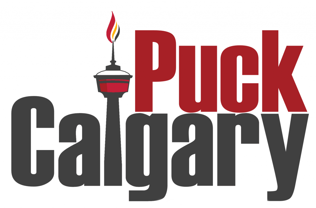
Quote:
Originally Posted by Split98
Back on track:
|
This is excellent work. The white background over Calgary though... it should be transparent so it works on a different colour background, no?
Here's how it looks in the quote as I'm typing this.

I'd also create a little separation for the Y between the two arches.
|
|
|
|
|
08-18-2014, 04:52 PM
|
#551
|
|
Franchise Player
Join Date: Aug 2007
Location: Ontario
|
|
|
|
|
|
The Following 2 Users Say Thank You to Split98 For This Useful Post:
|
|
|
08-18-2014, 04:52 PM
|
#552
|
 Posted the 6 millionth post! |
^^^ Good work, but I think the skyline on the letters jumbles it up a bit too much.
What I would do is detach the skyline from the letters, put the skyline in the background (in the white space) and gradient the buildings up from the grey bottom (or something like it). That way, the letters stay clear, you have the skyline, and you have a nice layered/textured look that adds depth.
|
|
|
|
|
08-18-2014, 04:53 PM
|
#553
|
|
Franchise Player
Join Date: Aug 2007
Location: Ontario
|
Quote:
Originally Posted by StrykerSteve
This is excellent work. The white background over Calgary though... it should be transparent so it works on a different colour background, no?
Here's how it looks in the quote as I'm typing this.
I'd also create a little separation for the Y between the two arches. |
Haha, you caught me before I uploaded a fixed version.
I was hoping someone would bring up the 'Y'. I blocked it out on purpose, but was undecided on how it looked. Seems way too dominant.
|
|
|
|
|
The Following User Says Thank You to Split98 For This Useful Post:
|
|
|
08-18-2014, 04:54 PM
|
#554
|
|
Franchise Player
Join Date: Aug 2007
Location: Ontario
|
Quote:
Originally Posted by Ozy_Flame
^^^ Good work, but I think the skyline on the letters jumbles it up a bit too much.
What I would do is detach the skyline from the letters, put the skyline in the background (in the white space) and gradient the buildings up from the grey bottom (or something like it). That way, the letters stay clear, you have the skyline, and you have a nice layered/textured look that adds depth.
|
That's a really good idea, thanks!
Edit:

Last edited by Split98; 08-18-2014 at 05:51 PM.
|
|
|
|
|
The Following 7 Users Say Thank You to Split98 For This Useful Post:
|
|
|
08-18-2014, 04:56 PM
|
#555
|
|
Franchise Player
Join Date: Jul 2009
Location: Red Deer
|
Player outline. 2/10.
Would not bang.
__________________
"It's a great day for hockey."
-'Badger' Bob Johnson (1931-1991)
"I see as much misery out of them moving to justify theirselves as them that set out to do harm."
-Dr. Amos "Doc" Cochran
|
|
|
|
|
The Following User Says Thank You to Yamer For This Useful Post:
|
|
|
08-18-2014, 06:00 PM
|
#556
|
|
Franchise Player
Join Date: Aug 2007
Location: Ontario
|
Quote:
Originally Posted by StrykerSteve
I'd also create a little separation for the Y between the two arches.
|
Fixed:

|
|
|
|
|
The Following 2 Users Say Thank You to Split98 For This Useful Post:
|
|
|
08-18-2014, 06:06 PM
|
#557
|
|
Franchise Player
Join Date: Aug 2007
Location: Ontario
|
Quote:
Originally Posted by StrykerSteve
I'd also create a little separation for the Y between the two arches.
|
And going completely the opposite direction and balancing out the weight:

|
|
|
|
|
08-18-2014, 07:08 PM
|
#558
|
|
Franchise Player
Join Date: Aug 2007
Location: Ontario
|
I'll have to fiddle with the perspective a bit more (the 'C' in Calgary is way off) but just going to throw this up before I get back to work:

|
|
|
|
|
The Following 4 Users Say Thank You to Split98 For This Useful Post:
|
|
|
08-18-2014, 07:39 PM
|
#560
|
|
Franchise Player
Join Date: Aug 2007
Location: Ontario
|
Quote:
Originally Posted by GoJetsGo
^ cool. Since it's already part way there it would be cool if that bottom piece looked a bit more like the Saddledome roof and broke off into flames at the end.  |
Hm, not sure if I'm following you there. Which bottom piece are you looking at? The flames or the bottom of 'Calgarypuck'?
|
|
|
|
 Posting Rules
|
You may not post new threads
You may not post replies
You may not post attachments
You may not edit your posts
HTML code is Off
|
|
|
All times are GMT -6. The time now is 02:00 AM.
|
|