 02-14-2013, 06:33 PM
|
#521
|
|
Franchise Player
Join Date: Aug 2007
Location: Vancouver
|
I like the cuff patch idea. But god, they gotta wear the vintages full time. There is just no other way.
__________________

|

|

|
|
The Following 2 Users Say Thank You to Coach For This Useful Post:
|
|
|
02-14-2013, 07:03 PM
|
#522
|
|
Franchise Player
|
Credit to the creator of that logo thingy, but it looks like a flaming violin or a tramp stamp or a flaming violin tramp stamp.
Why do we need a shoulder patch at all?
|
|
|
|
|
02-14-2013, 07:53 PM
|
#523
|
|
Franchise Player
Join Date: Jun 2006
Location: Calgary, Alberta
|
I don't think it looks good as shoulder patch. Works best as logo above name.
|
|
|
|
|
02-14-2013, 09:09 PM
|
#524
|
|
Draft Pick
|
I think their current jerseys are great and I LOVE the shoulder patches and I am not from Alberta so not biased by territory.
|
|
|
|
|
02-15-2013, 09:16 PM
|
#525
|
|
Draft Pick
Join Date: Jan 2013
Location: Dead Rear
|
Somebody call Don Draper. End this .
|
|
|
|
|
The Following 2 Users Say Thank You to LiquorPig For This Useful Post:
|
|
|
02-16-2013, 12:13 PM
|
#526
|
|
Scoring Winger
Join Date: Jul 2011
Location: at home
|
ok here's the updated version of my concept with improved lettering and some minor changes
I'm working on my own shoulder patch so stay tuned.


|
|
|
|
|
02-16-2013, 01:32 PM
|
#527
|
|
Franchise Player
Join Date: Dec 2005
Location: back in the 403
|
Quote:
Originally Posted by MattyC

I like the cuff patch idea. But god, they gotta wear the vintages full time. There is just no other way.
|
Ya, its to the point now where whenever they wear their normal, black C unis at home, that it just looks drab after a game in the retros. They're so dark its sometimes hard to even differentiate the black from the red from far away, I love how flashy the retros are in comparison.
|
|
|
|
|
02-16-2013, 07:40 PM
|
#528
|
|
Franchise Player
Join Date: Mar 2004
Location: Chilliwack, B.C
|
Black is lame, really miss the retro whites, love to see the team go back to the old school uniform full time.
|
|
|
|
|
The Following User Says Thank You to calgaryred For This Useful Post:
|
|
|
02-18-2013, 12:33 AM
|
#529
|
|
First Line Centre
|
I was trying to think of a way to honour both generations of iconic Flames jerseys, and this is my shot. What do you guys think?

__________________

Last edited by Cole436; 02-18-2013 at 01:22 AM.
|
|
|
|
|
The Following 2 Users Say Thank You to Cole436 For This Useful Post:
|
|
|
02-18-2013, 12:45 AM
|
#530
|
|
Lifetime Suspension
Join Date: Sep 2007
Location: blow me
|
^ I like!
Anything that has a BLACK "C" and letter is awesome, in my books.
|
|
|
|
|
02-18-2013, 01:09 AM
|
#531
|
|
Franchise Player
Join Date: Dec 2003
Location: Sector 7-G
|
Only problem is Black Letters will never work on any home jersey, Its way to hard for anyone to read.
|
|
|
|
|
02-18-2013, 01:22 AM
|
#532
|
|
First Line Centre
|
Quote:
Originally Posted by Otto-matic
Only problem is Black Letters will never work on any home jersey, Its way to hard for anyone to read.
|
fixed
__________________
|
|
|
|
|
02-18-2013, 02:46 AM
|
#533
|
|
Lifetime Suspension
Join Date: Sep 2007
Location: blow me
|
I just realized that black lettering would be hard to read.
But keep the black numbers and "C." Looks sharp!
|
|
|
|
|
02-18-2013, 10:59 AM
|
#534
|
|
Franchise Player
Join Date: Sep 2011
Location: The toilet of Alberta : Edmonton
|
Is not bring able to read the names all that important? 99% of hockey fans can identify players by their numbers anyway.
__________________
"Illusions Michael, tricks are something a wh*re does for money ....... or cocaine"
|
|
|
|
|
02-18-2013, 11:08 AM
|
#535
|
|
Franchise Player
Join Date: Dec 2003
Location: Sector 7-G
|
Quote:
Originally Posted by MisterJoji
Is not bring able to read the names all that important? 99% of hockey fans can identify players by their numbers anyway.
|
Ideally yes, but if I recall correctly the Flames had a backlash from the media and fans when they ran black lettering on the 04 Homes when they first came out.
|
|
|
|
|
The Following User Says Thank You to Otto-matic For This Useful Post:
|
|
|
02-18-2013, 11:46 AM
|
#536
|
|
Franchise Player
Join Date: Mar 2002
Location: Calgary
|

Quote:
Originally Posted by Otto-matic
Ideally yes, but if I recall correctly the Flames had a backlash from the media and fans when they ran black lettering on the 04 Homes when they first came out.
|
From the ones that said the music is too loud and there's a draft in the Saddledome. The numbers being 5x the size of the lettering should be all that was needed to identify players from afar.
Full respect to anyone I see at the 'Dome that has those, as most of those are preorders, sight unseen from summer 2003. The team wearing those on the ice lasted between 10-12 home games in 2003 (they wore them Nov 22 2003 as per the picture below, but by Dec 1 2003, they were white letters), although for the next few months after you could still get the Flames to put on black letters instead of white at the Fan Attic
Regardless, the jersey, for continuity sake, was originally designed with black letters as that went with the black shoulder and back numbers and went with the black C, same outlining and everything. But the black numbers and C stayed, and that's always sort of bugged me, at least the numbers staying black. (as much as something like that can). Though the Flames had a chance to redo that with the Edge style jerseys, though they just kept using the stockpile they had of the same number and name font from the 2004 jerseys.
That's why if and when the Flames do do a new jersey, the name and number font are changed (they first appeared 15 years ago) and the coloring issue is standardized.

Last edited by browna; 02-18-2013 at 11:49 AM.
|

|
|
|
The Following User Says Thank You to browna For This Useful Post:
|
|
|
02-18-2013, 01:04 PM
|
#537
|
|
First Line Centre
Join Date: Oct 2011
Location: The Armpit of BC: Trail
|
I love the remodel of the tower. That was way better than my original. The idea to use it on the cuff or above the name on the back was gold. Pure and simple. I agree it doesn't quite work as a shoulder patch, but hey, we tried, and some pretty great ideas were rolled out.
I think, maybe, for a cuff logo it's a little too complex. The Jackets have a star. Nice and simple. Sadly I think RBK wouldn't let us replace their logo with the tower.
__________________
Disregard any and all THANKS I give. I'm a dirty, dirty thanks-whore.
|
|
|
|
|
The Following 2 Users Say Thank You to Cheerio For This Useful Post:
|
|
|
02-18-2013, 06:23 PM
|
#539
|
|
Franchise Player
Join Date: Dec 2003
Location: Sector 7-G
|

Something I quickly whipped up, it looks horrible right now - not sure what to do with the sleeves.
|
|
|
|
|
02-18-2013, 11:25 PM
|
#540
|
|
Franchise Player
Join Date: Aug 2007
Location: Ontario
|
Quote:
Originally Posted by Cheerio
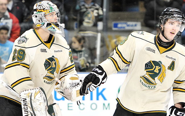
The Oilers don't do much right but they absolutely made the right call in going back to the retro unis full time and I'd like the Flames to follow suit. The retros look much better than the regular homes and I think a retro away would look really good. If teams still wore white at home, I would suggest a London Knights style off white jersey like these
 |
Frikken' LOVE our off whites!
|
|
|
|
 Posting Rules
|
You may not post new threads
You may not post replies
You may not post attachments
You may not edit your posts
HTML code is Off
|
|
|
All times are GMT -6. The time now is 08:28 PM.
|
|


