 02-13-2013, 06:05 PM
|
#501
|
|
Franchise Player
|
Quote:
Originally Posted by Split98

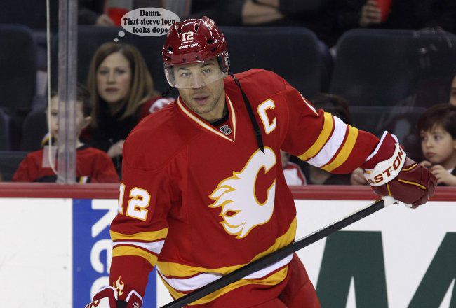
Agreed. And I kinda made it quick aside, but the more I think about it... the more I love the idea of this (or something similar) on the sleeve and clean shoulders:
Subtle touch without taking away from the overall cleanliness of the throwback jerseys I'd love to see return full-time.
Edit:
Not sure about you guys... but I dig the hell out of it:
 |
what about above the name on the back of the jersey if rebok is willing to give up their logo space. I think it could work there too
|

|

|
|
02-13-2013, 07:08 PM
|
#502
|
|
Crash and Bang Winger
Join Date: Mar 2008
Location: polymer records
|
This or nothing!

|
|
|
|
|
The Following 3 Users Say Thank You to Artie Fufkin For This Useful Post:
|
|
|
02-14-2013, 02:57 AM
|
#503
|
|
Franchise Player
Join Date: Aug 2007
Location: Ontario
|
Quote:
Originally Posted by Alberta_Beef
what about above the name on the back of the jersey if rebok is willing to give up their logo space. I think it could work there too
|
I'd love it there. But I'll bet that's a mandatory logo space.
|
|
|
|
|
02-14-2013, 03:12 AM
|
#504
|
|
Franchise Player
|
Quote:
Originally Posted by Split98
I'd love it there. But I'll bet that's a mandatory logo space.
|
perhaps, but with the jersey contract coming up in the next couple years you just never know
|
|
|
|
|
02-14-2013, 03:39 AM
|
#505
|
|
Franchise Player
Join Date: Aug 2007
Location: Ontario
|
Quote:
Originally Posted by Alberta_Beef
perhaps, but with the jersey contract coming up in the next couple years you just never know
|
True, and I'd love it there. But for as long as I can remember (CCM, Koho, Reebok, etc) the jersey brand has always been there.
|
|
|
|
|
02-14-2013, 03:49 AM
|
#506
|
|
Franchise Player
|
Quote:
Originally Posted by Split98
True, and I'd love it there. But for as long as I can remember (CCM, Koho, Reebok, etc) the jersey brand has always been there.
|
I don't remember CCM being there. but Koho and obviously reebok for sure. I'm sure (if allowed by the league) that if the team was willing to place the jersey makers logo somewhere else (maybe between the name and numbers, or on the front like the nike swoosh on some international jerseys) that the manufacturer would be fine with it
|
|
|
|
|
02-14-2013, 04:06 AM
|
#507
|
|
Franchise Player
Join Date: Aug 2007
Location: Ontario
|
Quote:
Originally Posted by Alberta_Beef
I don't remember CCM being there. but Koho and obviously reebok for sure. I'm sure (if allowed by the league) that if the team was willing to place the jersey makers logo somewhere else (maybe between the name and numbers, or on the front like the nike swoosh on some international jerseys) that the manufacturer would be fine with it
|
Ahhh, you're right about CCM:

Wish it'd go back there and I wouldn't mind doing something above the nameplate:
Edit:
I definitely dig!

Last edited by Split98; 02-14-2013 at 04:14 AM.
|
|
|
|
|
The Following 3 Users Say Thank You to Split98 For This Useful Post:
|
|
|
02-14-2013, 01:40 PM
|
#508
|
|
Franchise Player
|

Quote:
Originally Posted by Alberta_Beef
I don't remember CCM being there. but Koho and obviously reebok for sure. I'm sure (if allowed by the league) that if the team was willing to place the jersey makers logo somewhere else (maybe between the name and numbers, or on the front like the nike swoosh on some international jerseys) that the manufacturer would be fine with it
|
Before Reebok took over, CCM and Koho made away and home jerseys. Koho did home (darks) and CCM did away (whites), both having the logo under the neck line in the back. An embroidered NHL logo would go on the hem.
Reebok, of course owns CCM. Before that, CCM bought out Karhu, which owned Koho, Canadien, and Titan/Jofa. This is why it was 'easy' for Reebok to get into the hockey equipment marker.
Before the neck logo placement, logos were placed in the lower right hem (right butt cheek). This included CCM, Nike, Starter, Pro Player, etc., with NHL logo. Gretzky had special jerseys made with logos on both sides of the hem to allow for this tuck...making sure logo would show.
When Reebok (RBK) introduced the EDGE jerseys, the NHL logo was moved to the apex of the collar trim on the front
__________________
AS SEEN ON TV
|
|
|
|
|
The Following User Says Thank You to awildermode For This Useful Post:
|
|
|
02-14-2013, 01:50 PM
|
#509
|
|
#1 Goaltender
|
I'm loving these mock ups with the secondary logo! I really want to see this happen!
|
|
|
|
|
02-14-2013, 01:53 PM
|
#510
|
|
Franchise Player
Join Date: Mar 2002
Location: Calgary
|
Quote:
Originally Posted by Split98
Agreed. And I kinda made it quick aside, but the more I think about it... the more I love the idea of this (or something similar) on the sleeve and clean shoulders:
Subtle touch without taking away from the overall cleanliness of the throwback jerseys I'd love to see return full-time.
Edit:
Not sure about you guys... but I dig the hell out of it:
|
Have to be careful though...something subtle on the bottom of the sleeve could qucikly and easily turn into what Daymond Langkow had here in the late 90's (ignore the waves (can't see them I guess, they are on the back) and rain lines, if you can)

|
|
|
|
|
02-14-2013, 02:01 PM
|
#511
|
|
Powerplay Quarterback
|
Quote:
Originally Posted by Split98
Ahhh, you're right about CCM:
Edit:
I definitely dig!
|
Not bad, but how would something like that look as a shoulder patch?
|
|
|
|
|
02-14-2013, 02:46 PM
|
#512
|
|
Draft Pick
|
Quote:
Originally Posted by t0rrent98
Not bad, but how would something like that look as a shoulder patch?
|
I think it looks all right.

|
|
|
|
|
02-14-2013, 02:53 PM
|
#513
|
|
Franchise Player
Join Date: Sep 2011
Location: The toilet of Alberta : Edmonton
|
Quote:
Originally Posted by Fire_Dash
I think it looks all right.
|
Looks fantastic. I'd love to see what it looks like on our regular home and aways. Anything is better than those stupid flags.
__________________
"Illusions Michael, tricks are something a wh*re does for money ....... or cocaine"
|
|
|
|
|
02-14-2013, 02:54 PM
|
#514
|
|
Franchise Player
Join Date: Feb 2007
Location: Calgary, AB
|
Like it best above the name plate, really don't like it as a shoulder patch.
Needs to be something small and subtle on the retro jersey.
|
|
|
|
|
The Following 2 Users Say Thank You to SuperMatt18 For This Useful Post:
|
|
|
02-14-2013, 03:02 PM
|
#515
|
|
Franchise Player
Join Date: Aug 2007
Location: Ontario
|
Quote:
Originally Posted by browna
Have to be careful though...something subtle on the bottom of the sleeve could qucikly and easily turn into what Daymond Langkow had here in the late 90's (ignore the waves (can't see them I guess, they are on the back) and rain lines, if you can)
|
LOL!
That... is awesome.
|
|
|
|
|
02-14-2013, 03:34 PM
|
#516
|
|
Lifetime Suspension
Join Date: Oct 2012
Location: Halifax
|
Like it best as a patch above the name plate. It doesn't really fit as a shoulder patch, the sleeve one is okay but it looks a little funny too. But that might just be because you never see sleeve patches on NHL jerseys.
|
|
|
|
|
02-14-2013, 03:35 PM
|
#517
|
|
Draft Pick
|
Quote:
Originally Posted by MisterJoji
Looks fantastic. I'd love to see what it looks like on our regular home and aways. Anything is better than those stupid flags.
|
Here you go much better then the Flags IMO.

|
|
|
|
|
The Following 2 Users Say Thank You to Fire_Dash For This Useful Post:
|
|
|
02-14-2013, 04:04 PM
|
#519
|
|
Lifetime Suspension
Join Date: Oct 2012
Location: Halifax
|
Quote:
Originally Posted by Fire_Dash
Here you go much better then the Flags IMO.
|
They look much better on the Retros IMO.
|
|
|
|
|
02-14-2013, 05:30 PM
|
#520
|
|
Franchise Player
Join Date: Mar 2004
Location: Chilliwack, B.C
|
Im tired of shoulder patches way over done
|
|
|
|
 Posting Rules
|
You may not post new threads
You may not post replies
You may not post attachments
You may not edit your posts
HTML code is Off
|
|
|
All times are GMT -6. The time now is 06:30 AM.
|
|


