|
View Poll Results: The new 3rds:
|
|
Yay!
|
   
|
166 |
75.80% |
|
Nay!
|
  
|
5 |
2.28% |
|
Meh
|
  
|
48 |
21.92% |
 09-22-2018, 05:04 PM
|
#481
|
|
Franchise Player
Join Date: Mar 2002
Location: Calgary
|

Quote:
Originally Posted by Bingo

They look great ...
But I just don't get why they'd make a big deal about honoring the 89 jersey but not go the whole way and have the stripes right at the bottom.
Odd
|
I think because the stripes are now stiched. Prior on the 80s, the stripes were just a different color of jersey material. To have now the stiched stripe hem also be at the very bottom hem of the jersey probably had durability issues for those hems together.
Reduced collar striping looks good.
I'd assume pants (shell) and socks will have the same striping as always.
They are expected, but great. I have a pro authentic Joe Mullen that I got in 1994 when they were blowing out jerseys right aftet the pedestals came out and from that point, until the 2001 season and the death of those pedestal and the whites in the same template as the 2003 reds came out, was a dark time for uniforms for the franchise.
I think a white retro in the same format would been bolder. I don't believe they can wear third jerseys in the playoffs anyways, so the C of Red gets full effect in the playoffs. And the C of Red, courtesy of Don Whittman in 86 with the first official coining of the phrase, had the Flames wearing something other than red at home through until Fall 2003 anyways.
|

|

|
|
The Following User Says Thank You to browna For This Useful Post:
|
|
|
09-22-2018, 05:12 PM
|
#482
|
|
All I can get
|
Quote:
Originally Posted by RM14
Here are the various eras side by side:
80s CCM, 30th anniversary CCM, Reebok Edge, Addidas current
|
Early-mid 80s Sandow Knit (SK). The big difference between these and the CCMs that followed was the fabric used, Durene which is a cotton blend. Subsequent jerseys are polyester-based.

__________________
Edmonton is No Good.
Last edited by Reggie Dunlop; 09-22-2018 at 05:17 PM.
|

|
|
|
The Following User Says Thank You to Reggie Dunlop For This Useful Post:
|
|
|
09-22-2018, 06:14 PM
|
#483
|
|
Not a casual user
Join Date: Mar 2006
Location: A simple man leading a complicated life....
|
I voted meh because I was hoping to see some tweaking with the retros. Maybe smaller stripes at the bottom, shoulder patches and such. It's not that I don't like them, I just wanted something minor that would wow me. They're much like the other retros.
__________________

|
|
|
|
|
The Following 3 Users Say Thank You to Dion For This Useful Post:
|
|
|
09-22-2018, 06:24 PM
|
#484
|
|
Lifetime Suspension
|
I like that the C and yellows pop a bit more on this one though there's nothing earth shattering in terms of design progression that warranted all the mystery. Don't know how it's an homage to the originals with the C still enlarged and there being red along the bottom of the jersey still but hey.
It looks good though with all the buildup they could've taken a couple more creative chances like a retro scheme shoulder patch or the collar idea like the poster above.
|
|
|
|
|
09-22-2018, 07:07 PM
|
#485
|
|
Could Care Less
|
I wish I hadnt bought an adidas jersey last season. The vertical stripes are horrendously large. Should have waited for this year. These are beautiful
|
|
|
|
|
09-22-2018, 07:26 PM
|
#486
|
|
Crash and Bang Winger
Join Date: May 2009
Location: Calgary
|
 This year's retros are fine - but can't we add a little something?
These retros are fine - a bit meh however. They'd look pretty great with the new shoulder patch in retro colors added... Like this:


__________________
The Doctor is in
Last edited by Dr. Pepper; 09-22-2018 at 07:29 PM.
|
|
|
|
|
The Following 8 Users Say Thank You to Dr. Pepper For This Useful Post:
|
|
|
09-22-2018, 08:16 PM
|
#487
|
|
Franchise Player
Join Date: Oct 2006
Location: Calgary
|
To me, the new 3rd is a 3/10. The Flames have always had terrible jerseys except the 04 era reds. That was a good jersey. Everything else is just okay and passable. The retro is okay.
__________________
Fireside Chat - The #1 Flames Fan Podcast - FiresideChat.ca
|
|
|
|
|
The Following 2 Users Say Thank You to Caged Great For This Useful Post:
|
|
|
09-22-2018, 10:00 PM
|
#488
|
|
Franchise Player
Join Date: Nov 2009
Location: Kelowna, BC
|
Quote:
Originally Posted by Dr. Pepper
These retros are fine - a bit meh however. They'd look pretty great with the new shoulder patch in retro colors added... Like this:
|
this is still my #1 go to of all my creations 
i like the new retro but the collar - uggghh. i just don't like the adidas collar (not just the flames, but all the adidas collars)
__________________
"...and there goes Finger up the middle on Luongo!" - Jim Hughson, Av's vs. 'Nucks
|
|
|
|
|
The Following 2 Users Say Thank You to bc-chris For This Useful Post:
|
|
|
09-22-2018, 10:12 PM
|
#489
|
|
First Line Centre
|
Quote:
Originally Posted by bc-chris
this is still my #1 go to of all my creations |
I feel for a 3rd, it should be opposite. The round logo as the crest and flaming C's on the shoulders. Same colours, no black.
|
|
|
|
|
09-22-2018, 10:16 PM
|
#490
|
|
First Line Centre
Join Date: Oct 2009
Location: Calgary
|
Nah... the original Jersey needs no tweaks. It's amazing.
|
|
|
|
|
The Following User Says Thank You to RM14 For This Useful Post:
|
|
|
09-22-2018, 10:32 PM
|
#491
|
|
Powerplay Quarterback
Join Date: Nov 2014
Location: Calgary, AB
|
Just picked up a Monahan Retro at the fanattic and I have a couple of notes:
On the collar, I feel they could have used white threading to stitch the yellow portion of the collar. This would have used a modern adidas collar template, with more of a shout out to the original.
To me, it is the perfect mixture of old and new. I like the adizero template, and with these retros, it just works. These jerseys should be worn full time, without a doubt.
They do not have the same "speed hole" template as say; Pittsburgh or Boston where there is a rounded segment off the shoulder. They are the normal template that we have on our regular set.
The white portion of the "C" Crest has an embroidered outer edge. I am assuming they did this to make the Crest "pop" out more, in a way. This, in direct contrast with the gold outer layer.
The fight strap is a nice touch. The jersey, while still a replica, still does a good job making you feel as though it is the real deal.
Personally, I love the collar. The shiny logo, and the way the two gold borders meet it in the middle looks awesome.
|
|
|
|
|
09-22-2018, 11:17 PM
|
#492
|
|
Some kinda newsbreaker!
Join Date: May 2004
Location: Learning Phaneufs skating style
|
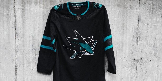
I think the Sharks absolutely nailed their 3rds.
|
|
|
|
|
The Following 10 Users Say Thank You to sureLoss For This Useful Post:
|
|
|
09-22-2018, 11:19 PM
|
#493
|
|
Powerplay Quarterback
Join Date: Nov 2014
Location: Calgary, AB
|
Quote:
Originally Posted by sureLoss
I think the Sharks absolutely nailed their 3rds.
|
I agree. They look amazing. Teal and black just work together.
|
|
|
|
|
09-22-2018, 11:49 PM
|
#494
|
|
Could Care Less
|
Quote:
Originally Posted by sureLoss
I think the Sharks absolutely nailed their 3rds.
|
Might be the best jersey in the league.
|
|
|
|
|
09-23-2018, 12:01 AM
|
#495
|
|
damn onions
|
Whats with the weird cobblestone street or grey wood paneling behind all these 3rd jersey debuts?
So strange.
|
|
|
|
|
09-23-2018, 08:36 AM
|
#496
|
|
Powerplay Quarterback
|
Quote:
Originally Posted by heep223
Might be the best jersey in the league.
|
Not a chance
__________________
Quote:
Originally Posted by HotHotHeat
THIS is why people make fun of Edmonton. When will this stupid city figure it out? They continue to kick their own ass every day, it's impossible not to make fun of them.
|
|
|
|
|
|
The Following 5 Users Say Thank You to Sutter_in_law For This Useful Post:
|
|
|
The Following 2 Users Say Thank You to Howie_16 For This Useful Post:
|
|
|
09-23-2018, 11:38 AM
|
#498
|
|
First Line Centre
Join Date: Jan 2011
Location: Fort St. John, BC
|
When on the FanAttic website, how do I determine what size of jersey I need? Are the numbers chest size? Waist size? It was much easier when the size was on the ugly grey tag on the front
|
|
|
|
|
09-23-2018, 11:41 AM
|
#499
|
|
Taking a while to get to 5000
|
An Adidas 52 is basically a Reebok large. If that helps any.
|
|
|
|
|
09-23-2018, 12:02 PM
|
#500
|
|
First Line Centre
Join Date: Jan 2011
Location: Fort St. John, BC
|
Quote:
Originally Posted by Toonage
An Adidas 52 is basically a Reebok large. If that helps any.
|
That's the exact answer I was looking for, thanks
|
|
|
|
 Posting Rules
|
You may not post new threads
You may not post replies
You may not post attachments
You may not edit your posts
HTML code is Off
|
|
|
All times are GMT -6. The time now is 07:59 PM.
|
|


