 11-12-2020, 03:29 PM
|
#21
|
|
Franchise Player
Join Date: Dec 2011
Location: Calgary
|
I just bought one of those yellow Sabres jerseys over quarantine. $50 for a Reebok Authentic with a tie down. It’s so bad I had to have it.
|

|

|
|
The Following User Says Thank You to N-E-B For This Useful Post:
|
|
|
11-12-2020, 03:32 PM
|
#22
|
|
Franchise Player
Join Date: Nov 2008
Location: the dark side of Sesame Street
|
Of the many questions raised by those Sabres thirds, I've always wondered why there appear to be two shades of yellow in the front?
__________________
"If Javex is your muse
then dive in buddy"
- Surferguy
|
|
|
|
|
11-12-2020, 03:34 PM
|
#23
|
|
First round-bust
Join Date: Feb 2015
Location: speculating about AHL players
|

Calgary Flames
Best:
 Worn 2003 to 2007
It's a damn shame that these were only worn for three seasons. These are so nice on every level. The striping is great, both of the logos are awesome (even the black "C"!) and I love the angled font on the back. There's not a lot else that I can say.
Worst:
 Worn 2007 to 2017
...and then these stuck around for a decade. What a mess. The tank-top piping is here, too, while the waist striping has been removed in favour of, well, basically nothing. And then there are the flags, which were introduced with good intentions but look extremely out-of-place in execution (particularly the blue flag of Alberta).
Weirdest:
 Worn 1994 to 2000
Look, I love these. They're great. They're also ridiculous. I have no idea what compelled the Flames to rid themselves of their iconic retro jerseys in favour of this outrageous design, but... they did.
There's a lot to unpack, here. The pedestal is a bizarre design element that hasn't aged particularly well. I think that, without it, the waist striping would actually look pretty good. The white "C" with the black outline doesn't look very good against the red (a sentiment that the current Flames marketing and design team agrees with). The angled font on the back is strange and ended up infiltrating countless bad Reebok Edge NHL.com customizations for years to come.
__________________
Need a great deal on a new or pre-owned car? Come see me at Platinum Mitsubishi 2720 Barlow Trail NE
|

|
|
|
11-12-2020, 03:34 PM
|
#24
|
|
Franchise Player
|
I just feel like this needs to be posted
|
|
|
|
|
11-12-2020, 03:37 PM
|
#25
|
|
First round-bust
Join Date: Feb 2015
Location: speculating about AHL players
|
Yeah I couldn't find room for that one, unfortunately. But it's really great.
__________________
Need a great deal on a new or pre-owned car? Come see me at Platinum Mitsubishi 2720 Barlow Trail NE
|
|
|
|
|
11-12-2020, 03:43 PM
|
#26
|
|
Franchise Player
Join Date: Dec 2011
Location: Calgary
|
I love the 04’s but there’s no way the Flames best jersey isn’t the red one from the 80’s.
|
|
|
|
|
The Following 23 Users Say Thank You to N-E-B For This Useful Post:
|
calgaryred,
dino7c,
djsFlames,
Flashpoint,
Funkhouser,
GreenHardHat,
Hoop27,
Huntingwhale,
Jacks,
JohnnyB,
kkaleR,
Madrox,
Mightyfire89,
mikephoen,
Number 39,
Poe969,
ShotDownInFlames12,
socalwingfan,
SportsJunky,
The Familia,
WilliPlett,
Zarley,
zukes
|
|
11-12-2020, 03:44 PM
|
#27
|
|
Franchise Player
Join Date: Feb 2006
Location: Calgary, AB
|
Quote:
Originally Posted by CroFlames

I just feel like this needs to be posted
|
It's bad but it's not as bad as the yellow one and it's weird but it's not as weird as the Buffaslug.
__________________
Turn up the good, turn down the suck!
|
|
|
|
|
The Following User Says Thank You to getbak For This Useful Post:
|
|
|
11-12-2020, 03:47 PM
|
#28
|
|
Franchise Player
Join Date: Feb 2006
Location: Calgary, AB
|
Flames: - Best - Retros
- Worst - Cowboy shoulders/wordmark
- Weird - Heritage Classic
__________________
Turn up the good, turn down the suck!
|
|
|
|
|
The Following 21 Users Say Thank You to getbak For This Useful Post:
|
3thirty,
Bourque's Twin,
Brad Marsh,
Braden,
btimbit,
calgaryred,
dino7c,
etc,
FireGilbert,
ForeverFlameFan,
Funkhouser,
Icon,
Jacks,
Joborule,
mikephoen,
Pepper2489,
Redliner,
Robbob,
ShotDownInFlames12,
SportsJunky,
The Familia
|
|
11-12-2020, 03:57 PM
|
#29
|
|
First round-bust
Join Date: Feb 2015
Location: speculating about AHL players
|
Carolina Hurricanes
Best:
 Worn 1997 to 2007
These are clean, simple, and beautiful. I love the shade of red that the Hurricanes chose to use when they relocated. I like the white uniform they debuted with more than the red one because it allows the shoulder patch to stand out more. I also enjoy the italic numerical font the Canes chose and I didn't like when they abandoned it.
Worst:
 Worn 2013 to 2017
I actually liked these when they came out. I'm not sure why; they're almost entirely devoid of personality. Change the logo to a maple leaf and you'd have a perfectly serviceable Team Canada uniform. But "Hurricanes" is way too descriptive a name to be paired with such a boring jersey.
Weirdest:
 Worn 2019 to present
I don't hate these at all, but they're just a little strange. These are the "Tom Dundon jersey" — he reportedly despised the Canes' previous white jersey to the point where they often wore their red one on the road.
So, Carolina came out with a New York Rangers-inspired design, an odd approach to begin with. But then there are the helmet decals:

I mean, they're cool. But they're also strange.
__________________
Need a great deal on a new or pre-owned car? Come see me at Platinum Mitsubishi 2720 Barlow Trail NE
|
|
|
|
|
11-12-2020, 04:31 PM
|
#30
|
|
Franchise Player
|
Nah, anything with a shortened version of the team nickname is an abomination. The "Sens" ones were worst, the "Bolts" ones were also bad. Those are their worst jerseys by a mile.
I'd have gone with the original flag unis for weirdest, because... why?
__________________
"The great promise of the Internet was that more information would automatically yield better decisions. The great disappointment is that more information actually yields more possibilities to confirm what you already believed anyway." - Brian Eno
|
|
|
|
|
11-12-2020, 04:50 PM
|
#31
|
|
Franchise Player
Join Date: Feb 2007
Location: Calgary, AB
|
Quote:
Originally Posted by TheScorpion
Calgary Flames
|
I think I'd go.
Best: White Retro / 2019 Heritage Classic - Something about that jersey with the new Adidas quality just worked. Easily the best looking Flames jersey IMO, especially in-person. I loved the Red 2003 jersey, but the re-cut of the white retro takes the cake.
Worst: Red Flag Jersey - I actually dislike the red jersey more than the white from this era. The blue Alberta flag clashes more on the red/black jersey than it does on the White jersey IMO.
The Western 3rd jersey is runner up here, but the striping was actually nice on that jersey, and the shoulder patch is a great design. Just needed a normal crest on the front.
Weirdest: The pedestal jersey for sure I think. It was very 90s, but also just felt like somebody saw the 1990 Germany World Cup soccer jerseys and went "We should do that on our Flames jersey"
Last edited by SuperMatt18; 11-12-2020 at 04:59 PM.
|
|
|
|
|
The Following 2 Users Say Thank You to SuperMatt18 For This Useful Post:
|
|
|
11-12-2020, 05:38 PM
|
#32
|
|
Franchise Player
Join Date: Nov 2008
Location: the dark side of Sesame Street
|
Quote:
Originally Posted by SuperMatt18
I think I'd go.
Best: White Retro / 2019 Heritage Classic - Something about that jersey with the new Adidas quality just worked. Easily the best looking Flames jersey IMO, especially in-person. I loved the Red 2003 jersey, but the re-cut of the white retro takes the cake.
Worst: Red Flag Jersey - I actually dislike the red jersey more than the white from this era. The blue Alberta flag clashes more on the red/black jersey than it does on the White jersey IMO.
The Western 3rd jersey is runner up here, but the striping was actually nice on that jersey, and the shoulder patch is a great design. Just needed a normal crest on the front.
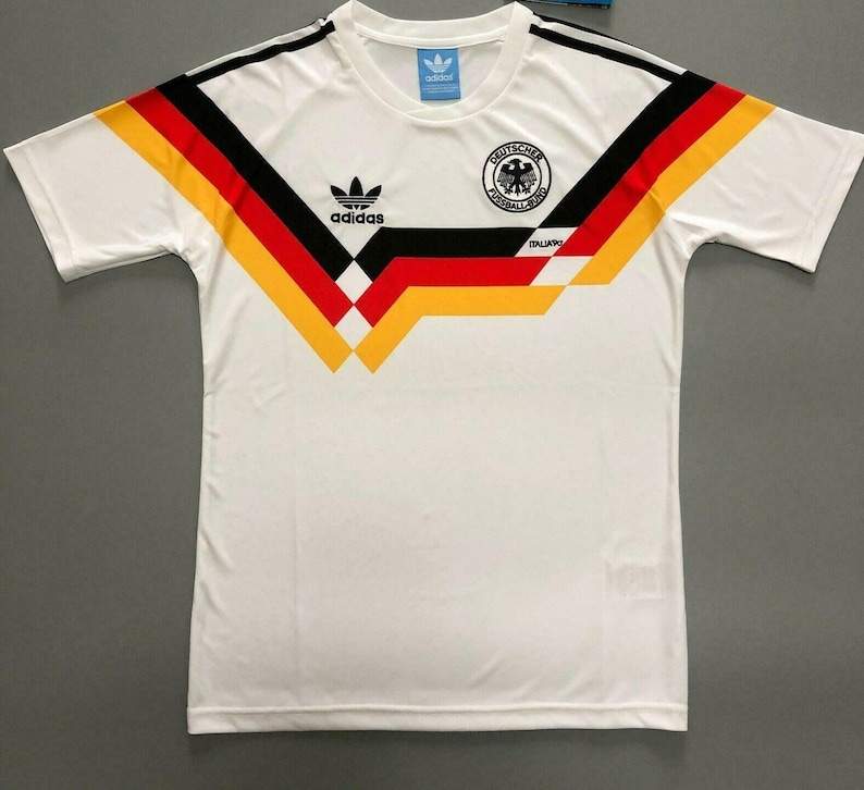
Weirdest: The pedestal jersey for sure I think. It was very 90s, but also just felt like somebody saw the 1990 Germany World Cup soccer jerseys and went "We should do that on our Flames jersey"
|
or the 1988 West German hockey sweaters?

__________________
"If Javex is your muse
then dive in buddy"
- Surferguy
|
|
|
|
|
11-12-2020, 05:38 PM
|
#33
|
|
Franchise Player
Join Date: Aug 2007
Location: Calgary
|
Worst category for me


__________________

Last edited by Nammer403; 11-12-2020 at 05:41 PM.
|
|
|
|
|
11-12-2020, 11:49 PM
|
#34
|
|
damn onions
|
Quote:
Originally Posted by TheScorpion
Carolina Hurricanes
Best:
Worn 1997 to 2007
These are clean, simple, and beautiful. I love the shade of red that the Hurricanes chose to use when they relocated. I like the white uniform they debuted with more than the red one because it allows the shoulder patch to stand out more. I also enjoy the italic numerical font the Canes chose and I didn't like when they abandoned it.
Worst:
Worn 2013 to 2017
I actually liked these when they came out. I'm not sure why; they're almost entirely devoid of personality. Change the logo to a maple leaf and you'd have a perfectly serviceable Team Canada uniform. But "Hurricanes" is way too descriptive a name to be paired with such a boring jersey.
Weirdest:
Worn 2019 to present
I don't hate these at all, but they're just a little strange. These are the "Tom Dundon jersey" he reportedly despised the Canes' previous white jersey to the point where they often wore their red one on the road.
So, Carolina came out with a New York Rangers-inspired design, an odd approach to begin with. But then there are the helmet decals:
I mean, they're cool. But they're also strange.
|
I love jerseys too man. Collected them as a kid. I like that Hurricanes helmet logo... I wonder if you switched out the word Canes for that red / black simplified helmet logo I bet that white sweater would be sweet. Other thing is I like Carolinas unique striping of the hurricane warning flag pattern... its unique to them and they should never abandon it, looks sweet. Agree with your ranking here.
As for Buffalo, I think the jerseys they just came out with are the best by far. I hope their socks are the 3 stripe pattern they used to have adopted by Blackfoot in Calgary minor hockey, again unique to them.
|
|
|
|
|
The Following User Says Thank You to Mr.Coffee For This Useful Post:
|
|
|
11-13-2020, 12:36 AM
|
#35
|
|
All I can get
|
There's no such thing as a good Edmonton jersey.
__________________
Edmonton is No Good.
|
|
|
|
|
The Following User Says Thank You to Reggie Dunlop For This Useful Post:
|
|
|
11-13-2020, 12:37 AM
|
#36
|
|
damn onions
|
It’ll be funny to see you evaluate Detroit.
|
|
|
|
|
The Following User Says Thank You to Mr.Coffee For This Useful Post:
|
|
|
11-13-2020, 12:51 AM
|
#37
|
|
First round-bust
Join Date: Feb 2015
Location: speculating about AHL players
|
Quote:
Originally Posted by Mr.Coffee
It’ll be funny to see you evaluate Detroit.
|
Well screw it, let's skip ahead just this once.
Detroit Red Wings
Best:
 Worn 1983 to present
Sure, some of the intricacies of the tailoring have changed as the NHL has switched between jersey providers. But let's not mince words: for good reason, this design hasn't changed for nearly 40 years. The red jersey is great but I slightly prefer the white one (I kinda like white jerseys better in general). I just like the white body with the red arms more than I like the straight red.
Worst:
 Worn 2014
Sorry, but beige doesn't belong on a Red Wings jersey, especially not at the expense of white. This jersey looks like a bowl of oatmeal with way too many strawberries on top. The asymmetrical shoulder patch is distracting and the fake-looking old-timey logo and number fonts are just ugly. Sure, I get that they were going for "vintage," but it doesn't look genuine. It doesn't look like anything the Red Wings would ever have worn outside of a fake "retro" event.
Weirdest:
 Worn 2016
I don't know what the hell that logo is supposed to be. A D with wings, I guess? It kind of looks like a Flaming "C" knockoff when you think of it that way. Anywho, this is a Stadium Series jersey, which I guess makes the comically oversized numbers a little more reasonable, but out of context, they look absurd. Imagine buying one of these, putting it on, and the number extends half the length of your arm. Also, is that a wordmark on the collar? Wut?
The diagonal stripe behind the logo makes the uniform look like it belongs on a football pitch which, I guess, close enough — this was for the Stadium Series. Still, definitely very weird.
__________________
Need a great deal on a new or pre-owned car? Come see me at Platinum Mitsubishi 2720 Barlow Trail NE
|
|
|
|
|
11-13-2020, 02:09 AM
|
#38
|
|
Scoring Winger
Join Date: Jul 2011
Location: at home
|
I don't quite understand how anyone can consider our jersey with black C the best. Black is the color of something that has burnt. Also, it has very little contrast on red background hence isn't very recognizable. Just imagine Red Wings' home uniforms with black logo - does that make any sense?
Best:

Worst:

Weirdest:

|
|
|
|
|
The Following 6 Users Say Thank You to playmaker For This Useful Post:
|
|
|
11-13-2020, 02:12 AM
|
#39
|
|
Scoring Winger
Join Date: Jul 2011
Location: at home
|
DALLAS:
Best:

Worst:

Weirdest:

|
|
|
|
|
11-13-2020, 02:14 AM
|
#40
|
|
Scoring Winger
Join Date: Jul 2011
Location: at home
|
EDMONTON
Best:
N/A
Worst:

Weirdest:

|
|
|
|
|
The Following User Says Thank You to playmaker For This Useful Post:
|
|
 Posting Rules
|
You may not post new threads
You may not post replies
You may not post attachments
You may not edit your posts
HTML code is Off
|
|
|
All times are GMT -6. The time now is 01:53 PM.
|
|


