 08-02-2016, 10:52 AM
|
#21
|
|
Franchise Player
|
What changed on the new jerseys?
|

|

|
|
08-02-2016, 11:14 AM
|
#22
|
|
#1 Goaltender
|
I love them personally.
|
|
|
|
|
The Following User Says Thank You to Monahan For Mayor For This Useful Post:
|
|
|
08-02-2016, 11:19 AM
|
#23
|
|
#1 Goaltender
Join Date: Aug 2011
Location: Not cheering for losses
|
Never liked the Team Canada logo, so not a fan of these.
|
|
|
|
|
The Following User Says Thank You to sun For This Useful Post:
|
|
|
08-02-2016, 11:20 AM
|
#24
|
|
Uncle Chester
|
I'm another one who doesn't like the black on the Canadian jersey. At least not so much of it. As an accent maybe it's ok.
|
|
|
|
|
08-02-2016, 11:24 AM
|
#25
|
|
Unfrozen Caveman Lawyer
Join Date: Oct 2002
Location: Crowsnest Pass
|
No need for the player in the Leaf. Too Players Association.
|
|
|
|
|
08-02-2016, 11:25 AM
|
#26
|
|
Scoring Winger
Join Date: Nov 2006
Location: Calgary, AB
|
I don't get the side stripes. Man, if they were going to release a new jersey every year, then at least change the whole thing up. It's the same template but with black and stripes.
Yawn.
|
|
|
|
|
08-02-2016, 11:25 AM
|
#27
|
|
In the Sin Bin
|
I also don't really like the Team Canada logo. Seems too corporate.
|
|
|
|
|
08-02-2016, 11:27 AM
|
#28
|
|
That Crazy Guy at the Bus Stop
Join Date: Jun 2010
Location: Springfield Penitentiary
|
I'm not really a fan. Too much black.
|
|
|
|
|
08-02-2016, 11:29 AM
|
#29
|
|
aka Spike
Join Date: Sep 2004
Location: The Darkest Corners of My Mind
|
|
|
|
|
|
08-02-2016, 11:30 AM
|
#30
|
|
Franchise Player
Join Date: Oct 2001
Location: NYYC
|
Quote:
Originally Posted by sun

Never liked the Team Canada logo, so not a fan of these.
|
The slanted logo on the Canada Cup jerseys is still my favourite, and would still look fantastic even today. It's timeless.
|
|
|
|
|
The Following 2 Users Say Thank You to Table 5 For This Useful Post:
|
|
|
08-02-2016, 11:45 AM
|
#31
|
|
Powerplay Quarterback
|
Why does the jersey change every single year?
|
|
|
|
|
08-02-2016, 11:47 AM
|
#32
|
|
Franchise Player
Join Date: Feb 2013
Location: Boca Raton, FL
|
Quote:
Originally Posted by craigwd
Why does the jersey change every single year?
|
Income. They're like a church, they always need money.
__________________
"You know, that's kinda why I came here, to show that I don't suck that much" ~ Devin Cooley, Professional Goaltender
|
|
|
|
|
The Following User Says Thank You to Cali Panthers Fan For This Useful Post:
|
|
|
08-02-2016, 12:21 PM
|
#33
|
|
Lifetime Suspension
|
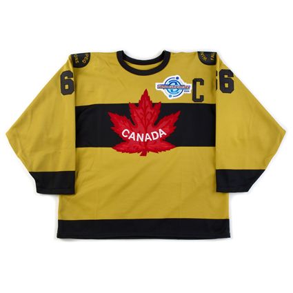
I've never cared for the Hockey Canada logo. 2010 and 2014 jerseys look stellar in comparison.
|
|
|
|
|
08-02-2016, 12:48 PM
|
#34
|
|
#1 Goaltender
Join Date: Jan 2010
Location: Calgary
|
A modern version of this would be ideal, and something they should never change. Like others mentioned, this is timeless and classic. Love it. Both white and red, no need for black.
But, these latest versions of the jerseys are nice, I like them. I won't likely buy one but if they come out with the Canada Cup jersey I linked, I'll buy one of those.
__________________
"You're worried about the team not having enough heart. I'm worried about the team not having enough brains." HFOil fan, August 12th, 2020. E=NG
|
|
|
|
|
The Following 2 Users Say Thank You to foshizzle11 For This Useful Post:
|
|
|
08-02-2016, 12:49 PM
|
#35
|
|
Scoring Winger
Join Date: Jun 2010
Location: Calgary
|
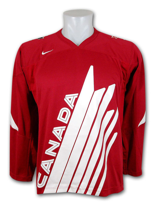
How about this jersey from the 2004 World Cup of Hockey?
|
|
|
|
|
08-02-2016, 01:31 PM
|
#36
|
|
That Crazy Guy at the Bus Stop
Join Date: Jun 2010
Location: Springfield Penitentiary
|
I'll always prefer 2009 and 2011 for recent jerseys. The 2009 seems like a great throwback to the slanted leaf canada cup jersey.

|
|
|
|
|
The Following 3 Users Say Thank You to Cecil Terwilliger For This Useful Post:
|
|
|
08-02-2016, 01:33 PM
|
#37
|
|
First round-bust
Join Date: Feb 2015
Location: speculating about AHL players
|
Nothing will top the '72, Nagano '98, Salt Lake '02, Vancouver '10, or Sochi '14 Black jerseys.
The Sochi jerseys did black right. These are just gratuitous.
__________________
Need a great deal on a new or pre-owned car? Come see me at Platinum Mitsubishi 2720 Barlow Trail NE
|
|
|
|
|
08-02-2016, 01:43 PM
|
#38
|
|
Franchise Player
|
The 2002 Salt Lake era jerseys are my favorites.
Ever since Sochi, there's been a progressively more Reichish aesthetic to our threads.
|
|
|
|
|
08-02-2016, 01:49 PM
|
#39
|
|
Franchise Player
|
were the 2002 jersey's the ones with a dash of gray/grey in them as I like those.
personally, I l;ike the jersey's am just not a fan of the round/oval neckline - I prefer a v-neck
__________________
If I do not come back avenge my death
|
|
|
|
|
08-02-2016, 03:20 PM
|
#40
|
|
Franchise Player
|
Quote:
Originally Posted by Funkhouser

These were the best Team Canada jerseys that Hockey Canada has done to-date IMO... |
FYI -- these are on clearance at Sport Chek for $35... only smalls and mediums though.
|
|
|
|
|
The Following User Says Thank You to tvp2003 For This Useful Post:
|
|
 Posting Rules
|
You may not post new threads
You may not post replies
You may not post attachments
You may not edit your posts
HTML code is Off
|
|
|
All times are GMT -6. The time now is 11:04 AM.
|
|


