 08-20-2013, 10:53 AM
|
#21
|
|
Franchise Player
Join Date: Dec 2011
Location: Calgary
|
Seems like they just want more money. I think these are a total flop. Too simple and practice jersey-like. Reminds me of the 2008 Oilers uniforms.
|

|

|
|
The Following 2 Users Say Thank You to N-E-B For This Useful Post:
|
|
|
08-20-2013, 10:54 AM
|
#22
|
|
Lifetime Suspension
|
Will have to see them on the ice but I'm initially impressed.
|
|
|
|
|
08-20-2013, 10:54 AM
|
#23
|
|
Franchise Player
Join Date: Jul 2004
Location: Bay Area
|
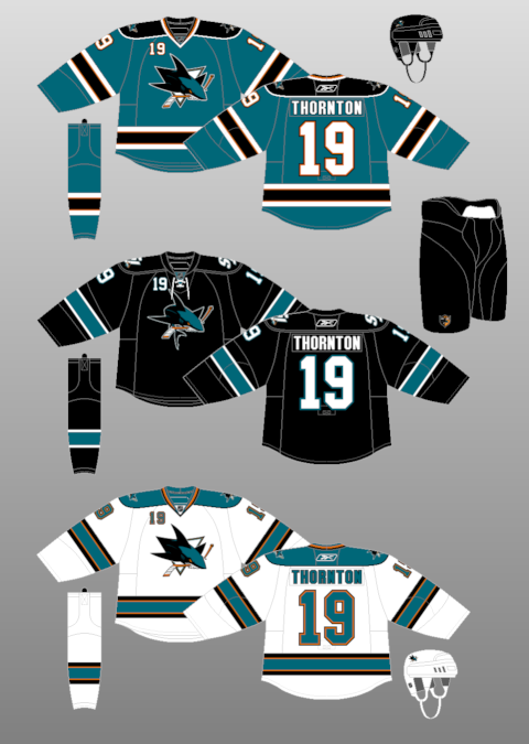
It's great except for the colour. I will have to buy for my kids regardless. Black is normally boring, but their's was great i thought.
|
|
|
|
|
08-20-2013, 10:56 AM
|
#24
|
|
Franchise Player
Join Date: Feb 2006
Location: Calgary, AB
|
They talk about reducing the weight by getting rid of unnecessary stuff but keep the stupid numbers on the front of the jersey? Plus, they add the completely useless strings to the collar.
Who knew that black fabric weighs more than teal fabric, but white fabric weighs less than teal?
Of all the teams that could benefit from a uniform redesign, the Sharks were pretty low on the list.
__________________
Turn up the good, turn down the suck!
|

|
|
|
The Following 2 Users Say Thank You to getbak For This Useful Post:
|
|
|
08-20-2013, 10:59 AM
|
#25
|
|
First Line Centre
Join Date: Feb 2010
Location: Calgary
|
I'm just not feeling these, like the Cane's new set they are just a little too plain. Even just a hit of colour on the collar would make a world of difference on the home set.

I get that the current trend is towards traditional/simple stripping, but a few of these teams are taking it a little far and just end up looking plain/unfinished.
Much like the Leaf's 2007 jerseys they just look like practice sweaters.
|
|
|
|
|
08-20-2013, 11:03 AM
|
#26
|
|
Lifetime Suspension
Join Date: Oct 2012
Location: Halifax
|
Quote:
Originally Posted by getbak

They talk about reducing the weight by getting rid of unnecessary stuff but keep the stupid numbers on the front of the jersey? Plus, they add the completely useless strings to the collar.
Who knew that black fabric weighs more than teal fabric, but white fabric weighs less than teal?
Of all the teams that could benefit from a uniform redesign, the Sharks were pretty low on the list.
|
Those IMO, were one of the best jerseys in the league. All they did was take away the bottom stripping and the black shoulders. Pretty blatant cash grab.
|
|
|
|
|
08-20-2013, 11:16 AM
|
#27
|
|
Franchise Player
Join Date: Mar 2007
Location: Income Tax Central
|
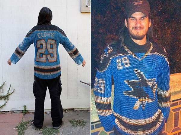
What kind of realistic weight savings are they hoping to get? Its a jersey, in the grand scheme of things it weighs practically nothing already.
__________________
The Beatings Shall Continue Until Morale Improves!
This Post Has Been Distilled for the Eradication of Seemingly Incurable Sadness.
The World Ends when you're dead. Until then, you've got more punishment in store. - Flames Fans
If you thought this season would have a happy ending, you haven't been paying attention.
|
|
|
|
|
08-20-2013, 11:20 AM
|
#28
|
|
Franchise Player
Join Date: Apr 2004
Location: I don't belong here
|
Woah, this is heavy.
|
|
|
|
|
08-20-2013, 11:21 AM
|
#29
|
|
Franchise Player
Join Date: Nov 2008
Location: the dark side of Sesame Street
|
Quote:
Originally Posted by Locke
What kind of realistic weight savings are they hoping to get? Its a jersey, in the grand scheme of things it weighs practically nothing already.
|
yeah, it's not like they were wearing something like this:
__________________
"If Javex is your muse
then dive in buddy"
- Surferguy
|
|
|
|
|
The Following User Says Thank You to Puppet Guy For This Useful Post:
|
|
|
08-20-2013, 11:24 AM
|
#30
|
|
#1 Goaltender
Join Date: Oct 2001
Location: Calgary Satellite Community
|
Nice football jerseys.
|
|
|
|
|
08-20-2013, 11:27 AM
|
#31
|
|
Franchise Player
Join Date: Feb 2007
Location: Calgary, AB
|
Think it needs the bottom striping.
|
|
|
|
|
The Following User Says Thank You to SuperMatt18 For This Useful Post:
|
|
|
08-20-2013, 12:04 PM
|
#32
|
|
Lifetime Suspension
Join Date: Oct 2012
Location: Halifax
|
Just to compare them better, the away one is nicer but still.
|
|
|
|
|
08-20-2013, 12:28 PM
|
#33
|
|
Franchise Player
Join Date: May 2004
Location: Helsinki, Finland
|
I'm going with the "looks like a practice jersey" crowd. The old ones were better.
|
|
|
|
|
The Following 15 Users Say Thank You to Itse For This Useful Post:
|
Żoso,
3thirty,
DaQwiz,
Domoic,
Flamesguy_SJ,
Flamezzz,
Locke,
Machiavelli,
Rathji,
rohara66,
SebC,
Stay Golden,
The Yen Man,
You Need a Thneed,
ZDogg
|
|
08-20-2013, 12:31 PM
|
#34
|
|
Franchise Player
Join Date: Mar 2002
Location: Calgary
|
Downgrade in my opinion.
Take the numbers off the front of the "old" set, and the patch, and the uncluttered look goes away. The orange around the numbers and letters was good, as was the yolk...and the collar was good too.
If you wanted to make a change to reduce the busy look further, maybe take the thick white stripe off/reduce the size off the bottom and arms of the dark jersey, and take/reduce the same thickness of black stripe off the light jerseys. Instead they just cut off the bottom third of the jersey, took away the collar (at least on the home set) and tacked on some laces.
New ones looks more like the dark Oilers set before they went back to the light blue, a glorified practice jersey with arm stripes, with no collar.
|
|
|
|
|
08-20-2013, 12:38 PM
|
#35
|
|
#1 Goaltender
Join Date: Aug 2011
Location: Not cheering for losses
|
The old ones were better. Should have ditched the number on the chest instead.
|
|
|
|
|
08-20-2013, 12:48 PM
|
#36
|
|
Franchise Player
Join Date: Mar 2007
Location: Income Tax Central
|
Quote:
Originally Posted by Itse
I'm going with the "looks like a practice jersey" crowd. The old ones were better.
|
Agreed, but also, do you really need the number in 4 places?
__________________
The Beatings Shall Continue Until Morale Improves!
This Post Has Been Distilled for the Eradication of Seemingly Incurable Sadness.
The World Ends when you're dead. Until then, you've got more punishment in store. - Flames Fans
If you thought this season would have a happy ending, you haven't been paying attention.
|
|
|
|
|
08-20-2013, 12:59 PM
|
#37
|
|
Franchise Player
Join Date: Jun 2006
Location: Calgary, Alberta
|
Those jerseys look fairly generic. They need at least something at the bottom.
What was wrong with their previous jerseys? Thought those were just fine. In fact, the new look like the old ones without the top and bottom stripes.
Last edited by Joborule; 08-20-2013 at 02:32 PM.
|
|
|
|
|
08-20-2013, 01:00 PM
|
#38
|
|
Franchise Player
|
I like them. I have never been a fan of the bottom striping. I don't wear shirts with a bottom striping for a reason , so why would i want my favourite team to have it on their jersey?
I really hope the flames do something like this.
|
|
|
|
|
08-20-2013, 01:04 PM
|
#39
|
|
Scoring Winger
|
They look way to plain imo
|
|
|
|
|
08-20-2013, 01:05 PM
|
#40
|
|
Franchise Player
Join Date: Mar 2007
Location: Income Tax Central
|
Quote:
Originally Posted by Joborule
Those jerseys look fairly generic. They need at least something at the bottom.
What was wrong with their previous jerseys? Thought those were just fine. In fact, the news look like the old ones without the top and bottom stripes.
|
Evidently they were too heavy.
__________________
The Beatings Shall Continue Until Morale Improves!
This Post Has Been Distilled for the Eradication of Seemingly Incurable Sadness.
The World Ends when you're dead. Until then, you've got more punishment in store. - Flames Fans
If you thought this season would have a happy ending, you haven't been paying attention.
|
|
|
|
 Posting Rules
|
You may not post new threads
You may not post replies
You may not post attachments
You may not edit your posts
HTML code is Off
|
|
|
All times are GMT -6. The time now is 10:54 PM.
|
|


