 06-12-2017, 10:54 PM
|
#21
|
|
damn onions
|
For what it's worth that icethetics.co website seems to infer that the reason the teams released uniforms today on twitter are because the teams not mentioned (MTL, TOR, CHI) will not have any changes whatsoever. So it seems to infer that the teams listed will have changes, albeit likely small ones.
Also notes that the Buffalo blue seems like the same older dark. Couple other interesting notes, like how Colorado was rumoured to switch their logo to the what's on their current 3rds but are keeping the original A logo for this year... LV commentary. Kinda interesting.
|

|

|
|
The Following 2 Users Say Thank You to Mr.Coffee For This Useful Post:
|
|
|
06-13-2017, 09:53 AM
|
#22
|
|
Franchise Player
|
I wasn't heavily on the "royal blue" train -- it would've been fine, but I quite like the dark navy look. We haven't seen it in a really 'cleaned up' form (without all the stupid piping) and I think it would look really great if it is cleaned up.
|
|
|
|
|
06-13-2017, 12:04 PM
|
#23
|
|
Franchise Player
Join Date: Feb 2006
Location: Calgary, AB
|
The Habs finally tweeted out their teaser this morning.
I'm sure everyone will be shocked to see that they'll have a red base jersey with a large blue stripe, bordered by smaller white stripes, running through the middle of the logo. The only noticeable change is that (like most other teams) the main colour of the logo will be done using the jersey mesh material rather than tackle twill.
That leaves Toronto, Chicago, and Pittsburgh as the only teams to have not yet sent out a teaser. One of those teams has a decent excuse for being preoccupied.
None of those three teams should be expected to make any significant changes to their uniforms. Toronto and Pittsburgh just changed theirs this season, and Bobby Hull was still with the Blackhawks the last time they made more than a minor tweak to theirs.
Unfortunately, no teams have sent out new teasers today, so it looks like we won't be getting a new teaser each day until the release. Hopefully something tomorrow.
__________________
Turn up the good, turn down the suck!
|
|
|
|
|
06-13-2017, 12:10 PM
|
#24
|
|
Franchise Player
Join Date: Oct 2006
Location: San Fernando Valley
|
Surprised the Oilers would stick with orange as they are the worst jerseys in the NHL.
|
|
|
|
|
The Following 5 Users Say Thank You to Erick Estrada For This Useful Post:
|
|
|
06-13-2017, 12:50 PM
|
#25
|
|
Franchise Player
Join Date: Jan 2013
Location: Cape Breton Island
|
Jets doing their best Blue Bombers impression from 95~ to 2014 and refusing to give fans what they want. Smart business strategy, bold.
|
|
|
|
|
06-14-2017, 11:16 AM
|
#26
|
|
Franchise Player
|
Addidas probably didn't want to come in and upset a bunch of fans with a radical redesign, so I'd bet they are all identical as last season save for some three stripe branding under the arm.
Little do they know Flames fans have been pining for a radical redesign.
|
|
|
|
|
06-14-2017, 03:27 PM
|
#27
|
|
GOAT!
|
Quote:
Originally Posted by Erick Estrada

Surprised the Oilers would stick with orange as they are the worst jerseys in the NHL.
|
As much as it kills me to say it, I like the Oilers' orange jerseys. I mean, I hate their logo and everything about the city/fanbase/organization, but I like the colors and patterns on their orange jerseys.
|
|
|
|
|
The Following 2 Users Say Thank You to FanIn80 For This Useful Post:
|
|
|
06-14-2017, 03:36 PM
|
#28
|
|
First Line Centre
|
Quote:
Originally Posted by GreenLantern2814
If the Flames jersey was going to be nearly identical, they would've included it with the teaser full of jerseys that aren't getting redesigned.
|
I bet it will be Remarkably similar!
|
|
|
|
|
06-14-2017, 03:37 PM
|
#29
|
|
Franchise Player
Join Date: Dec 2011
Location: Calgary
|
Quote:
Originally Posted by Erick Estrada
Surprised the Oilers would stick with orange as they are the worst jerseys in the NHL.
|
I am too. As much as I hate them, their blue uniforms weren't that bad. These orange ones are hard to look at though. Easily among the ugliest in the NHL.
Massive downgrade for them, which I'm fine with. Makes them easier to hate (as if it wasn't easy enough).
|
|
|
|
|
The Following User Says Thank You to N-E-B For This Useful Post:
|
|
|
06-14-2017, 03:51 PM
|
#30
|
|
Powerplay Quarterback
|
Quote:
Originally Posted by fanin80
as much as it kills me to say it, i like the oilers' orange jerseys. I mean, i hate their logo and everything about the city/fanbase/organization, but i like the colors and patterns on their orange jerseys.
|
get out!
__________________
Quote:
Originally Posted by HotHotHeat
THIS is why people make fun of Edmonton. When will this stupid city figure it out? They continue to kick their own ass every day, it's impossible not to make fun of them.
|
|
|
|
|
|
The Following 4 Users Say Thank You to Sutter_in_law For This Useful Post:
|
|
|
06-14-2017, 03:57 PM
|
#31
|
|
First Line Centre
Join Date: Jan 2011
Location: Fort St. John, BC
|
My theory is every jersey in the "teaser" is their current jersey, except for Minnesota because they are the only one switching primary colours
|
|
|
|
|
06-14-2017, 04:12 PM
|
#32
|
|
Franchise Player
Join Date: Feb 2006
Location: Calgary, AB
|
Quote:
Originally Posted by doctajones428
My theory is every jersey in the "teaser" is their current jersey, except for Minnesota because they are the only one switching primary colours
|
On most of the logos, you can see that the large coloured part of the logo is made using the same mesh material as the jersey. That was never done in the past.
You can see here in the red of the Habs logo, it's the same material as the red in the body of the jersey...
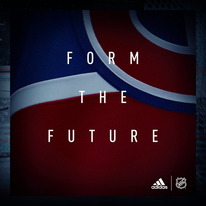
It's harder to see on the Flames' logo because it's black, but if you boost the brightness on the image, you can see that it too has the mesh logo.
__________________
Turn up the good, turn down the suck!
|
|
|
|
|
06-14-2017, 04:40 PM
|
#33
|
|
Franchise Player
Join Date: Dec 2005
Location: back in the 403
|
Quote:
Originally Posted by Erick Estrada
Surprised the Oilers would stick with orange as they are the worst jerseys in the NHL.
|
You ever seen Katz' velvet blazers? He's all about tacky
|

|
|
|
06-14-2017, 04:56 PM
|
#34
|
|
Scoring Winger
|
what a ####ing joke lol
|
|
|
|
|
06-14-2017, 07:04 PM
|
#35
|
|
First Line Centre
Join Date: Jan 2011
Location: Fort St. John, BC
|
Quote:
Originally Posted by getbak
On most of the logos, you can see that the large coloured part of the logo is made using the same mesh material as the jersey. That was never done in the past.
You can see here in the red of the Habs logo, it's the same material as the red in the body of the jersey...
It's harder to see on the Flames' logo because it's black, but if you boost the brightness on the image, you can see that it too has the mesh logo. |
Dammit! Every theory, hope and dream I can possibly cling onto that we're hopefully possibly maybe getting retro home/away jerseys has been destroyed
|
|
|
|
|
06-14-2017, 07:13 PM
|
#36
|
|
Franchise Player
Join Date: Feb 2010
Location: Hyperbole Chamber
|
Quote:
Originally Posted by Erick Estrada
Surprised the Oilers would stick with orange as they are the worst jerseys in the NHL.
|
Jersey has to fit the character of the organization.
|
|
|
|
|
The Following User Says Thank You to topfiverecords For This Useful Post:
|
|
|
06-14-2017, 07:56 PM
|
#37
|
|
Franchise Player
Join Date: Sep 2015
Location: Paradise
|
Quote:
Originally Posted by Erick Estrada
Surprised the Oilers would stick with orange as they are the worst jerseys in the NHL.
|
They can keep their NDP orange.
#orangecrush
|
|
|
|
|
06-14-2017, 08:32 PM
|
#38
|
|
Help, save, whatever.
|
Quote:
Originally Posted by FanIn80
As much as it kills me to say it, I like the Oilers' orange jerseys. I mean, I hate their logo and everything about the city/fanbase/organization, but I like the colors and patterns on their orange jerseys.
|
Me too. I like seeing some different coloured jerseys in this league. I love the Preds jerseys too with the yellow helmets. Really stands out which to me is the point of a uniform. Plus they look good IMO.
|
|
|
|
|
06-15-2017, 09:01 AM
|
#39
|
|
Some kinda newsbreaker!
Join Date: May 2004
Location: Learning Phaneufs skating style
|
teams now teasing the Adidas logos on their jerseys on twitter
|
|
|
|
|
06-15-2017, 09:03 AM
|
#40
|
|
Taking a while to get to 5000
|
Black outline on the lettering to further depress the retro crowd.
|
|
|
|
 Posting Rules
|
You may not post new threads
You may not post replies
You may not post attachments
You may not edit your posts
HTML code is Off
|
|
|
All times are GMT -6. The time now is 08:00 AM.
|
|


