06-20-2017, 10:59 PM
|
#301
|
|
damn onions
|
I'm still somewhat struck by how poorly the NHL unveiled this.
Literally a website full of nerds (like me) and even normal hockey fans eager to see these could not figure out when it was actually happening. Or where. Or any details. And the league's own website didn't even have details on it?
Random tweets and leaks. Random pictures. No organization. Just bizarre.
|

|

|
|
The Following 6 Users Say Thank You to Mr.Coffee For This Useful Post:
|
|
|
06-21-2017, 12:02 AM
|
#302
|
|
Closet Jedi
|
Flyers continue with their silly mishmash nameplate tradition. As far as I can tell, it's not a throwback to their old-timey jerseys. They just decided to put a colored block nameplate one day and stuck with it. So weird. It's so bad looking. Each number / name has a different, inconsistent scheme.
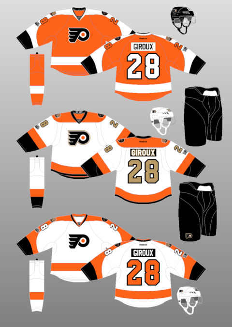
black-on-white for name
white-on-black for main number
orange-on-black for side number
It's madness!
New Flyers jersey video here:
https://twitter.com/NHLFlyers/status/877345515976798208
__________________
Gaudreau > Huberdeau AINEC
|
|
|
|
|
06-21-2017, 12:29 AM
|
#303
|
|
Franchise Player
Join Date: Feb 2006
Location: Calgary, AB
|
Just noticed this looking at the Stars jersey...
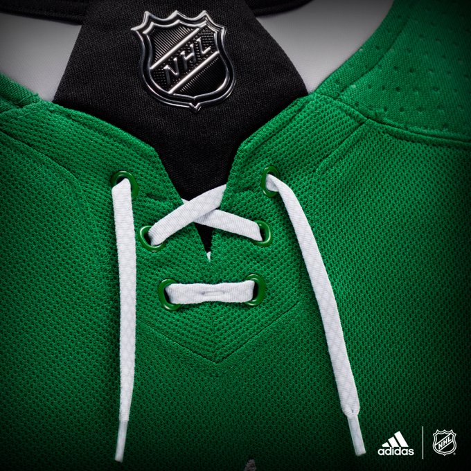
The collar laces have always been more decorative than practical (or at least since they stopped making jerseys out of wool), but now they serve no actual purpose.
Even the ones with the loose lace ends are sewn directly to the jersey so they can't be tightened even if you wanted to.
__________________
Turn up the good, turn down the suck!
|
|
|
|
|
06-21-2017, 12:54 AM
|
#305
|
|
First Line Centre
Join Date: Aug 2009
Location: About 5200 Miles from the Dome
|
Quote:
Originally Posted by AC

|
Oilers terrible is like infinity. Without delving into astrophysics too deep a lesser infinity of terrible is still terrible.
__________________
You have enemies? Good. That means you've stood up for something, sometime in your life.
Winston Churchill
|
|
|
|
|
The Following User Says Thank You to Chingas For This Useful Post:
|
|
|
06-21-2017, 01:02 AM
|
#306
|
|
First Line Centre
Join Date: Aug 2009
Location: About 5200 Miles from the Dome
|
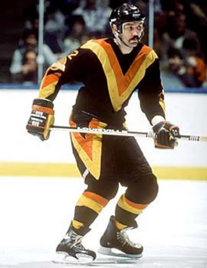
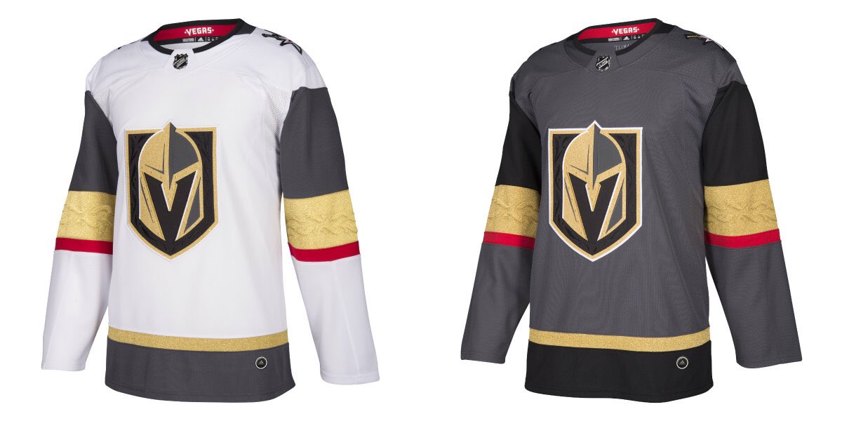
When I look at the Vegas kit I am reminded of these treasures.
__________________
You have enemies? Good. That means you've stood up for something, sometime in your life.
Winston Churchill
|
|
|
|
|
The Following User Says Thank You to Chingas For This Useful Post:
|
|
|
06-21-2017, 01:08 AM
|
#307
|
|
Lifetime Suspension
|
Quote:
Originally Posted by AC
I like them. |
Is it me or do these look like hoodies designed for teens, just minus the hoods?
And what's with the little stitching design in the gold. So strange. But I like new things so it's not all hate.
|
|
|
|
|
06-21-2017, 01:24 AM
|
#308
|
|
Franchise Player
Join Date: Oct 2006
Location: Calgary
|
I really like the Vegas kit. Definitely different.
__________________
Fireside Chat - The #1 Flames Fan Podcast - FiresideChat.ca
|
|
|
|
|
The Following 4 Users Say Thank You to Caged Great For This Useful Post:
|
|
|
06-21-2017, 01:25 AM
|
#309
|
|
Not a casual user
Join Date: Mar 2006
Location: A simple man leading a complicated life....
|
Quote:
Originally Posted by Caged Great
I really like the Vegas kit. Definitely different.
|
Sharp looking jerseys.
__________________

|
|
|
|
|
The Following 2 Users Say Thank You to Dion For This Useful Post:
|
|
|
06-21-2017, 01:26 AM
|
#310
|
|
Crash and Bang Winger
|
Quote:
Originally Posted by united
|
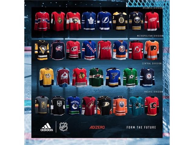
I really like the St. Louis and Minnesota jerseys. The Arizona jerseys to me are a head scratcher with their sleeves.. the black and or the white are completely out of place in that.
|
|
|
|
|
06-21-2017, 06:40 AM
|
#311
|
|
Franchise Player
Join Date: Mar 2006
Location: Shanghai
|
The more I look at that Vegas uni, the more I hate it. It's just brutally ugly. I can't believe the NHL allows shiny gold as a colour on jerseys. By no means am I a traditionalist, but shiny gold fabric doesn't belong on anything to take pride in. It would be like the flames using red sequence to sparkle like fire. Just tacky and ugly.
__________________
"If stupidity got us into this mess, then why can't it get us out?"
|
|
|
|
|
06-21-2017, 08:23 AM
|
#312
|
|
Crash and Bang Winger
Join Date: Jul 2005
Location: Aalborg, Denmark
|
Quote:
Originally Posted by JohnnyB
The more I look at that Vegas uni, the more I hate it. It's just brutally ugly..... Just tacky and ugly.
|
Well, that does reflect the character of the city.
|
|
|
|
|
06-21-2017, 08:27 AM
|
#313
|
|
Franchise Player
Join Date: Nov 2008
Location: the dark side of Sesame Street
|
Quote:
Originally Posted by JohnnyB
The more I look at that Vegas uni, the more I hate it. It's just brutally ugly. I can't believe the NHL allows shiny gold as a colour on jerseys. By no means am I a traditionalist, but shiny gold fabric doesn't belong on anything to take pride in. It would be like the flames using red sequence to sparkle like fire. Just tacky and ugly.
|
shhhhhhh...Ken King might hear you.
__________________
"If Javex is your muse
then dive in buddy"
- Surferguy
|
|
|
|
|
06-21-2017, 10:13 AM
|
#314
|
|
Franchise Player
|
__________________
Quote:
Originally Posted by CroFlames
Before you call me a pessimist or a downer, the Flames made me this way. Blame them.
|
|
|
|
|
|
The Following 6 Users Say Thank You to codynw For This Useful Post:
|
|
|
06-21-2017, 10:15 AM
|
#315
|
|
Franchise Player
|
__________________
Quote:
Originally Posted by CroFlames
Before you call me a pessimist or a downer, the Flames made me this way. Blame them.
|
|
|
|
|
|
The Following 4 Users Say Thank You to codynw For This Useful Post:
|
|
|
06-21-2017, 10:19 AM
|
#316
|
 Posted the 6 millionth post! |
While I'm not a fan for a lot of the new kits, I do like that the neck laces and the arm bands are different from team to team, and not just standard supplementary features. There appears to be a classic kit for some teams, and a more modern kit style for others.
|
|
|
|
|
06-21-2017, 10:22 AM
|
#317
|
|
Lifetime Suspension
|
can the faux british amonsgst us stop calling them kits..??
|
|
|
|
|
The Following 7 Users Say Thank You to IrishSpring2013 For This Useful Post:
|
|
|
06-21-2017, 10:23 AM
|
#318
|
|
Franchise Player
|
Quote:
Originally Posted by JohnnyB
The more I look at that Vegas uni, the more I hate it. It's just brutally ugly. I can't believe the NHL allows shiny gold as a colour on jerseys. By no means am I a traditionalist, but shiny gold fabric doesn't belong on anything to take pride in. It would be like the flames using red sequence to sparkle like fire. Just tacky and ugly.
|
Agree completely. But all they'd have to do to make it tolerable would be to remove red from the colour scheme.
__________________
"The great promise of the Internet was that more information would automatically yield better decisions. The great disappointment is that more information actually yields more possibilities to confirm what you already believed anyway." - Brian Eno
|
|
|
|
|
06-21-2017, 11:30 AM
|
#319
|
|
Franchise Player
Join Date: Dec 2005
Location: back in the 403
|
Quote:
Originally Posted by IrishSpring2013
can the faux british amonsgst us stop calling them kits..??
|
Apologies mate. Cheers
|
|
|
|
|
The Following 7 Users Say Thank You to Sainters7 For This Useful Post:
|
|
|
06-21-2017, 11:41 AM
|
#320
|
|
Franchise Player
|
Quote:
Originally Posted by Textcritic
As much as I do not understand the vitriol for the new Flames jersey I am equally confused by the gushing appraisals of the new Avalanche sweater.
Hmmm.
|
It's the closest thing they have to a "retro" so it's automatically better than any current design they could have 
|
|
|
|
 Posting Rules
|
You may not post new threads
You may not post replies
You may not post attachments
You may not edit your posts
HTML code is Off
|
|
|
All times are GMT -6. The time now is 12:13 AM.
|
|