To your first point, wikipedia doesn't keep track of how good or bad jerseys are. Icethetics and bleacher report do. Go back and look at my post regarding this. What a silly comment.
On your second point, blatantly copying the Rangers would be a bit tacky. However the original Jets jersey was a blatant copy of the Rangers. Also, many teams use the rangers colour scheme because it's pretty awesome.
I don't think Zarley is in charge around here, but he's a lot more qualified to be than you.
Yes, pretty weak sources that back your argument up.
First, yes icethetics gives the retro 4.5 / 5 stars with 1190 votes
BUT it also ranks the Flames second best jersey as the Ronald McDonald jersey with 3.5/5 stars and 1145 votes. So take it for what it's worth.
The bleecher report link is an analysts rankings of the nhl jerseys (basically a blog post).
Sure. How "good" a jersey is is pretty subjective. It's always opinion based. I actually prefer the heritage classic jerseys over our current home and away set as well so take it for what it's worth.
The striping is definitely the same as the 70s jersey, but maybe with updated colours. I'm actually not opposed to having a Flames uniform that's different than the Retro as long as a few guidelines are followed.
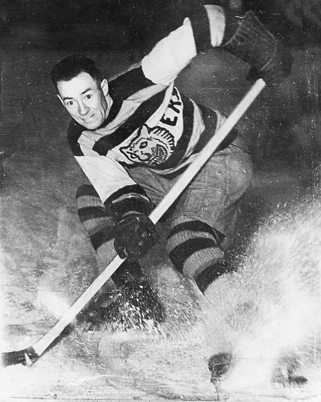
Look at the striping on the 2 photos above, it is quite clearly different. In the modern ones from top to bottom it goes orange, blue, white. In the one with Trottier it went white then orange with no in between.
Sure. How "good" a jersey is is pretty subjective. It's always opinion based. I actually prefer the heritage classic jerseys over our current home and away set as well so take it for what it's worth.
Me too. At first I thought they were appalling, but they actually don't look that bad, especially when put together with the whole uniform. If they toned down on the amount of stripes, it might actually look pretty solid.
Look at the striping on the 2 photos above, it is quite clearly different. In the modern ones from top to bottom it goes orange, blue, white. In the one with Trottier it went white then orange with no in between.
That's correct, but he was talking about the 70's version which is the same as the new Isles jersey.
Me too. At first I thought they were appalling, but they actually don't look that bad, especially when put together with the whole uniform. If they toned down on the amount of stripes, it might actually look pretty solid.
I don't love the Heritage Classic jerseys, the white "C" on the yellow has an uncomfortable contrast. What I don't mind about them is the tones of the red and gold they use.
They might actually work well on refined design of this jersey:
Might have to comp them up. Reminds me of the Cleveland Cavaliers minimal design set of uniforms.
I'm not usually a huge fan of dark red (ie. maroon), however I think it worked fairly well on the HC jerseys. What was cool about that set was that it had a bit of a classic rugby jersey feel to it which worked really well considering it was an outdoor game. This might be blasphemous around these parts, but I thought the flaming C was the worst part of the jersey. Not because it's not an awesome logo, because it is, but because it's too modern for that look. I think a simpler white C would have made the set look pretty awesome.
Not sure why but I like that. I like the simple jersey concept. Curious now maybe a bigger C maybe not, but throw the red pants on without the verticle yellow stripe. Stay away from any verticle stripes. Then socks two gold(yellow) stripes like the bottom of the jersey.
Last edited by FakenHaken; 03-19-2013 at 03:57 PM.
I still have my Flames jersey from 04 (when I was a teen, so it's a size too small now), and I won't buy a new one until they replace their primary jerseys. So if Flames want my money, they better get around to doing that soon enough.
For the one off HC jersey I was really hoping they were going to do an almost authentic homage to one of these:
And from this a third jersey to have a different colour scheme for a few games a year would have been cool to see this jersey (for something slightly different)
I'm all for trying a different colour scheme on a third jersey if you are keeping the main colour scheme true to the teams historic colours.
__________________
'When I use a word,' Humpty Dumpty said, in rather a scornful tone, 'it means just what I choose it to mean neither more nor less.'