06-20-2017, 07:31 PM
|
#221
|
|
All I can get
|
Quote:
Originally Posted by topfiverecords

No toilet seat around the neck though.
|
That would have been epic. Years and years of merciless mocking.
Toilet seat collars? They'd have never, ever, ever lived that down.
__________________
Edmonton is No Good.
Last edited by Reggie Dunlop; 06-20-2017 at 07:57 PM.
|

|

|
|
06-20-2017, 07:33 PM
|
#222
|
|
Franchise Player
|
Quote:
Originally Posted by gilligans_off
The VGK jersey is bad
|
Really? Why? I quite like it.
|
|
|
|
|
The Following 6 Users Say Thank You to ComixZone For This Useful Post:
|
|
|
06-20-2017, 07:35 PM
|
#223
|
|
All I can get
|
I always liked the gold as an accent colour, as it's also a "fire colour." It's a shame it's been minimized. More gold, less black.
__________________
Edmonton is No Good.
|
|
|
|
|
06-20-2017, 07:36 PM
|
#224
|
|
#1 Goaltender
|
Quote:
Originally Posted by ComixZone
Really? Why? I quite like it.
|
Should have been more golden, less knight.
|
|
|
|
|
The Following User Says Thank You to Nsd1 For This Useful Post:
|
|
|
06-20-2017, 07:38 PM
|
#225
|
|
Franchise Player
|
Quote:
Originally Posted by ComixZone
Really? Why? I quite like it.
|
Yeah I was expecting worse, that's not bad really. The logo isn't great but other than that it's okay
|
|
|
|
|
06-20-2017, 07:42 PM
|
#226
|
|
Franchise Player
Join Date: Oct 2001
Location: Flames fan in Seattle
|
I like that the knight shows a V for Vegas.
Simple minds enjoy simple things I guess
__________________

|
|
|
|
|
06-20-2017, 07:52 PM
|
#227
|
|
#1 Goaltender
|
Carolina with the warning stripe and black looks really good. Interested to see what color of gear they rock with that.
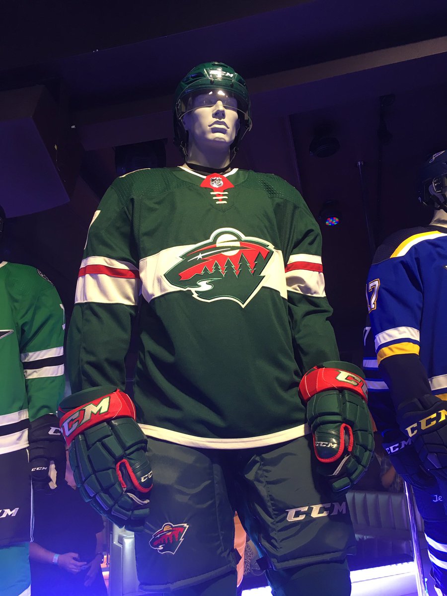
Minnesota and Colorado look great.
Sens, Flames, and Caps among the worst in the league
|
|
|
|
|
06-20-2017, 07:53 PM
|
#228
|
|
Franchise Player
Join Date: Mar 2006
Location: Shanghai
|
I actually like Nashville's the most. Vegas' are pretty ugly. They could have nice away jerseys though with that colour scheme.
__________________
"If stupidity got us into this mess, then why can't it get us out?"
|
|
|
|
|
06-20-2017, 07:53 PM
|
#229
|
|
Resident Videologist
Join Date: Mar 2002
Location: Calgary
|
I like the Vegas ones.
|
|
|
|
|
06-20-2017, 07:53 PM
|
#230
|
|
Franchise Player
Join Date: Dec 2011
Location: Calgary
|
Quote:
Originally Posted by ComixZone
Really? Why? I quite like it.
|
It would be money without the red. I know there's red in their shoulder patch but it looks really out of place on the jersey IMO.
|
|
|
|
|
The Following User Says Thank You to N-E-B For This Useful Post:
|
|
|
06-20-2017, 08:07 PM
|
#231
|
|
Franchise Player
Join Date: Mar 2006
Location: Shanghai
|
Vegas' jersey reminds me of the Thrashers. Not sure why.
__________________
"If stupidity got us into this mess, then why can't it get us out?"
|
|
|
|
|
06-20-2017, 08:14 PM
|
#232
|
|
damn onions
|
Wow. It's crazy how badly the NHL is handling this jersey unveiling thing.
The league's entire collection of jerseys are being renewed with a new contract, some / most uniforms are altered (albeit somewhat) and there's NO info about this event on the NHL website, or Adidas website. Impossible to know when or how to watch it, nobody knows... like this seems like a huge missed opportunity to market the league.
This could have been a televised event probably. Instead it's just... mystery.
Also, additional wow shout out to how bad the NHL website is. Are they trying to be brutal? I just don't get it.
|
|
|
|
|
06-20-2017, 08:14 PM
|
#233
|
|
Acerbic Cyberbully
Join Date: Aug 2003
Location: back in Chilliwack
|
 New 2017-2018 Uniforms: All other teams
Quote:
Originally Posted by JohnnyB
Vegas' jersey reminds me of the Thrashers. Not sure why.
|
You are not alone. It sparked the same memory when I saw the picture.
I can't say it is a bad look, but it is a bit busy for my tastes. I think it is the red striping that is the drawback.
|
|
|
|
|
06-20-2017, 08:18 PM
|
#234
|
|
First Line Centre
Join Date: Oct 2005
Location: Calgary
|
Quote:
Originally Posted by Mr.Coffee
Wow. It's crazy how badly the NHL is handling this jersey unveiling thing.
The league's entire collection of jerseys are being renewed with a new contract, some / most uniforms are altered (albeit somewhat) and there's NO info about this event on the NHL website, or Adidas website. Impossible to know when or how to watch it, nobody knows... like this seems like a huge missed opportunity to market the league.
This could have been a televised event probably. Instead it's just... mystery.
Also, additional wow shout out to how bad the NHL website is. Are they trying to be brutal? I just don't get it.
|
Agreed! The jerseys were originally supposed to be unveiled at the draft then they changed it to today for some reason, yet I can't find where to watch or ever a consistent time that they will be unveiled, I've heard 6pm, 7pm and 8pm our time... looks like it'll be 8pm
|
|
|
|
|
The Following 2 Users Say Thank You to sec304 For This Useful Post:
|
|
|
06-20-2017, 08:23 PM
|
#235
|
|
Franchise Player
Join Date: Sep 2013
Location: Brisbane
|
Quote:
Originally Posted by N-E-B
It would be money without the red. I know there's red in their shoulder patch but it looks really out of place on the jersey IMO.
|
Completely agree. Jerseys should ideally have a max of three colours but can sometimes get away with four. Adding red to a jersey that already has grey, gold, black, and white is unnecessary.
__________________
The masses of humanity have always had to surf.
|
|
|
|
|
The Following User Says Thank You to FireGilbert For This Useful Post:
|
|
|
06-20-2017, 08:25 PM
|
#236
|
|
Retired
Join Date: Dec 2014
Location: Back in Guelph
|
Nm
|
|
|
|
|
06-20-2017, 08:39 PM
|
#237
|
|
First Line Centre
Join Date: Oct 2005
Location: Calgary
|
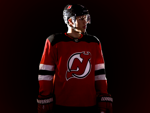
Weird to see the Devils change.... and for the worse 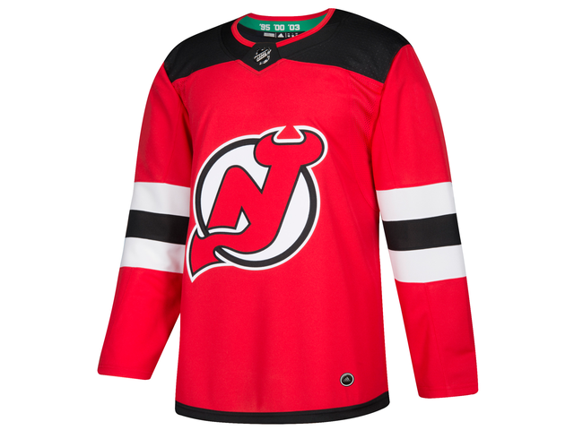
|
|
|
|
|
The Following User Says Thank You to sec304 For This Useful Post:
|
|
|
06-20-2017, 08:46 PM
|
#238
|
|
Scoring Winger
|
I like the Vegas jersey. It did immediately bring to mind Arizona though.
Last edited by Playfair; 06-20-2017 at 08:55 PM.
|
|
|
|
|
The Following User Says Thank You to JurassicTunga12 For This Useful Post:
|
|
|
06-20-2017, 08:54 PM
|
#240
|
|
#1 Goaltender
|
Wild Jersey, giant picture
|
|
|
|
|
The Following 2 Users Say Thank You to Nsd1 For This Useful Post:
|
|
 Posting Rules
|
You may not post new threads
You may not post replies
You may not post attachments
You may not edit your posts
HTML code is Off
|
|
|
All times are GMT -6. The time now is 09:26 AM.
|
|