 08-21-2018, 06:38 PM
|
#2321
|
|
Farm Team Player
Join Date: Jul 2005
Exp: 
|
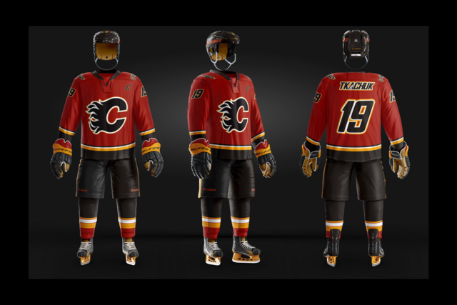
You're not wrong. Although I do like the Atlanta alternates' A.
Quote:
Originally Posted by Coach

The flaming C as the Captains C is the worst idea in the history of sports teams. Its worse than the horsehead. Its worse than the wordmark thirds.
Its just... worse.
|
|

|

|
|
The Following 5 Users Say Thank You to ignite For This Useful Post:
|
|
|
08-21-2018, 06:39 PM
|
#2322
|
|
Franchise Player
Join Date: Aug 2007
Location: Vancouver
|
Quote:
Originally Posted by ignite
You're not wrong. Although I do like the Atlanta alternates' A.
|
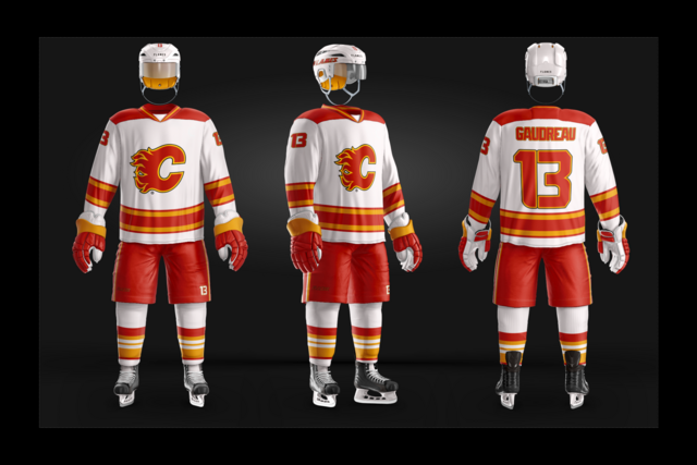
Agreed. It even looks cool in the name bar.
But the double flaming C on the front is just terrible.
__________________

|
|
|
|
|
08-21-2018, 07:02 PM
|
#2323
|
|
All I can get
|
Quote:
Originally Posted by Toonage
|
There were some gawd-awful Devils teams wearing those pyjamas. They were often referred to as "Team Christmas" because they kept gifting wins for opponents.
The era brought about Gretzky's infamous "the Devils are a Mickey Mouse operation" remarks that sparked New Jersey fans to wear Disney mouse ear hats.
Given the Oilers more recent history, those remarks come back as Karma.
Yet another reason the Oilers are No Good™.
__________________
Edmonton is No Good.
|
|
|
|
|
The Following User Says Thank You to Reggie Dunlop For This Useful Post:
|
|
|
08-21-2018, 07:39 PM
|
#2324
|
|
Franchise Player
Join Date: Oct 2001
Location: Calgary, AB
|
Quote:
Originally Posted by Coach
The flaming C as the Captains C is the worst idea in the history of sports teams. Its worse than the horsehead. Its worse than the wordmark thirds.
Its just... worse.
|
I agree terrible.
They made Iginla use a flaming C as the Captain's C for a while until Iginla asked them to change it back to the standard C.
|
|
|
|
|
08-21-2018, 07:44 PM
|
#2325
|
|
Farm Team Player
Join Date: Jul 2005
Exp:
|
Quote:
Originally Posted by Fire
I agree terrible.
They made Iginla use a flaming C as the Captain's C for a while until Iginla asked them to change it back to the standard C.
|
|
|
|
|
|
08-21-2018, 07:56 PM
|
#2326
|
|
First Line Centre
Join Date: Dec 2013
Location: Montréal, QC
|
Quote:
Originally Posted by Fire
I agree terrible.
They made Iginla use a flaming C as the Captain's C for a while until Iginla asked them to change it back to the standard C.
|
I'm pretty sure that was in the Fleury era.
__________________
These guys come in and its always a nice polite one. You serve them because you dont want to cause a scene. And then they become a regular and after awhile they bring a friend. And that dude is cool too.
And THEY bring friends and they stop being cool and then you realize, oh, this is a Nazi bar now. And its too late because theyre entrenched and if you try to kick them out, they cause a PROBLEM. So you have to shut them down.
|
|
|
|
|
08-21-2018, 07:58 PM
|
#2327
|
|
Franchise Player
Join Date: Feb 2006
Location: Calgary, AB
|
Quote:
Originally Posted by Fire
I agree terrible.
They made Iginla use a flaming C as the Captain's C for a while until Iginla asked them to change it back to the standard C.
|
No they didn't. The Flaming C as Captain's C was only used briefly in the late 90s, long before Iginla was named Captain. I believe Fleury and Simpson are the only captains to have worn the Flaming C as the Captain's C.
__________________
Turn up the good, turn down the suck!
|
|
|
|
|
08-21-2018, 08:06 PM
|
#2328
|
|
#1 Goaltender
|
I think the problem with the captains flaming C is that it’s right above the logo which is exactly the same
On the horse head jersey I think it would look cool
|
|
|
|
|
08-21-2018, 08:07 PM
|
#2329
|
|
#1 Goaltender
|
Duplicate
|
|
|
|
|
08-21-2018, 08:08 PM
|
#2330
|
|
#1 Goaltender
|
Like two exact same post right above one another...
|
|
|
|
|
The Following User Says Thank You to red sky For This Useful Post:
|
|
|
08-21-2018, 08:11 PM
|
#2331
|
|
All I can get
|
Quote:
Originally Posted by getbak
No they didn't. The Flaming C as Captain's C was only used briefly in the late 90s, long before Iginla was named Captain. I believe Fleury and Simpson are the only captains to have worn the Flaming C as the Captain's C.
|
IIRC, it was the league stepping in.

__________________
Edmonton is No Good.
|
|
|
|
|
08-21-2018, 10:38 PM
|
#2332
|
|
Franchise Player
Join Date: Oct 2001
Location: Calgary, AB
|
Quote:
Originally Posted by getbak
No they didn't. The Flaming C as Captain's C was only used briefly in the late 90s, long before Iginla was named Captain. I believe Fleury and Simpson are the only captains to have worn the Flaming C as the Captain's C.
|
Must of confused Iginla with Fleury. Easy to do. Basically identical players...
|
|
|
|
|
08-22-2018, 12:22 AM
|
#2333
|
|
Farm Team Player
Join Date: Jul 2005
Exp:
|
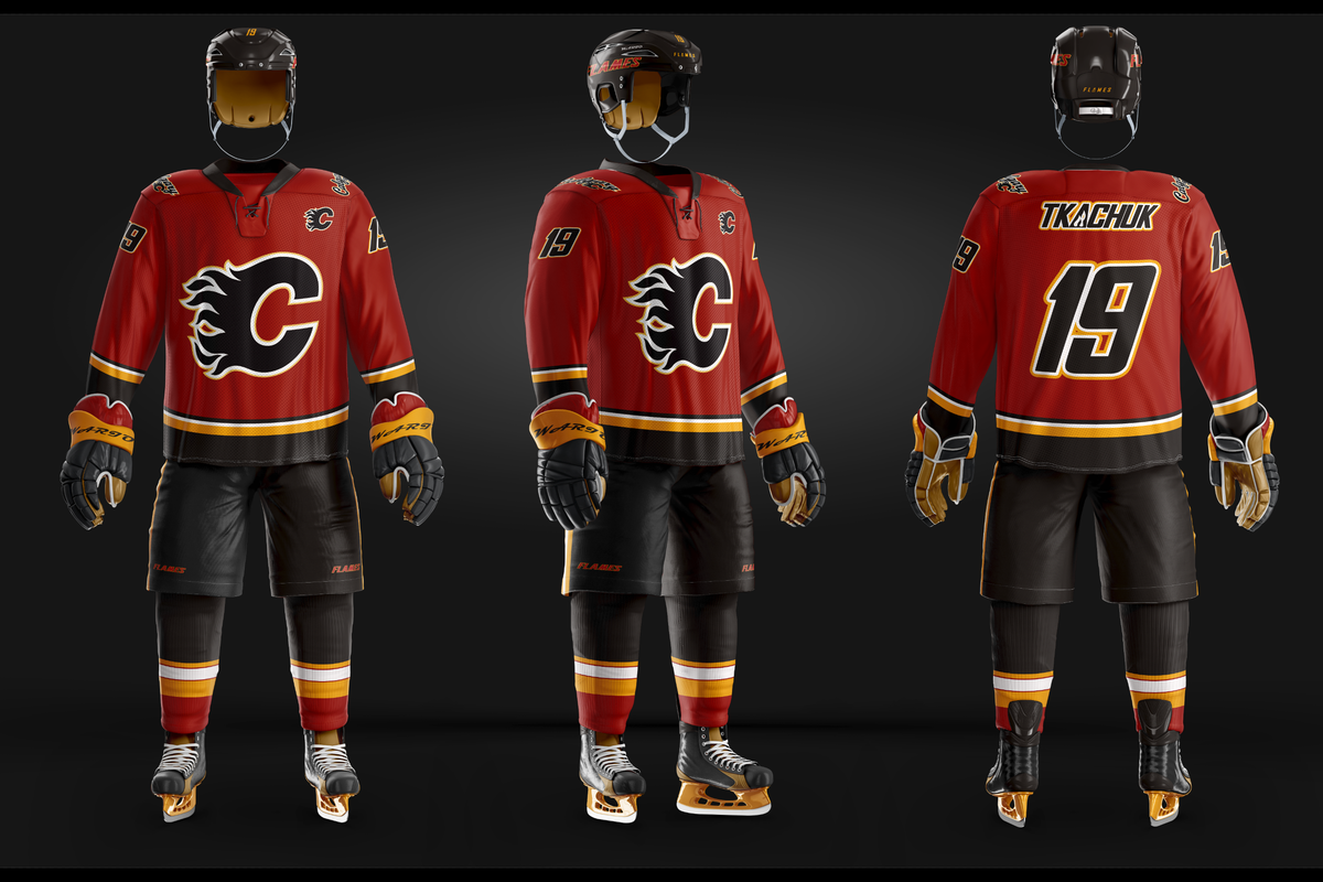
Another Jersey. I may keep going until the Photoshop trial is done.
Font is from the Seahawks. Coming up with new striping ideas is a pain in the arsenal. I went with the classic this time (Not the socks, obviously). 
|
|
|
|
|
The Following 9 Users Say Thank You to ignite For This Useful Post:
|
|
|
08-22-2018, 01:08 AM
|
#2334
|
|
First Line Centre
Join Date: Aug 2009
Location: About 5200 Miles from the Dome
|
If you use a different player you will have more room for your design.
__________________
You have enemies? Good. That means you've stood up for something, sometime in your life.
Winston Churchill
|
|
|
|
|
08-22-2018, 01:21 AM
|
#2335
|
|
Farm Team Player
Join Date: Jul 2005
Exp:
|
Quote:
Originally Posted by Chingas
If you use a different player you will have more room for your design.
|
That's funny!
These racing stripes I feel are pretty sharp!!
I blame the meds. 
|
|
|
|
|
08-22-2018, 01:30 AM
|
#2336
|
|
First Line Centre
|
Quote:
Originally Posted by ignite
Alright, alright, alright!!
Future Captain. IMHO
The brown leather is a tribute to the old school leather gloves and skates.
WARIO is the glove manufacturer now. LOL
I'm not a huge fan of the shoulder Logo, but have no alternatives.
I would buy this!
Ken King, please call to offer me a design contract. 
 |
Would you be able to share the PSD file you're using? I'd love to take a swing at some of these.
__________________

|
|
|
|
|
08-22-2018, 01:41 AM
|
#2337
|
|
Farm Team Player
Join Date: Jul 2005
Exp:
|
https://sportstemplates.net
I'm sure enjoying it. I've always wondered why so many jersey designs suck... It's because it's bloody tough to do.
Quote:
Originally Posted by Cole436
Would you be able to share the PSD file you're using? I'd love to take a swing at some of these.
|
|
|
|
|
|
The Following User Says Thank You to ignite For This Useful Post:
|
|
|
08-22-2018, 07:22 AM
|
#2338
|
|
Franchise Player
Join Date: Aug 2007
Location: Ontario
|
They're looking good! Really well done for just introducing yourself to it.
I remember clear as day being mind-@&*ed just trying to resize an image before understanding what I do in that program.
A couple things I'll suggest would be moving the arm striping up a bit, and you could probably get away with a big bigger fonts. This guy has a pretty good baseline established:

You should also look to have a bit more daylight between your numbers and letters. I think you're adding stroke to live text - so look to adjust tracking in the Character panel to get that spacing back.
Keep having fun with it! If you're not into Photoshop beyond the trial, check out free (or at least much cheaper) options out there.
|
|
|
|
|
The Following User Says Thank You to Split98 For This Useful Post:
|
|
|
08-22-2018, 07:24 AM
|
#2339
|
|
Franchise Player
Join Date: Aug 2007
Location: Ontario
|
Quote:
Originally Posted by ignite
That's funny!
These racing stripes I feel are pretty sharp!!
I blame the meds.
|
You should give a Nashville or Blues concept a try 
|
|
|
|
|
The Following User Says Thank You to Split98 For This Useful Post:
|
|
|
08-22-2018, 08:53 AM
|
#2340
|
|
Franchise Player
Join Date: Sep 2013
Location: Brisbane
|
Quote:
Originally Posted by ignite
Another Jersey. I may keep going until the Photoshop trial is done.
Font is from the Seahawks. Coming up with new striping ideas is a pain in the arsenal. I went with the classic this time (Not the socks, obviously).
|
I like the font because it makes the dead space in 13 look like a C.
__________________
The masses of humanity have always had to surf.
|
|
|
|
|
The Following 5 Users Say Thank You to FireGilbert For This Useful Post:
|
|
 Posting Rules
|
You may not post new threads
You may not post replies
You may not post attachments
You may not edit your posts
HTML code is Off
|
|
|
All times are GMT -6. The time now is 06:47 PM.
|
|


