|
View Poll Results: Best Flames Jersey Design All Time
|
|
Original (Retro) 1980-1994
|
   
|
221 |
70.83% |
|
Angled Podium 1995-2000
|
  
|
8 |
2.56% |
|
Horse-head Black 1998-2006
|
  
|
13 |
4.17% |
|
2004 Era (V bottom) 2003-2007
|
  
|
50 |
16.03% |
|
Current Set 2007-2016
|
  
|
17 |
5.45% |
|
Current 3rd 2013-2016
|
  
|
3 |
0.96% |
 03-22-2016, 03:26 PM
|
#141
|
|
First round-bust
Join Date: Feb 2015
Location: speculating about AHL players
|
I think I'll go get one customized with 'Backstrom' on the back. Who's with me?
__________________
Need a great deal on a new or pre-owned car? Come see me at Platinum Mitsubishi 2720 Barlow Trail NE
|

|

|
|
03-22-2016, 03:47 PM
|
#142
|
|
In the Sin Bin
|
Quote:
Originally Posted by New Era

If the abominations that Addidas created for the World Cup are any indication, I don't want them rebranding anything for the Flames. I mean, what the heck is that thing on the front of the Canadian jersey??? How go you screw up a white maple leaf???
|
Agreed. The Canadian jersey looks like what a third-rate DC Comics superhero would wear. It's just terrible.
|
|
|
|
|
03-22-2016, 04:01 PM
|
#143
|
|
Crash and Bang Winger
Join Date: Aug 2011
Location: East of the Rockies, West of the rest
|
Quote:
Originally Posted by RM14
But what i mean is, why discontinue a popular Jersey?
|
I've been asking myself that since they decided to do it. My guess is that they brought in a fresh look alternate to go along with the fresh look Flames of 2013. Whatever their reasoning was, I think it's safe to say that it was a mistake.
|
|
|
|
|
03-22-2016, 04:19 PM
|
#144
|
|
Franchise Player
Join Date: Jun 2006
Location: Calgary, Alberta
|
For any of the graphic designers here, would be cool to see what a retro theme Flames jersey would look like with the Adidas world cup of hockey template.
|
|
|
|
|
03-22-2016, 04:22 PM
|
#145
|
|
First Line Centre
Join Date: Oct 2009
Location: Calgary
|
Wow, there have been some bad word mark based jerseys in recent memory. I am glad our three years are done! The Flames third actually stacks up nicely against most of these.
|
|
|
|
|
03-22-2016, 04:27 PM
|
#146
|
|
Franchise Player
Join Date: Feb 2006
Location: Calgary
|
I don't even remember that Buffalo word mark jersey.
__________________
The Quest stands upon the edge of a knife. Stray but a little, and it will fail, to the ruin of all. Yet hope remains while the Company is true. Go Flames Go!
Pain heals. Chicks dig scars. Glory... lasts forever.
|
|
|
|
|
03-22-2016, 04:29 PM
|
#147
|
|
Franchise Player
|
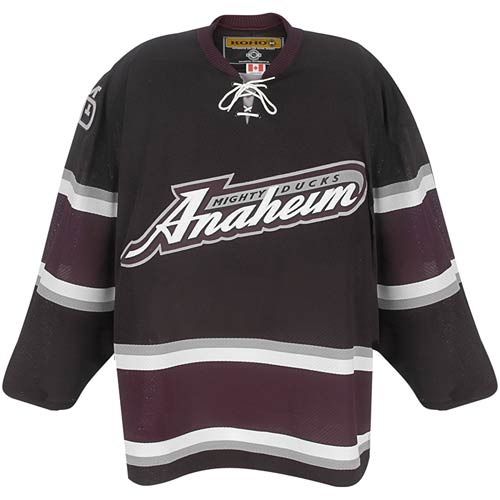
The Buffalo one I do. Short lived. Was the Anaheim one even used? In the CCM/Koho era? That I don't remember at all.
|
|
|
|
|
03-22-2016, 04:31 PM
|
#148
|
|
Taking a while to get to 5000
|
Quote:
Originally Posted by kunkstyle
The Buffalo one I do. Short lived. Was the Anaheim one even used? In the CCM/Koho era? That I don't remember at all.
|
I seem to recall pics of Fedorov in one, but I may be out to lunch on that.
Edit: Found it. Best I can do, sorry can't embed...
http://www.sportsbusinessdaily.com/D...p-Reasons.aspx
Last edited by Toonage; 03-22-2016 at 04:33 PM.
|
|
|
|
|
The Following User Says Thank You to Toonage For This Useful Post:
|
|
|
03-22-2016, 04:36 PM
|
#149
|
|
Franchise Player
Join Date: Feb 2006
Location: Calgary, AB
|
Quote:
Originally Posted by kunkstyle
The Buffalo one I do. Short lived. Was the Anaheim one even used? In the CCM/Koho era? That I don't remember at all.
|
It was their alternate jersey starting in 2003-04. They wore it until they changed their uniforms completely in 2006-07.
They actually wore it as their home jersey during the 2006 playoffs.
__________________
Turn up the good, turn down the suck!
|
|
|
|
|
The Following User Says Thank You to getbak For This Useful Post:
|
|
|
03-22-2016, 04:54 PM
|
#150
|
|
Powerplay Quarterback
|
Quote:
Originally Posted by Joborule
For any of the graphic designers here, would be cool to see what a retro theme Flames jersey would look like with the Adidas world cup of hockey template.
|
I might give this a whirl tonight. Any teams template stand out to you as better than the others?
|
|
|
|
|
03-22-2016, 04:58 PM
|
#151
|
|
First Line Centre
Join Date: Oct 2009
Location: Calgary
|
Quote:
Originally Posted by kunkstyle
The Buffalo one I do. Short lived. Was the Anaheim one even used? In the CCM/Koho era? That I don't remember at all.
|
Pretty sure Anaheim wore that one at home during the 06' first round series against the Flames.
|
|
|
|
|
The Following User Says Thank You to RM14 For This Useful Post:
|
|
|
03-22-2016, 05:06 PM
|
#152
|
|
Franchise Player
Join Date: Jun 2006
Location: Calgary, Alberta
|
Quote:
Originally Posted by Scary Eloranta
I might give this a whirl tonight. Any teams template stand out to you as better than the others?
|
Russia and USA's replicate close to what I would have in mind.
|
|
|
|
|
03-22-2016, 05:13 PM
|
#153
|
|
Scoring Winger
Join Date: Dec 2015
Location: Calgary via Palm Desert
|
Quote:
Originally Posted by the_only_turek_fan
They are 50% off right now at Jersey City.
Guys working there said they are going back to the retros for third jerseys in 2016-16.
|
They've been 50% off for about a month. No one knows yet what we will be using in 16/17. Could be the retros, could be something new altogether.
Last edited by TheOnlyBilko; 03-22-2016 at 05:39 PM.
|
|
|
|
|
03-22-2016, 05:24 PM
|
#154
|
|
Franchise Player
Join Date: Dec 2005
Location: back in the 403
|
Buffalo's were only cool because at the time, they were still wearing their 90s era black/red unis. So it was a kind of throwback look to their original - and now current - uniforms.
|
|
|
|
|
03-22-2016, 05:28 PM
|
#155
|
|
Scoring Winger
Join Date: Dec 2015
Location: Calgary via Palm Desert
|
$104 I bought mine on Feb 16

|
|
|
|
|
03-22-2016, 05:34 PM
|
#156
|
|
First Line Centre
Join Date: Oct 2009
Location: Calgary
|
With all this 3rd jersey talk, this is the first time I have ever noticed that the Regular vs the 3rd jersey full set-up is mostly just the socks and arms reversed, no piping and black shoulders. Take the best elements between the two and we have a better Jersey.

|
|
|
|
|
03-22-2016, 05:40 PM
|
#157
|
|
Retired
Join Date: May 2004
Location: Pacific Ocean
|
How good would Sam & the boys look in these full time

|
|
|
|
|
The Following 15 Users Say Thank You to socalwingfan For This Useful Post:
|
bc-chris,
Dion,
Fire of the Phoenix,
GreenLantern2814,
Hack&Lube,
Hockey Fan #751,
icecube,
Mightyfire89,
Mustache,
redflamesfan08,
RM14,
Sainters7,
Scary Eloranta,
TheScorpion,
the_only_turek_fan
|
|
03-22-2016, 05:51 PM
|
#159
|
|
In the Sin Bin
Join Date: Dec 2006
Location: compton
|
"We don't like making money off jersey sales, therefore we haven't gone back to the retro uniforms. They would sell like hotcakes, and we can't have that."- Calgary Flames person in charge of merchandise.
|
|
|
|
|
The Following User Says Thank You to icecube For This Useful Post:
|
|
|
03-22-2016, 05:54 PM
|
#160
|
|
Franchise Player
|
Quote:
Originally Posted by bc-chris
|
As word mark Jerseys go, ours and Buffalo's are actually not bad. They're not memorable, but they're fine. Whatever happens, I hope we carry the numbers and shoulder patches of the alternates forward.
I can't stand our current number font, it looks horribly dated. The numbers need to not be tilted, and they need to be slimmer. Fat, off balance numbers can go.
|
|
|
|
|
The Following User Says Thank You to GreenLantern2814 For This Useful Post:
|
|
| Thread Tools |
Search this Thread |
|
|
|
 Posting Rules
|
You may not post new threads
You may not post replies
You may not post attachments
You may not edit your posts
HTML code is Off
|
|
|
All times are GMT -6. The time now is 07:18 AM.
|
|