 06-04-2013, 06:16 PM
|
#101
|
|
Jordan!
Join Date: Jul 2009
Location: Chandler, AZ
|
Gotta say, love em! I love that logo and the shoulder patches
|

|

|
|
06-04-2013, 06:21 PM
|
#102
|
|
Franchise Player
Join Date: Mar 2004
Location: 161 St. - Yankee Stadium
|
Like them. Time for the Flames to lose the weird piping.
|
|
|
|
|
06-04-2013, 06:45 PM
|
#103
|
|
Lifetime Suspension
Join Date: Oct 2012
Location: Halifax
|
It's only the back but the Away one looks way better to me.
|
|
|
|
|
The Following User Says Thank You to $ven27 For This Useful Post:
|
|
|
06-04-2013, 06:50 PM
|
#104
|
|
First Line Centre
|
They are nice. Chicago home in green and the new Carolina away with green shoulder
|
|
|
|
|
06-04-2013, 06:51 PM
|
#105
|
|
Franchise Player
Join Date: Oct 2006
Location: Calgary
|
If the green was slightly darker and there was a different non clip art looking logo it would be perfect.
|
|
|
|
|
06-04-2013, 06:56 PM
|
#106
|
|
Franchise Player
|
Quote:
Originally Posted by lazypucker

They are nice. Chicago home in green and the new Carolina away with green shoulder
|
These were my thoughts exactly.
|
|
|
|
|
06-04-2013, 07:07 PM
|
#107
|
|
Franchise Player
Join Date: Mar 2004
Location: Chilliwack, B.C
|
finally hockey jerseys are looking more like hockey jerseys again.
|
|
|
|
|
The Following 5 Users Say Thank You to calgaryred For This Useful Post:
|
|
|
06-04-2013, 07:23 PM
|
#108
|
|
Franchise Player
Join Date: Oct 2001
Location: Kalispell, Montana
|
Huge improvement. Instantly a top 10 jersey.
__________________
I am in love with Montana. For other states I have admiration, respect, recognition, even some affection, but with Montana it is love." - John Steinbeck
|
|
|
|
|
06-04-2013, 07:33 PM
|
#109
|
|
Lifetime Suspension
|
They remind me of the North Dakota Fighting Sioux.
|
|
|
|
|
06-04-2013, 07:39 PM
|
#110
|
|
Lifetime Suspension
|
Those are awesome Jerseys.
I love this trend moving away from italicized name fonts and futuristic looking just because we should be futuristic looking.
|
|
|
|
|
06-04-2013, 07:40 PM
|
#111
|
|
damn onions
|
The green should be darker. They're okay. Not sure the need for the new logo, if your dropping the gold just change the original logo to silver outlining but keep the same design.
|
|
|
|
|
06-04-2013, 07:42 PM
|
#112
|
|
Lifetime Suspension
|
Quote:
Originally Posted by TopChed
Those aren't bad, but the logo still needs work and it really doesn't come close to the North Stars jerseys:

I'd take those over either of the concepts posted. They should just put a simple logo on these and reclaim those colours. |
Yeah, but you are comparing it to probably on of the top 10 NHL Jerseys and logos of all time. That is a pretty high bar to reach.
|
|
|
|
|
06-04-2013, 07:53 PM
|
#113
|
|
Powerplay Quarterback
|
LOVE these jerseys! Just a massive improvement, though really anything would be better than the terrible basketball jerseys they've been wearing the last couple years. I wasn't really sold on the logos when they were leaked on their app but they really stand out well on that green jersey, I think its the silver that helps with that. A simple, clean design with no crazy vertical stripes or piping.
The league as a whole needs more color and this green jersey is a step in the right direction. I was so bummed when the Kings took their purple and gold jersey out of rotation.
__________________
"If the oceans was whiskey and I was a duck, I'd swim to the bottom and never come up, but the oceans ain't whiskey, and I ain't no duck, so I'll play the Jack of Diamonds and toast to my luck..."
|
|
|
|
|
06-04-2013, 07:56 PM
|
#114
|
|
First Line Centre
Join Date: Feb 2010
Location: Calgary
|
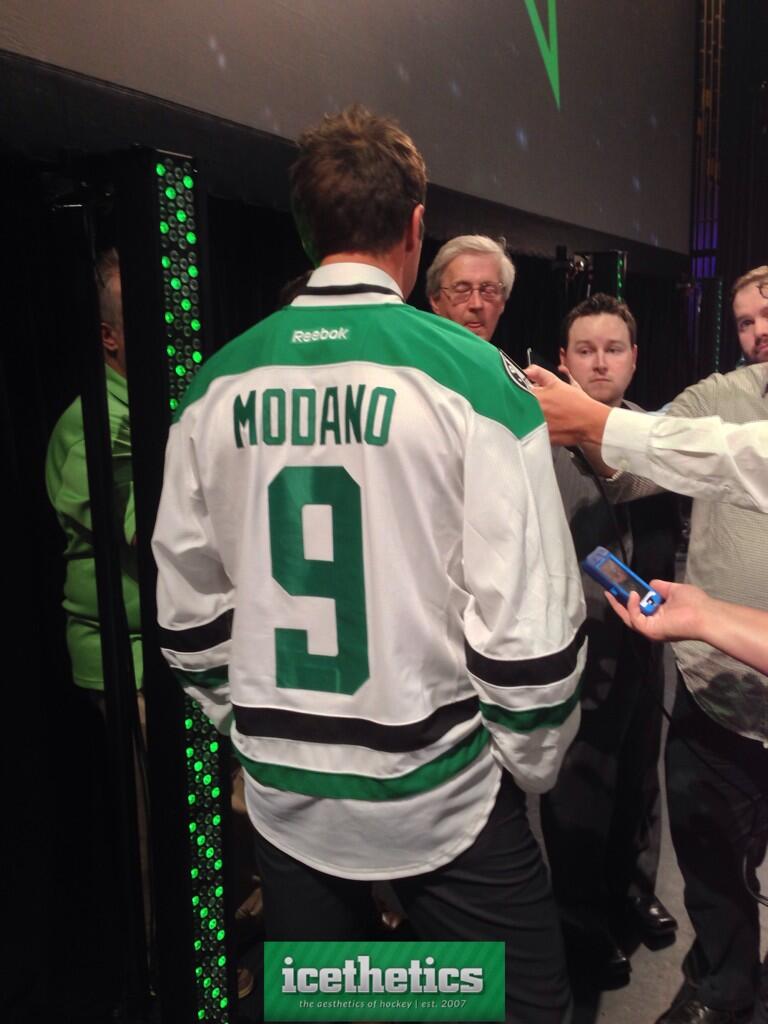
As far as I'm concerned Dallas just nailed it with this redesign. I know not everyone is feeling the "D" primary crest but I think it works so well with the overall package that it's a winner.
And the stripping pattern brings to mind the Whalers old threads, aka: the greatest jersey of all time.
|
|
|
|
|
The Following 3 Users Say Thank You to Regular_John For This Useful Post:
|
|
|
06-04-2013, 07:57 PM
|
#115
|
|
Franchise Player
Join Date: Dec 2008
Location: Calgary, Alberta
|
Really impressed with the jerseys. The logo passes the "can an 8 year old draw it in his notebook" test, which as silly as it sounds, is really important IMO.
Like how they moved away from the Minnesota green, but didn't go too far. The silver is growing on me, and makes more sense for Texas, as well as stars, they are more silvery in the night sky than gold anyways.
|
|
|
|
|
06-04-2013, 08:14 PM
|
#116
|
|
Lifetime Suspension
Join Date: Mar 2002
Location: Sydney, NSfW
|
the logo looks very amateurish, like something Joe Bozo whipped up during his lunch break for his beer league team and still had time to finish his sandwich
|
|
|
|
|
06-04-2013, 08:23 PM
|
#118
|
|
Franchise Player
Join Date: Jun 2006
Location: Calgary, Alberta
|
Quote:
Originally Posted by calgaryred
finally hockey jerseys are looking more like hockey jerseys again.
|
Agree. Love the trend of going back to what worked.
|
|
|
|
|
06-04-2013, 08:26 PM
|
#119
|
|
Franchise Player
|
I really like these jerseys. Well done Dallas!
|
|
|
|
|
06-04-2013, 09:31 PM
|
#120
|
|
Scoring Winger
Join Date: Nov 2006
Location: Calgary, AB
|
The Stars jersey aren't bad...is it coincidence that them and the Canes are going back towards the more traditional striping at the bottom of the jerseys? I like them, although, I would hate for other future re-designs to all look like kind of the same except for the colouring.
I was hoping they would go back to something like they had from their cup win in '99.
|
|
|
|
| Thread Tools |
Search this Thread |
|
|
|
 Posting Rules
|
You may not post new threads
You may not post replies
You may not post attachments
You may not edit your posts
HTML code is Off
|
|
|
All times are GMT -6. The time now is 05:19 AM.
|
|


