|
View Poll Results: Hiow do you like the leaked jersey?
|
|
Like
|
   
|
185 |
24.03% |
|
Dislike
|
  
|
585 |
75.97% |
 10-24-2013, 01:35 PM
|
#601
|
|
Owner
Join Date: Dec 2001
Location: Calgary
|
I said it 23 and 28 pages ago, but they are growing on me a lot
Like the jersey, don't like the word art on the front
|

|

|
|
The Following User Says Thank You to Bingo For This Useful Post:
|
|
|
10-24-2013, 01:43 PM
|
#602
|
|
First Line Centre
Join Date: Oct 2005
Location: Calgary
|
Quote:
Originally Posted by Bingo

I said it 23 and 28 pages ago, but they are growing on me a lot
Like the jersey, don't like the word art on the front
|
Agreed!
red jersey? check
horizontal striping? check
new and decent shoulder crest? check
I like the number and name fonts too!
My dislikes are:
-the script writing at the front, although if it was the flaming C, our home jerseys and these would look redundant.
-don't really like the shoulders, I wish the whole jersey was red.
Considering Ken King was going to put out an all black third jersey with a script front a few years ago, this is a much better idea.
|
|
|
|
|
10-24-2013, 01:47 PM
|
#603
|
|
Franchise Player
|
Quote:
Originally Posted by Howie_16
That pedestal design is the worst in Flames history, flags and piping included.
|
I'm definitely in the minority but the red pedestal jersey is easily my favorite jersey the Flames have ever worn. I proudly wear it everytime I'm at the Dome. Now that I actually think about it, I think it is the white C (and white shoulders) I like so much about it. Much better than a black C in my opinion.
These new jerseys are growing on me. I look forward to seeing them overtop of shoulder pads to get a better impression.
|
|
|
|
|
10-24-2013, 02:37 PM
|
#604
|
|
Franchise Player
Join Date: Dec 2011
Location: Calgary
|
These new 3rds, call me crazy, but I really like them. I like the word mark on them. They're clean, simple, and unique. The only change I would make would be to get rid of the flaming C under the word mark. I will be buying one the day they are released, getting "Monahan 23" on the back, and wearing it to the dome. I've been wearing my retro for 2 years now. Time for a change.
|
|
|
|
|
10-24-2013, 03:45 PM
|
#605
|
|
Unfrozen Caveman Lawyer
Join Date: Oct 2002
Location: Crowsnest Pass
|
Quote:
Originally Posted by Bingo
I said it 23 and 28 pages ago, but they are growing on me a lot
Like the jersey, don't like the word art on the front
|
I agree, but the word art is the focal point of the entire jersey. It ruins everything that is good about the uniform for me. It really is no better than the Wal-Mart knock-offs.
|
|
|
|
|
The Following 4 Users Say Thank You to troutman For This Useful Post:
|
|
|
10-24-2013, 04:06 PM
|
#606
|
|
First Line Centre
Join Date: Nov 2009
Location: TEXAS!!
|
After much soul-searching and reconsideration, I still think this is the 2nd worst Flames jersey ever. Second only to the Ronald McDonald threads.
__________________
I am a lunatic whose world revolves around hockey and Oilers hate.
|
|
|
|
|
10-24-2013, 04:26 PM
|
#607
|
|
Scoring Winger
Join Date: Dec 2010
Location: Cowtown
|
Who do they have picking these things?
It's like they go out of their way to find the most bland uniform so that it wont upset the 60 year old ultra conservative lady behind the glass, who stops Ken King, because she thinks they have a relationship, in the hallways of the Saddledome every time she sees him.
Let's step outside our comfort zone and do something no one else has!! At least it would be refreshing, new, and totally our own.
It's a Calgary Flames third jersey not an NHL template that we need to follow.
Grow a pair Ken King and be unique and enterprising.
I would laugh if wasn't so damn depressing. If it comes to pass then someone should lose their job over this.
Ken King are you listening??
__________________

Last edited by klikitiklik; 10-24-2013 at 04:38 PM.
Reason: forgot words
|
|
|
|
|
10-24-2013, 04:29 PM
|
#608
|
|
#1 Goaltender
|
__________________
"I think the eye test is still good, but analytics can sure give you confirmation: what you see...is that what you really believe?"
Scotty Bowman, 0 NHL games played
|
|
|
|
|
The Following 4 Users Say Thank You to united For This Useful Post:
|
|
|
10-24-2013, 04:35 PM
|
#609
|
|
Powerplay Quarterback
Join Date: Aug 2005
Location: Sunny California
|
Unfortunate choice in jersey design. Looks like garbage.
__________________


|
|
|
|
|
10-24-2013, 05:31 PM
|
#610
|
|
Crash and Bang Winger
Join Date: May 2009
Location: Calgary
|
 I like the shoulder logo...
I do like the new shoulder logo - actually looks pretty cool in b/w:

And it looks increasingly likely that these are the new 3rds:

__________________
The Doctor is in
|
|
|
|
|
10-24-2013, 05:40 PM
|
#611
|
|
Franchise Player
Join Date: Feb 2006
Location: Calgary, AB
|
__________________
Turn up the good, turn down the suck!
|
|
|
|
|
10-24-2013, 05:45 PM
|
#612
|
|
In the Sin Bin
|
Quote:
Originally Posted by BACKCHECK!!!
After much soul-searching and reconsideration, I still think this is the 2nd worst Flames jersey ever. Second only to the Ronald McDonald threads.
|
The only thing wrong with the HC jerseys was that they Flames-ized it. They should have kept the Tigers' black and orange, imnsho.
I have a hard time ranking this jersey behind either the pedestal unis, the horse head or our current.
|
|
|
|
|
10-24-2013, 06:04 PM
|
#613
|
|
Franchise Player
Join Date: Jun 2009
Location: Thunder Bay Ontario
|
So is anyone here going to Flames Fest this weekend?
__________________
Fan of the Flames, where being OK has become OK.
|
|
|
|
|
10-24-2013, 06:26 PM
|
#614
|
|
Franchise Player
Join Date: Feb 2006
Location: Calgary, AB
|
Here is the shoulder logo colourized:

And here's today's second teaser photo:
__________________
Turn up the good, turn down the suck!
|
|
|
|
|
10-24-2013, 06:38 PM
|
#615
|
|
Lifetime Suspension
|
For a shoulder patch I love that logo.
|
|
|
|
|
10-24-2013, 06:40 PM
|
#616
|
|
In the Sin Bin
|
Agreed. Would love to see them replace the flags on our primary sets with it.
Because, truthfully, we're at least 3-4 years away from the team changing that. They are going to let the third jersey sales play out before correcting the primaries.
|
|
|
|
|
10-24-2013, 06:44 PM
|
#617
|
|
Powerplay Quarterback
|
Quote:
Originally Posted by M*A*S*H 4077
I'm definitely in the minority but the red pedestal jersey is easily my favorite jersey the Flames have ever worn. I proudly wear it everytime I'm at the Dome.
|
I certainly prefer you wear the Flames' pedestal jersey to the 'Dome over a Canucks or Oilers rag!
Quote:
Originally Posted by klikitiklik
Let's step outside our comfort zone and do something no one else has!! At least it would be refreshing, new, and totally our own.
|
Isn't that what the Sabres did?
|
|
|
|
|
10-24-2013, 06:47 PM
|
#618
|
|
#1 Goaltender
|
Quote:
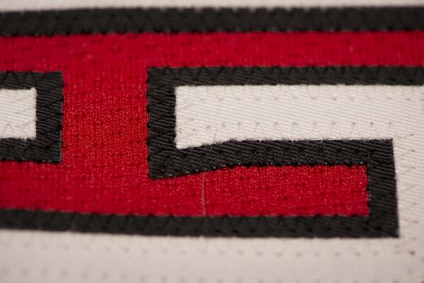
Originally Posted by getbak
Here is the shoulder logo colourized:
And here's today's second teaser photo:
|
Am I missing something? Where could this be on the uni?
|
|
|
|
|
10-24-2013, 06:53 PM
|
#619
|
|
Franchise Player
Join Date: Mar 2002
Location: Calgary
|
Quote:
Originally Posted by bax
Am I missing something? Where could this be on the uni?
|
Guessing...a sideways view of the white "G" in Glencross?
|
|
|
|
|
10-24-2013, 06:53 PM
|
#620
|
|
Lifetime Suspension
|
Quote:
Originally Posted by bax
Am I missing something? Where could this be on the uni?
|
On...the... shoulder?
|
|
|
|
| Thread Tools |
Search this Thread |
|
|
|
 Posting Rules
|
You may not post new threads
You may not post replies
You may not post attachments
You may not edit your posts
HTML code is Off
|
|
|
All times are GMT -6. The time now is 06:28 AM.
|
|


