Is it trying to replicate a cape? Really horrible. And you'd think that having the buffalo in the logo would make putting the city name on it redundant.
Was this something from the Guardian Project that they forgot to throw in the garbage?
Is it trying to replicate a cape? Really horrible. And you'd think that having the buffalo in the logo would make putting the city name on it redundant.
Was this something from the Guardian Project that they forgot to throw in the garbage?
Why? What's so redundant about the Buffalo Buffalo Sabres?
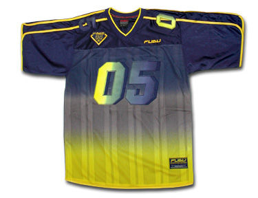
I don't think they're worse than the Ducks' Wild Wing jersey or even the Islanders current third. I'd put it on par with the Canucks' gradient jersey.
OK the ducks Wild Wing jersey could, maybe, possibly be worse. But it's pretty close. The Islanders current third is pretty bad, but the striping is still somewhat classic so I give the Islanders the slight edge.
What the #### were the Sabres thinking? Seriously what the #### is going on in their head? You have to be smoking some seriously heavy dope to think this is even remotely good.
If I'm a Sabres fan, I'm absolutely livid that some jackass in the marketing department wants to embarrass the team like this. This is inexcusably bad.
I think this falls in the category of worst nhl jersey in nhl history. The wild wing jersey was silly and cartoonish, but wasn't a complete abomination. The Isles isn't that bad either in comparison.
How they managed to screw up everything on the jersey is amazing. I don't know how they managed. It would take a lot of effort to make something that bad.
__________________ Fireside Chat - The #1 Flames Fan Podcast - FiresideChat.ca
I think this falls in the category of worst nhl jersey in nhl history. The wild wing jersey was silly and cartoonish, but wasn't a complete abomination. The Isles isn't that bad either in comparison.
How they managed to screw up everything on the jersey is amazing. I don't know how they managed. It would take a lot of effort to make something that bad.
The Wild Wing jersey should be in the conversation for best jersey ever. That thing was awesome.
I have no Photoshop skills but would like to see a similar jersey mocked up without any of the grey/silver accents. Think it would be actually decent without those additions.
The Following 2 Users Say Thank You to SuperMatt18 For This Useful Post:
'Remember the car Homer Simpson designed? Well I want that in a jersey'. Said someone in the Buffalo Sabres organization.
__________________
The Quest stands upon the edge of a knife. Stray but a little, and it will fail, to the ruin of all. Yet hope remains while the Company is true. Go Flames Go!