 05-02-2012, 08:30 PM
|
#141
|
|
Franchise Player
|
Quote:
Originally Posted by tomo

Here is my updated design with changes from feedback.
Thanks for the feedback guys.
- made numbers and "C" white for improved readability.
- Added silver outline around numbers and logos.
- made charcoal cloth of jersey and socks a bit lighter (to avoid one big black blob).
 |
Quote:
Originally Posted by tomo
My third jersey concept.
Charcoal body with Black pants charcoal socks.
Crests (flaming C, numbers, & both flags) in graphite & silver
hope you like.
 |
Loving both sets of Black/charcoal unis you created.
I think it'd be great to have one of those, or something like that as a third....
|

|

|
|
05-02-2012, 08:40 PM
|
#142
|
|
Franchise Player
Join Date: Jun 2011
Location: STH since 2002
|
Good concept with one change, the Flaming C being red with a yellow border.
__________________

Last edited by Stay Golden; 05-02-2012 at 11:04 PM.
|
|
|
|
|
The Following User Says Thank You to Stay Golden For This Useful Post:
|
|
|
05-03-2012, 12:02 AM
|
#143
|
|
Scoring Winger
Join Date: Mar 2012
Location: Halifax, NS
|
Okay, this is a design I made somewhat quickly, but the general idea is there. I've noticed a trend amongst some other teams (Pittsburgh, St. Louis, Florida & Columbus) to make this style as an alternate jersey.
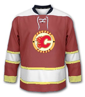
I wouldn't want it as our primary Home jersey, but I'd love it for an alternate.
__________________
"Im on a mission to civilize." - Will McAvoy
|
|
|
|
|
The Following User Says Thank You to JerryUnderscore For This Useful Post:
|
|
|
05-03-2012, 04:14 AM
|
#144
|
|
Franchise Player
|
Quote:
Originally Posted by tomo
Red definitely looks great in HD, but that being said red is also the worst colour on standard definition televisions (which is said to be around 42% of televisions in Canada).
The idea of having another jersey colour option isn't to replace the main jerseys but to add some variety.
|
We are the C of red.
|
|
|
|
|
The Following User Says Thank You to redforever For This Useful Post:
|
|
|
05-03-2012, 05:35 AM
|
#145
|
|
Lifetime Suspension
|
Quote:
Originally Posted by BACKCHECK!!!
I think the current Flames home jersey is one of the best jerseys I've ever seen.
|
Of course, but most people don't buy more than one.
|
|
|
|
|
05-03-2012, 06:20 AM
|
#146
|
|
Franchise Player
Join Date: Sep 2005
Location: Toronto, Ontario
|
Quote:
Originally Posted by JerryUnderscore
Okay, this is a design I made somewhat quickly, but the general idea is there. I've noticed a trend amongst some other teams (Pittsburgh, St. Louis, Florida & C
olumbus) to make this style as an alternate jersey.
I wouldn't want it as our primary Home jersey, but I'd love it for an alternate. |
Replace the thick yellow at the end of the sleeves with black to match the collar, and you got yourself a deal! Looks great!
|
|
|
|
|
05-03-2012, 06:57 AM
|
#147
|
|
Scoring Winger
Join Date: Oct 2003
Location: Geneseo, NY
|
The original jersey and the original black crested flaming C (from last Stanley Cup run) are superb jerseys. Nothing else is needed. The black horse head jersey ranks as the worst jersey in Flames history, yes, worse than pedestal C. Shame on any concept design that removes the flaming C or moves away from red as the primary jersey color.
|
|
|
|
|
The Following 2 Users Say Thank You to Phil Russell For This Useful Post:
|
|
|
05-03-2012, 07:08 AM
|
#148
|
|
Franchise Player
|
Ken...if you are reading this thread please ignore these silly designs and stay the course! These guys all forgot their ADHD meds today!
|
|
|
|
|
The Following 4 Users Say Thank You to Cheese For This Useful Post:
|
|
|
05-03-2012, 07:09 AM
|
#149
|
|
Franchise Player
|
Quote:
Originally Posted by JerryUnderscore
Okay, this is a design I made somewhat quickly, but the general idea is there. I've noticed a trend amongst some other teams (Pittsburgh, St. Louis, Florida & Columbus) to make this style as an alternate jersey.
I wouldn't want it as our primary Home jersey, but I'd love it for an alternate. |
My wife wouldnt wear something this ugly.
|
|
|
|
|
The Following User Says Thank You to Cheese For This Useful Post:
|
|
|
05-03-2012, 08:22 AM
|
#150
|
|
Self-Retirement
|
Quote:
Originally Posted by JerryUnderscore
Okay, this is a design I made somewhat quickly, but the general idea is there. I've noticed a trend amongst some other teams (Pittsburgh, St. Louis, Florida & Columbus) to make this style as an alternate jersey.
I wouldn't want it as our primary Home jersey, but I'd love it for an alternate. |
I understand the concept you are going for, but IMO it doesn't work. Specifically the colours chosen are too feminine (sorry girls) for a NHL team. I know some teams have lighter colours for 3rds and it works for them. But light red is really pink, and pink doesn't fit with a NHL team.
I think the best solution is retro red for home, retro red for away and 2004 red with black c for 3rd.
|
|
|
|
|
05-03-2012, 09:09 AM
|
#151
|
|
Voted for Kodos
|
Quote:
Originally Posted by Phil Russell
The original jersey and the original black crested flaming C (from last Stanley Cup run) are superb jerseys. Nothing else is needed. The black horse head jersey ranks as the worst jersey in Flames history, yes, worse than pedestal C. Shame on any concept design that removes the flaming C or moves away from red as the primary jersey color.
|
This. Black is so 1990s.
|
|
|
|
|
05-03-2012, 09:22 AM
|
#152
|
|
Franchise Player
Join Date: Apr 2004
Location: I don't belong here
|
Tomo made a very nice looking jersey. However I don't feel that black should ever again be the primary colour for a Flames jersey. Black is a great accent colour but the primary should be red or nothing.
|
|
|
|
|
The Following User Says Thank You to Buff For This Useful Post:
|
|
|
05-03-2012, 09:40 AM
|
#153
|
|
Franchise Player
Join Date: Nov 2003
Location: Calgary, AB
|
Guys, it's not black... it's graphite!
|
|
|
|
|
05-03-2012, 11:00 AM
|
#154
|
|
Scoring Winger
Join Date: Mar 2012
Location: Halifax, NS
|
Quote:
Originally Posted by normtwofinger
I understand the concept you are going for, but IMO it doesn't work. Specifically the colours chosen are too feminine (sorry girls) for a NHL team. I know some teams have lighter colours for 3rds and it works for them. But light red is really pink, and pink doesn't fit with a NHL team.
|
Yeah, the red could be darker. I was going more for a maroon, but slightly muted.
__________________
"Im on a mission to civilize." - Will McAvoy
|
|
|
|
|
05-03-2012, 11:15 AM
|
#155
|
|
Crash and Bang Winger
Join Date: Aug 2007
Location: Calgary, AB
|

You know it's spring and the Flames are golfing when the jersey threads are out in full force! 
I'm glad so many of you still enjoy that old set I made waaaay back. I did it when it was announced that Reebok was taking over the NHL jerseys and the only template available at the time was the All-Star template from the previous year. That's exactly what it is - a recolour of the All-star jersey. The only "creative" thing I did was add the Alberta shoulder patches - which, honestly is just a rip-off of what Dallas did... just waaaay better. 
I'm a huge fan of NO BLACK on the jersey. Not even as an accent. That isn't to say I don't like it - I actually love the Black 'C' but I think the Flames have always looked best in Red/Gold/White only. It's just so... classy.
I found this one I did a couple of years ago on my laptop this morning and thought I'd contribute it. Basically just a tweak of our old set. The shoulders might need a nice shoulder patch or something. I just like a clean look. Something our current home/away are NOT.
Anyway, please debate. I love these threads and how completely polarizing some of the opinions are!


|
|
|
|
|
The Following 6 Users Say Thank You to DT77 For This Useful Post:
|
|
|
05-03-2012, 11:19 AM
|
#156
|
|
Franchise Player
Join Date: Apr 2004
Location: I don't belong here
|
Quote:
Originally Posted by Tyler
Guys, it's not black... it's graphite!
|
Is graphite red?
I rest my case.
|
|
|
|
|
05-03-2012, 11:43 AM
|
#157
|
|
Franchise Player
Join Date: Jul 2009
Location: Calgary
|
Bumping these from some discussion before they unveiled the retro 3rds...
I like the shoulder logos on these:


Someone had also posted this shoulderpatch idea:

|
|
|
|
|
05-03-2012, 11:48 AM
|
#158
|
|
Franchise Player
Join Date: Jul 2009
Location: Calgary
|
^ Just noticed these were posted in this thread already; had skipped that page I guess.
Regardless, me still likey.
|
|
|
|
|
05-03-2012, 11:53 AM
|
#159
|
|
Backup Goalie
Join Date: Mar 2010
Location: Seattle
Exp: 
|
Like I have said before, I love the original Flames jerseys and I think our current jerseys are some of the finest in the league. Yes we are the sea of red, yes I love the retro jerseys. I'm not trying to replace any of them, well that's not completely true because I would like my concept to replace the previous black flaming horses head jersey.
My concept is more of an edit than a redesign of our current jerseys. All I have done is changed the colours a bit, added a couple stripes. I did this because personally I like the idea of a black or grey coloured jersey. I think that it adds a bit of variety and gets rid of the homogenization of only having a red or a white jersey.
|
|
|
|
|
The Following User Says Thank You to tomo For This Useful Post:
|
|
|
05-03-2012, 01:10 PM
|
#160
|
|
Franchise Player
Join Date: Oct 2006
Location: San Fernando Valley
|
Quote:
Originally Posted by JerryUnderscore
Okay, this is a design I made somewhat quickly, but the general idea is there. I've noticed a trend amongst some other teams (Pittsburgh, St. Louis, Florida & Columbus) to make this style as an alternate jersey.
I wouldn't want it as our primary Home jersey, but I'd love it for an alternate. |
For some reason when I look at that jersey I think of Flash Gordon.
|
|
|
|
| Thread Tools |
Search this Thread |
|
|
|
 Posting Rules
|
You may not post new threads
You may not post replies
You may not post attachments
You may not edit your posts
HTML code is Off
|
|
|
All times are GMT -6. The time now is 07:26 PM.
|
|


