 05-11-2014, 11:48 PM
|
#901
|
|
Franchise Player
Join Date: Apr 2008
Location: CGY
|
The Flames should absolutely be wearing the jerseys playmaker posted. Great idea adding the vintage design with the 3rd jersey patch. Perhaps a re-designed black flaming C as an alternate?
|

|

|
|
05-11-2014, 11:49 PM
|
#902
|
|
#1 Goaltender
Join Date: Jan 2009
Location: Calgary
|
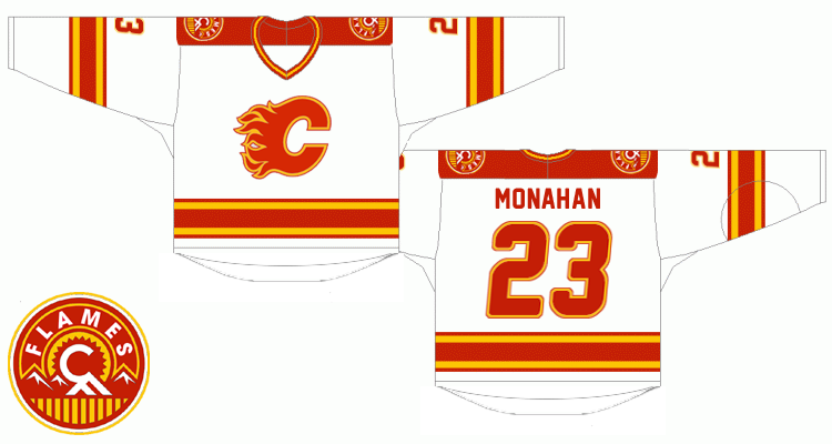
nice concept playmaker. I like it other than the numbers.
Here's another concept I found on icethetics.
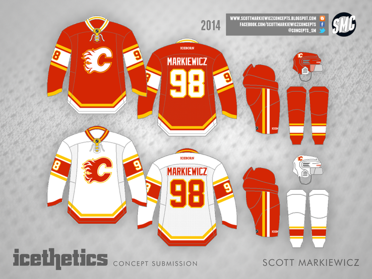
It's clear that no black is the way to go... now Ken King only needs to get on board.
|
|
|
|
|
The Following 3 Users Say Thank You to _Q_ For This Useful Post:
|
|
|
05-11-2014, 11:59 PM
|
#903
|
|
First Line Centre
|
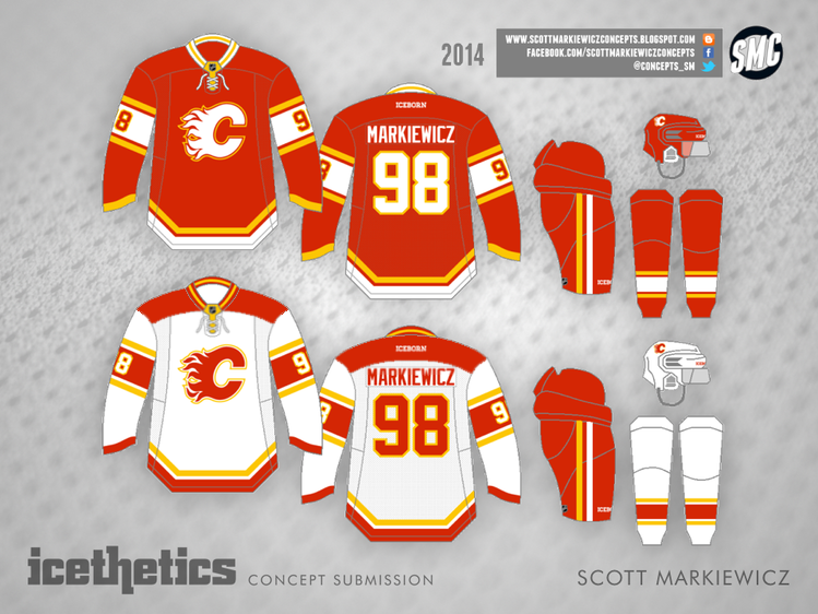
I really liked playmaker's design, and I made a few changes to it.
I increased the logo size and changed the font to be post-retro's font.


__________________

Last edited by Cole436; 05-12-2014 at 02:56 PM.
|
|
|
|
|
The Following 7 Users Say Thank You to Cole436 For This Useful Post:
|
|
|
05-12-2014, 08:00 AM
|
#904
|
|
Powerplay Quarterback
|
Quote:
Originally Posted by _Q_

nice concept playmaker. I like it other than the numbers.
Here's another concept I found on icethetics.
It's clear that no black is the way to go... now Ken King only needs to get on board. |
Sorry, about the question, but would this decision fall under Burke or King? Is it a decision for Hockey Operations Calgary Flames or is it a decision for Calgary Flames Sports and Entertainment?
I also like the no black, but grew up with the 80's Flames and love tradition so I'm very biased.
Hate it on the Stampeders as a side note.
|
|
|
|
|
05-12-2014, 11:19 AM
|
#905
|
|
Franchise Player
Join Date: Dec 2005
Location: back in the 403
|
Damn that shoulder patch looks great without the black. I already like it with the black, but it pops a lot more with just the red/yellow. As for the main logo, I prefer the retro way, with the yellow touching the white crest (as opposed to the red space in between), but otherwise nice concepts guys. That's the thing, I don't even necessarily need the retros to return, as much as I just want to see that colour scheme in general come back. It's just so much flashier and eye-catching than the current ones.
On a side note, thank jebus for the Flames breaking out the retros at least that one time this past season, so my jersey snobness can finally justify getting Backlund with the "A", or Monahan on the retro I picked up this year.
|
|
|
|
|
05-12-2014, 12:12 PM
|
#906
|
|
Lifetime Suspension
Join Date: Jul 2003
Location: Calgary, Alberta
|
Quote:
Originally Posted by _Q_
nice concept playmaker. I like it other than the numbers.
Here's another concept I found on icethetics.
It's clear that no black is the way to go... now Ken King only needs to get on board. |
This is a neat look.
|
|
|
|
|
05-12-2014, 12:33 PM
|
#907
|
|
First Line Centre
|
Quote:
Originally Posted by _Q_
nice concept playmaker. I like it other than the numbers.
Here's another concept I found on icethetics.
It's clear that no black is the way to go... now Ken King only needs to get on board. |
Not bad, I kind of like the updated simplistic look. However, I would change the away jerseys so they have a red bar on the shoulder, rather than be white.
|
|
|
|
|
The Following 4 Users Say Thank You to saXon For This Useful Post:
|
|
|
05-12-2014, 12:43 PM
|
#908
|
|
#1 Goaltender
Join Date: Jan 2009
Location: Calgary
|
^^ love the red shoulders. I think I completes the look.
|
|
|
|
|
05-12-2014, 01:52 PM
|
#909
|
|
Scoring Winger
Join Date: Jul 2011
Location: at home
|
Thanks for the positive feedback. Concerning the font controversy, I don't think that typeface is anywhere close to 'comic' as referred by some people. The proportions are actually quite conservative (see below), so perhaps it was because I skewed the numbers a bit (couldn't find an italic version of the font)

As for the proposed increase of logo size, I'm honestly not a big fan of giant logos mainly because... well this is quite a challenge to describe for a non-native speaker. I mean it gets distorted easily, so when the play is going on you rarelly see the original shape (perhaps with the exception of bigger goalie jerseys) and I don't like that.
In terms of proportions the flames logo is close to the Hawks logo and here's the comparison - I think it should be downsized to cca 90% of its current size.
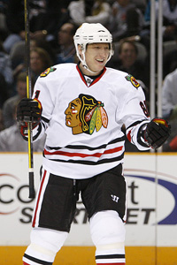

Bigger isn't always better 
|
|
|
|
|
The Following 2 Users Say Thank You to playmaker For This Useful Post:
|
|
|
05-13-2014, 12:11 AM
|
#910
|
|
First Line Centre
Join Date: Mar 2013
Location: YYC
|

Quote:
Originally Posted by playmaker
though i'm in favor of keeping a small amount of black on our jerseys (previously posted bastian schmulling's concept is my favorite) recently i've been playing with retro ideas for slight modifications if the flames decide to go full retro. Here is a concept i created:
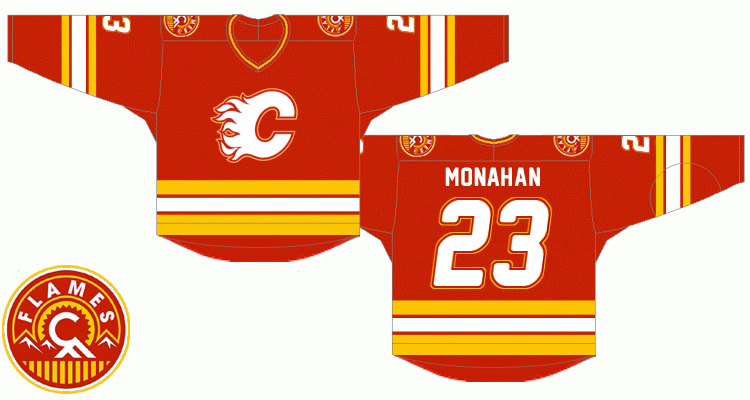
notable changes:
* the red flaming c should be outlined the same way as it is on our current road jersey, yet using red instead of black. In order to unify the outlined look of the logo on both jerseys, the white flaming c would be quite a challenge to adapt but the red and yellow outline combo turned out to be good looking. Same for the numbers.
* lettering - the goal was so that slighly italic and double outline numbers match the logo. As for the typeface itself, i've used the freeware 'new athletic m54' font which imho combines the best of both worlds - sans-serif style from the original retro font and gently rounded corners from the new one.
* squared off yokes are a bit contrversial but i found them perfectly fitting for stars and wild simplistic designs. It's one of those nice little modern touches i'd include, like them a lot.
* as for the shoulder patch, i was quite surprised when i photoshopped out the black because to me it looks sharper without it on both home and road uniforms
any thoughts ? |
ken king please read!!!
__________________

|
|
|
|
|
08-20-2014, 05:27 PM
|
#911
|
|
Crash and Bang Winger
Join Date: May 2009
Location: Calgary
|
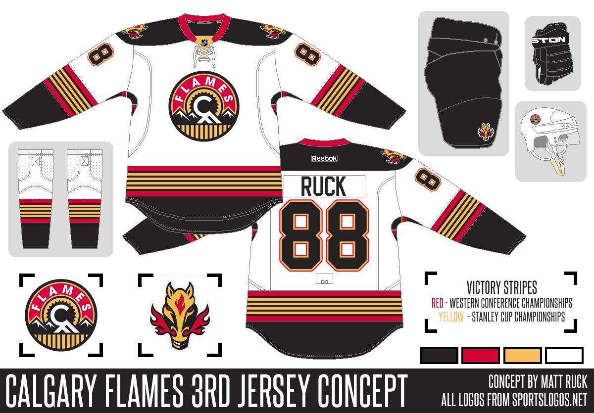
 Another concept
First off - if you don't like this thread - keep your thoughts to yourself. It's for people who like to look at jersey concepts. Also for those who want the current set to change.
So - here's one I found that I kinda like, although it's a bit blackhawk-ish:
__________________
The Doctor is in
|
|
|
|
|
The Following 2 Users Say Thank You to Dr. Pepper For This Useful Post:
|
|
|
08-20-2014, 05:32 PM
|
#912
|
|
Franchise Player
Join Date: Feb 2012
Location: NC
|
Yeah, you're right on the blackhawk-ish look. I wouldn't hate it, in fact I would prefer those over the alternates we have right now. I would love to bring the retro look back more than anything though.
|
|
|
|
|
08-20-2014, 06:03 PM
|
#913
|
|
Franchise Player
Join Date: Oct 2006
Location: Calgary
|
Could you make the white red?
__________________
Fireside Chat - The #1 Flames Fan Podcast - FiresideChat.ca
|
|
|
|
|
08-20-2014, 06:07 PM
|
#914
|
|
Could Care Less
|
Anything that brings back the flaming snot horse head has my vote!
|
|
|
|
|
08-20-2014, 06:16 PM
|
#915
|
|
Franchise Player
Join Date: Oct 2001
Location: Flames fan in Seattle
|
I like that except for the blackhawks feel like you said.
__________________
|
|
|
|
|
08-20-2014, 06:19 PM
|
#916
|
|
Scoring Winger
Join Date: Aug 2005
Location: Down by the sea, where the watermelons grow, back to my home, I dare not go...
|
I chuckle every time I see this thread pop up to the top. Ken King better be reading this thread.
|
|
|
|
|
08-20-2014, 06:25 PM
|
#917
|
|
#1 Goaltender
|
Every time I see that logo I think of the Colorado Rockies, don't know why, its not even that close.
|
|
|
|
|
08-20-2014, 06:35 PM
|
#918
|
|
Franchise Player
Join Date: Jul 2009
Location: Calgary
|
I like this one, except I think a Flames jersey needs a flaming C on it, somewhere... shoulder instead of the horse?
|
|
|
|
|
08-20-2014, 07:07 PM
|
#919
|
|
Powerplay Quarterback
Join Date: Dec 2009
Location: Tokyo, Japan
|
Quote:
Originally Posted by Dr. Pepper
First off - if you don't like this thread - keep your thoughts to yourself. It's for people who like to look at jersey concepts. Also for those who want the current set to change.
So - here's one I found that I kinda like, although it's a bit blackhawk-ish:
|
Why does it have that little legend about Victory Stripes? Looks like 2 Western Conference championships and 4 Stanley Cup championships.
Edit: Oh! In the armpit not the main stripes. Weird. Let's put our championships in the armpit.
|
|
|
|
|
08-20-2014, 08:28 PM
|
#920
|
|
Franchise Player
Join Date: Oct 2001
Location: Behind Nikkor Glass
|
Quote:
Originally Posted by Dr. Pepper
First off - if you don't like this thread - keep your thoughts to yourself.
|
Nope.
|
|
|
|
 Posting Rules
|
You may not post new threads
You may not post replies
You may not post attachments
You may not edit your posts
HTML code is Off
|
|
|
All times are GMT -6. The time now is 05:45 AM.
|
|


