 11-12-2020, 01:32 AM
|
#1
|
|
First round-bust
Join Date: Feb 2015
Location: speculating about AHL players
|
 The best, worst, and weirdest jerseys every NHL team has ever worn
Hey, folks: I love hockey jerseys and, with the impending release of the "Reverse Retro" series, it's time for me to write about them again!
In this thread, I'll be breaking down the best, worst, and weirdest jerseys that every team has ever worn. Will I get pedantic? Yes.
I hope you enjoy this. Please feel free to comment on my choices and share what you would change about my picks!
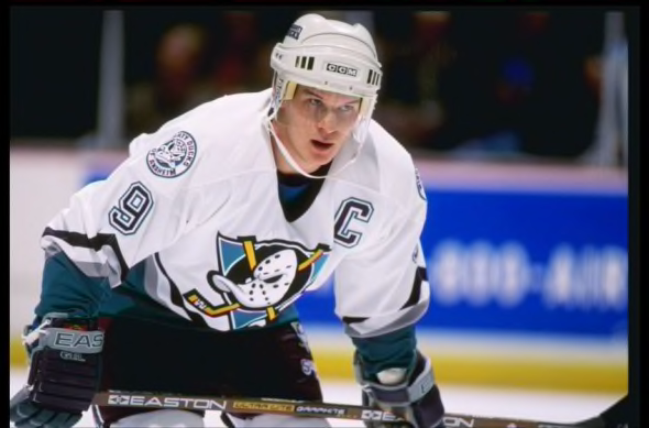
Anaheim Ducks
Best:
 Worn 1995 to 2006
It's too bad that the Ducks didn't win their Cup in these jerseys. They're iconic for good reason. I love the angled diagonal stripe... it's not too busy, but it's bold. The logo is silly, but it's not distractingly bad or out-of-place. The colour scheme is distinctive. In my opinion, the white jersey is cleaner than the purple one (and it's the one Paul Kariya was wearing when he scored the "off the floor/on the board" goal).
Worst:
 Worn 2015 to 2017; 2019 to present
These suck. I hate orange as part of the Ducks' colour scheme, and it's particularly obnoxious on this uniform. With its bland striping pattern and ugly number font, this jersey feels like a relic from 2006 — and not in a good way. Everything about it is terrible.
Weirdest:
 Worn 2018 to 2019
This jersey has seven colours on it. It's such a weird mish-mash of elements from the Ducks' jerseys over the years:
- For some reason, this uniform is primarily black, despite it clearly being based on the Mighty Ducks' old home uniform, which was purple. Why not just make this one purple too?
- The sticks in the main logo are now orange, for some reason, despite them never being orange before and orange not appearing anywhere else on the jersey
- The waist stripe is at a significantly different (and more boring) angle than before
- The Ducks' gold primary logo is on the shoulders, despite gold not appearing anywhere else on the jersey
- The jersey has an ugly green shoulder yoke that has never appeared on any Ducks jersey before (it kind of resembles the shoulders on the little-seen Mighty Ducks fourth jersey from 1997)
Bizarre. Thankfully, the Ducks put this thing out to pasture after just one season, replacing it with... the orange jersey seen in the "worst" section. Great. Combined with their very bad home and away jerseys, the Ducks probably have the worst jersey kit in the league.
It doesn't have to be this way...
So good.
__________________
Need a great deal on a new or pre-owned car? Come see me at Platinum Mitsubishi 2720 Barlow Trail NE
|

|

|
|
The Following 7 Users Say Thank You to TheScorpion For This Useful Post:
|
|
|
11-12-2020, 01:42 AM
|
#2
|
|
First round-bust
Join Date: Feb 2015
Location: speculating about AHL players
|

Arizona Coyotes
Best:
 Worn 1997 to 2003
Hopefully Arizona brings these back soon. The Kachina jerseys are so great, incorporating some of the NHL's least-used colours all together into designs that are way more cohesive than they have any right to be. The black Kachina is fantastic, and I love how it adds beige into the mix, but I think the logo stands out better against the white background. I also love the rounded number font.
Worst:
 Worn 2007 to 2015
Yawwwwwn. These are so boring. The Coyotes inexplicably removed the waist stripe from the previous version of this design when they moved over to Reebok Edge, and the result is a uniform that looks so incomplete that it could masquerade as a practice jersey. But the Coyotes also had their best season ever in this jersey, losing to the Stanley Cup champion L.A. Kings in the 2012 West final. So, if the Flames ever want to make it back to the Cup final, I guess they need to ditch the yellow and black and just run with a Detroit Red Wings-style two-tone jersey. It worked for the Coyotes.
Weirdest:
 Worn 1998 to 2003
This isn't exactly an unexpected choice... but it's the right one. Not many NHL jerseys come adorned with a purple crescent moon and a field of cacti. Also, I just realized that the crest is just a decapitated version of the Kachina coyote, which is a little disturbing.
I think it's pretty likely that the Coyotes' "reverse retro" jersey is a purple version of this one.
__________________
Need a great deal on a new or pre-owned car? Come see me at Platinum Mitsubishi 2720 Barlow Trail NE
|
|
|
|
|
The Following 4 Users Say Thank You to TheScorpion For This Useful Post:
|
|
|
11-12-2020, 01:57 AM
|
#3
|
|
First round-bust
Join Date: Feb 2015
Location: speculating about AHL players
|
Boston Bruins
Best:
 Worn 1981 to 1995
These are slightly different from the jerseys Bobby Orr skated in as a Bruin but, in my opinion, they're better. I'm not a huge fan of shoulder yokes, and I think the numerical font looks sharper on these ones. Even better, this jersey boasts one of the greatest shoulder patches in NHL history.
Worst:
 Worn 1940 to 1944
Yeah, these are pretty old, but they don't get a pass. The Bruins just look weird in yellow, and script logos don't belong on hockey jerseys! These pre-date the spoked "B" and it's clear that, at this point, the Bruins were still very much in an experimental phase with their uniforms. Their next effort wasn't much better...
Weirdest:
 Worn 1948 to 1949
I'm 90% sure that logo was drawn by an 11-year-old. But, believe it or not, that is the first spoked "B" logo ever worn by the Bruins. (Thankfully, it wasn't their final revision). This uniform was worn in commemoration of the Bruins' 25th anniversary and, if you look closely, you can see the numbers "24" and "49" on the spokes of the logo.
Also, what's going on with those socks? My goodness. I think there are more stripes there than there are Bruins Stanley Cups.
__________________
Need a great deal on a new or pre-owned car? Come see me at Platinum Mitsubishi 2720 Barlow Trail NE
|
|
|
|
|
The Following 2 Users Say Thank You to TheScorpion For This Useful Post:
|
|
|
11-12-2020, 02:31 AM
|
#4
|
|
Resident Videologist
Join Date: Mar 2002
Location: Calgary
|
These are definitely the worst Bruins jerseys IMO:

|
|
|
|
|
The Following 36 Users Say Thank You to AC For This Useful Post:
|
Braden,
BsFaninCGY,
calgaryred,
camm13,
Cheese,
CroFlames,
Dajazz,
dash_pinched,
davidus_49,
Dion,
Displaced Flames fan,
Flashpoint,
Flickered Flame,
Freddy,
getbak,
GreenHardHat,
GreenLantern2814,
greyshep,
handgroen,
Itse,
klikitiklik,
LIP MAN,
mikephoen,
MrMike,
ozzy,
Patek23,
Plaedo,
rotten42,
Scary Eloranta,
ShotDownInFlames12,
Table 5,
the2bears,
tripin_billie,
Wood,
You Need a Thneed,
zukes
|
|
11-12-2020, 02:33 AM
|
#5
|
|
First round-bust
Join Date: Feb 2015
Location: speculating about AHL players
|
They're close, but at least the striping is kinda cool. Looks like the fur of a grizzly.
__________________
Need a great deal on a new or pre-owned car? Come see me at Platinum Mitsubishi 2720 Barlow Trail NE
|
|
|
|
|
The Following User Says Thank You to TheScorpion For This Useful Post:
|
|
|
11-12-2020, 05:11 AM
|
#6
|
|
Franchise Player
|
All hail Boston meth bear
|
|
|
|
|
The Following User Says Thank You to btimbit For This Useful Post:
|
|
|
11-12-2020, 07:18 AM
|
#7
|
|
Franchise Player
|
I actually think the Ducks' "weirdest" one is one of their best. Maybe it's the nostalgia but I absolutely love that Might Ducks logo. I wish they kept that logo and name. I'd probably hate them a little less. There was actually a time I didn't hate the Ducks (the Selanne/Kariya era and their '03 run). Their orange one makes me so angry since that reminds me of that stupid HC curse.
Great writeups and looking forward to seeing this thread progress. Ultimately can't wait to see what is probably the worst/weirdest jersey of all; the musical STL jersey 
|
|
|
|
|
The Following User Says Thank You to Huntingwhale For This Useful Post:
|
|
|
11-12-2020, 07:31 AM
|
#8
|
|
Franchise Player
Join Date: Jul 2010
Location: Van Island
|
Anaheim worst

|
|
|
|
|
The Following 29 Users Say Thank You to MrMike For This Useful Post:
|
AC,
Beer-gut Murray,
BeltlineFan,
BlAcKNoVa,
Brodie66,
Buff,
calgaryred,
CroFlames,
dino7c,
Dion,
edn88,
FlamesAddiction,
flamesfan1297,
Flashpoint,
GreenHardHat,
greyshep,
HockeyPuck,
jaikorven,
Jordan!,
klikitiklik,
mikephoen,
Plaedo,
Scary Eloranta,
SilverKast,
Table 5,
tripin_billie,
troutman,
WilliPlett,
zukes
|
|
11-12-2020, 07:34 AM
|
#9
|
|
Powerplay Quarterback
Join Date: Mar 2014
Location: MTL
|
A few notes:
-agree on the best ducks jersey
-Wild Wing is clearly their worst and weirdest
-I like the introduction of orange as a colour, but it has been poorly executed
-I prefer the simple Coyotes jersey...the colour is great, the logo is simple. I find it a clean design. I think their current threads are their worst...the nonsensical black bands are as logical as the Flames’ stripes to nowhere
-Meth Bear is definitely the worst Bruins
Great thread, thank you!
Last edited by Funkhouser; 11-12-2020 at 07:51 AM.
|
|
|
|
|
11-12-2020, 07:35 AM
|
#10
|
|
Franchise Player
Join Date: Jul 2010
Location: Van Island
|
Quote:
Originally Posted by Funkhouser

A few notes:
-agree on the best ducks jersey
-Wild Wing is clearly their worst and weirdest
-I prefer the simple Coyotes jersey...the colour is great, the logo is simple. I find it a clean design. I think their current threads are their worst...the nonsensical black bands are as logical as the Flames stripes to nowhere
-Meth Bear is definitely the worst Bruins
Great thread, thank you!
|
The black bands are my favourite part. I think it really makes them look sharp.
|
|
|
|
|
11-12-2020, 08:12 AM
|
#11
|
|
Franchise Player
|
I got dis for the Sabres already:
Best: original white
Worst: slug
Weirdest: two tone third
|
|
|
|
|
11-12-2020, 09:36 AM
|
#12
|
|
Franchise Player
Join Date: Feb 2007
Location: Calgary, AB
|
Quote:
Originally Posted by MrMike
Anaheim worst
|
You misspelled "Best"
|
|
|
|
|
The Following 10 Users Say Thank You to SuperMatt18 For This Useful Post:
|
|
|
11-12-2020, 10:16 AM
|
#13
|
|
Lifetime Suspension
Join Date: Jul 2003
Location: Calgary, Alberta
|
I used to hate the Mighty Ducks concept. I thought a Disney jersey was not worthy of being in the NHL. This was when I was a kid.
Now as a 37 year old, I would love to see the Disney jersey back.
|
|
|
|
|
The Following User Says Thank You to the_only_turek_fan For This Useful Post:
|
|
|
11-12-2020, 10:17 AM
|
#14
|
|
Franchise Player
|
Yeah, Wild Wing falls into "so bad it's good" territory. But it is clearly their weirdest jersey. I'm not sure how anyone could argue that.
__________________
"The great promise of the Internet was that more information would automatically yield better decisions. The great disappointment is that more information actually yields more possibilities to confirm what you already believed anyway." - Brian Eno
|
|
|
|
|
The Following User Says Thank You to CorsiHockeyLeague For This Useful Post:
|
|
|
11-12-2020, 10:29 AM
|
#15
|
|
Franchise Player
Join Date: Mar 2012
Location: Sylvan Lake
|
Thread

__________________
Captain James P. DeCOSTE, CD, 18 Sep 1993
Corporal Jean-Marc H. BECHARD, 6 Aug 1993
|
|
|
|
|
The Following 16 Users Say Thank You to undercoverbrother For This Useful Post:
|
bc-chris,
camm13,
cam_wmh,
christoph186,
Dion,
GreenHardHat,
Nammer403,
ozzy,
PaperBagger'14,
rotten42,
Scary Eloranta,
Scroopy Noopers,
shadowlord,
SilverKast,
Snuffleupagus,
socalwingfan
|
|
11-12-2020, 11:54 AM
|
#16
|
|
First round-bust
Join Date: Feb 2015
Location: speculating about AHL players
|
Quote:
Originally Posted by CorsiHockeyLeague
Yeah, Wild Wing falls into "so bad it's good" territory. But it is clearly their weirdest jersey. I'm not sure how anyone could argue that.
|
It was close to being my pick, for sure.
I'll have Buffalo, Calgary, Carolina, and Chicago up at some point today.
__________________
Need a great deal on a new or pre-owned car? Come see me at Platinum Mitsubishi 2720 Barlow Trail NE
|
|
|
|
|
11-12-2020, 12:14 PM
|
#17
|
|
First Line Centre
Join Date: Mar 2013
Location: YYC
|
Quote:
Originally Posted by TheScorpion
Worst:
|
Respectfully disagree with the "Worst" jersey for the Coyotes. It may be a bland or boring jersey, but then you would have to make that argument for Detroit, Tampa, and Toronto. It's the years of staring at a blue Alberta flag, and the eye-popping Canadian flag on the Flames jersey's that made me jealous of simple jerseys like this.
Also having the same colour pants and socks makes those jerseys stand out as one of the best uniforms the Coyotes have ever had.
In my opinion, these are far better than their current jerseys with those terrible black/red/white sleeves.
__________________

|
|
|
|
|
The Following 8 Users Say Thank You to Mattman For This Useful Post:
|
|
|
11-12-2020, 12:16 PM
|
#18
|
|
First round-bust
Join Date: Feb 2015
Location: speculating about AHL players
|
I like those sleeves!
__________________
Need a great deal on a new or pre-owned car? Come see me at Platinum Mitsubishi 2720 Barlow Trail NE
|
|
|
|
|
11-12-2020, 01:55 PM
|
#19
|
|
Powerplay Quarterback
Join Date: Mar 2014
Location: MTL
|
Quote:
Originally Posted by Mattman
Respectfully disagree with the "Worst" jersey for the Coyotes. It may be a bland or boring jersey, but then you would have to make that argument for Detroit, Tampa, and Toronto. It's the years of staring at a blue Alberta flag, and the eye-popping Canadian flag on the Flames jersey's that made me jealous of simple jerseys like this.
Also having the same colour pants and socks makes those jerseys stand out as one of the best uniforms the Coyotes have ever had.
In my opinion, these are far better than their current jerseys with those terrible black/red/white sleeves. |
100% agree
Their simplicity makes them great, much like the current Lightning, Maple Leafs, and Red Wings
As for the current dark sleeves, they make me want to burn my eyes out...
|
|
|
|
|
11-12-2020, 03:19 PM
|
#20
|
|
First round-bust
Join Date: Feb 2015
Location: speculating about AHL players
|
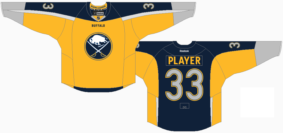
Buffalo Sabres
Best:
 Worn 1983 to 1996
I really do love that the Sabres have reinstated a variation of these. Buffalo just looks right in the blue and gold. I do like the small accoutrements that the Sabres have included in the logo on their new design. But, when it comes down to it, I kind of like that this old jersey has a gold collar and the shoulder patches. I think the Sabres' new design looks a little bit plain up top.
Worst:
 Worn 2013 to 2015
I'm pretty sure Reebok had basically given up by this point in their jersey contract with the league. This Sabres uniform is such a strange mish-mash of different elements and I'm amazed it made it past the conceptual stage. What are those weird grey vertical stripes on the back of the jersey? Why is there an enclave of yellow on the collar? Why are the front and the back of the jerseys two different colours, vaguely resembling an apron? Why did the Sabres decide to reveal this jersey by having Steve Ott pose for some blurry pictures in a random hallway?
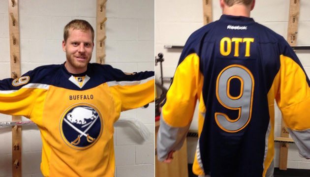
Why, why, why, why.
I want one.
Weirdest:
 Worn 2006 to 2010
This was such a weird departure from everything else the Sabres had ever done in the past. What is going on with those splotches on the underarms? Who thought it was a good idea to put numbers on the the chest?
The silver stripes coming down the front of the jersey kind of create the effect of a tank-top. And the logo... my god, the logo. It's a San Diego Chargers-brand snail.
I actually own one of these. It's at North Star Jerseys right now getting Thomas Vanek's name on the back. It's a perfectly strange jersey for a perfectly strange player.
__________________
Need a great deal on a new or pre-owned car? Come see me at Platinum Mitsubishi 2720 Barlow Trail NE
|
|
|
|
|
The Following User Says Thank You to TheScorpion For This Useful Post:
|
|
 Posting Rules
|
You may not post new threads
You may not post replies
You may not post attachments
You may not edit your posts
HTML code is Off
|
|
|
All times are GMT -6. The time now is 10:34 AM.
|
|


/https://www.thestar.com/content/dam/thestar/sports/hockey/2012/05/23/phoenix_coyotes_will_they_ever_make_money/coyotesshake.jpeg)