08-27-2013, 11:01 AM
|
#1
|
|
Some kinda newsbreaker!
Join Date: May 2004
Location: Learning Phaneufs skating style
|
 Team USA Olympic Jersey
|

|

|
|
08-27-2013, 11:03 AM
|
#3
|
|
One of the Nine
Join Date: Jul 2007
Location: Space Sector 2814
|
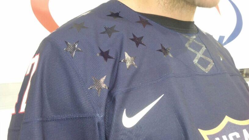
Looks like a figure skating uniform... not that there is anything wrong with that..

__________________
"In brightest day, in blackest night / No evil shall escape my sight / Let those who worship evil's might / Beware my power, Green Lantern's light!"
|
|
|
|
|
The Following 3 Users Say Thank You to GreenLantern For This Useful Post:
|
|
|
08-27-2013, 11:03 AM
|
#4
|
|
Franchise Player
|
ok yeah, that sucks. The fake laces and the stars look bad.
__________________
Quote:
Originally Posted by MisterJoji

Johnny eats garbage and isnt 100% committed.
|
|
|
|
|
|
The Following 4 Users Say Thank You to nik- For This Useful Post:
|
|
|
08-27-2013, 11:05 AM
|
#5
|
|
Some kinda newsbreaker!
Join Date: May 2004
Location: Learning Phaneufs skating style
|
Yup the star and laces look like someone's Mom/Sister drew them on with a magic marker
|
|
|
|
|
08-27-2013, 11:06 AM
|
#6
|
|
Voted for Kodos
|
Take off the fake laces and stars and it would look ok, not great, but ok. Now it looks terrible.
|
|
|
|
|
08-27-2013, 11:06 AM
|
#7
|
|
Franchise Player
Join Date: Feb 2007
Location: Calgary, AB
|
Russia's are just as bad, if not worse. Scratch that, the white ones are worse, and the red ones have the same stupid fake laces.
Actually don't mind the stars though, wonder if Canada will get Nike Maple Leaves on the the shoulders.

Last edited by SuperMatt18; 08-27-2013 at 11:09 AM.
|
|
|
|
|
08-27-2013, 11:06 AM
|
#8
|
|
Acerbic Cyberbully
Join Date: Aug 2003
Location: back in Chilliwack
|
The laces are lame but I like the stars. And I love the crest.
|
|
|
|
|
The Following 2 Users Say Thank You to Textcritic For This Useful Post:
|
|
|
08-27-2013, 11:08 AM
|
#9
|
|
Franchise Player
|
oh god ... does that mean the laces are coming on the Canada jerseys too?
__________________
Quote:
Originally Posted by MisterJoji
Johnny eats garbage and isnt 100% committed.
|
|
|
|
|
|
08-27-2013, 11:08 AM
|
#10
|
|
Lifetime Suspension
|
The laces are definitely stupid looking but I don't mind the stars and the design itself is rather simple. I'm curious what colour pants they're going with. And at least they didn't put any silly rainbows on it!
|
|
|
|
|
08-27-2013, 11:10 AM
|
#11
|
|
Lifetime Suspension
Join Date: Oct 2012
Location: Halifax
|
Quote:
Originally Posted by SuperMatt18
Russia's are just as bad, if not worse. Scratch that, the white ones are worse, and the red ones have the same stupid fake laces.
Actually don't mind the stars though, wonder if Canada will get Nike Maple Leaves on the the shoulders.
|
Russia's are awesome, what're you talking about?
|
|
|
|
|
The Following 7 Users Say Thank You to $ven27 For This Useful Post:
|
|
|
08-27-2013, 11:12 AM
|
#12
|
|
Franchise Player
|
Those are not nice. All of a sudden some of those mock flames jerseys in the other thread look a whole lot better.
|
|
|
|
|
08-27-2013, 11:14 AM
|
#13
|
|
Powerplay Quarterback
|
is that stuff all pressed on rather than stitched on? that looks horrible...
__________________

|
|
|
|
|
The Following User Says Thank You to renny For This Useful Post:
|
|
|
08-27-2013, 11:14 AM
|
#14
|
|
#1 Goaltender
|
These are pretty terrible when compared to the retro jerseys they wore in Vancouver. That Gold medal game had some outstanding jerseys in my opinion.
|
|
|
|
|
08-27-2013, 11:19 AM
|
#15
|
|
First Line Centre
Join Date: Jan 2010
Location: So Long, Bannatyne
|
Ha ha ha! Anybody else initially think that Guerin's undershirt collar was actually part of the jersey design itself?
|
|
|
|
|
The Following 5 Users Say Thank You to drewtastic For This Useful Post:
|
|
|
08-27-2013, 11:20 AM
|
#16
|
|
Franchise Player
Join Date: Feb 2007
Location: Calgary, AB
|
Quote:
Originally Posted by $ven27
Russia's are awesome, what're you talking about?
|
I think they are horrible. Not everybody has the same taste.
The whites have a stupid design, and I don't like the Russian flag on the arms of the red or the fake drawstrings on the neck.
|
|
|
|
|
08-27-2013, 11:22 AM
|
#17
|
|
Franchise Player
Join Date: Apr 2004
Location: I don't belong here
|
Quote:
Originally Posted by drewtastic
Ha ha ha! Anybody else initially think that Guerin's undershirt collar was actually part of the jersey design itself?
|
No, but I'd like to see that happen. The endless criticism would be entertaining.
|
|
|
|
|
08-27-2013, 11:30 AM
|
#18
|
|
Lifetime Suspension
|
My first instinct was confusion, then laughter. Those jerseys are ew-begew. Some of the worst Olympic jerseys I've seen in recent history.
The Russian ones on the other hand, I actually like the white one, it's just SO Russian.
|
|
|
|
|
The Following User Says Thank You to strombad For This Useful Post:
|
|
|
08-27-2013, 11:32 AM
|
#19
|
|
Powerplay Quarterback
Join Date: Aug 2007
Location: 403
|
I like the high striping on the arms. But the fake laces have got to go.
|
|
|
|
|
08-27-2013, 11:38 AM
|
#20
|
|
Franchise Player
Join Date: Mar 2004
Location: Chilliwack, B.C
|
Fake Laces suck other than that I like the USA jersey
|
|
|
|
|
The Following 2 Users Say Thank You to calgaryred For This Useful Post:
|
|
 Posting Rules
|
You may not post new threads
You may not post replies
You may not post attachments
You may not edit your posts
HTML code is Off
|
|
|
All times are GMT -6. The time now is 02:12 AM.
|
|