 05-24-2013, 10:01 AM
|
#1
|
|
Some kinda newsbreaker!
Join Date: May 2004
Location: Learning Phaneufs skating style
|
 Dallas Stars leak new logo. Update: jersey officially released
http://www.icethetics.info/blog/2013...own-logos.html
Was supposed to be revealed June 4th, but was accidentally shown on their iOS app.

update: Jersey officially released
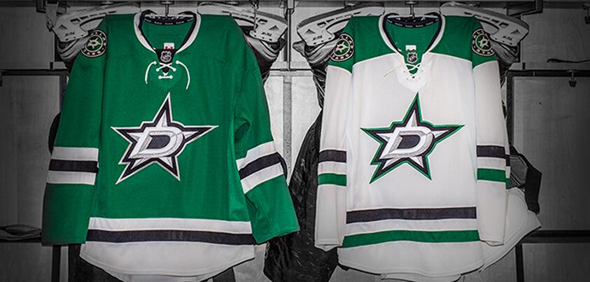
Last edited by sureLoss; 06-04-2013 at 07:05 PM.
|

|

|
|
05-24-2013, 10:03 AM
|
#2
|
|
Franchise Player
|
Great shoulder patch, but if they are replacing the "Stars" on the front then Boourns.
__________________

|
|
|
|
|
The Following 6 Users Say Thank You to corporatejay For This Useful Post:
|
|
|
05-24-2013, 10:04 AM
|
#3
|
|
Powerplay Quarterback
Join Date: Jun 2011
Location: Vancouver, BC
|
Not a huge fan. Logos like these just make me appreciate how great the Flaming C is
|
|
|
|
|
The Following 6 Users Say Thank You to Samiz For This Useful Post:
|
|
|
05-24-2013, 10:06 AM
|
#4
|
|
Franchise Player
Join Date: Mar 2007
Location: Income Tax Central
|
Yeah, this is a great supplementary logo, but could you imagine that on the front of a jersey? I dont think it has the 'iconic' look they were going for.
It looks like a poorly formed throwing-star. 
__________________
The Beatings Shall Continue Until Morale Improves!
This Post Has Been Distilled for the Eradication of Seemingly Incurable Sadness.
The World Ends when you're dead. Until then, you've got more punishment in store. - Flames Fans
If you thought this season would have a happy ending, you haven't been paying attention.
|
|
|
|
|
05-24-2013, 10:07 AM
|
#5
|
|
Franchise Player
Join Date: Oct 2009
Location: Calgary
|
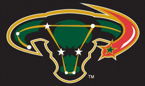
Was kind of hoping they would bring back the Ovary logo
Tags for size
__________________
All hockey players are bilingual. They know English and profanity - Gordie Howe
Last edited by TurdFerguson; 05-24-2013 at 10:09 AM.
|
|
|
|
|
The Following 7 Users Say Thank You to TurdFerguson For This Useful Post:
|
|
|
05-24-2013, 10:09 AM
|
#6
|
 Posted the 6 millionth post! |
Should have gone for a more classic look. This is too 2005 for me.
|
|
|
|
|
05-24-2013, 10:11 AM
|
#7
|
|
Franchise Player
Join Date: Dec 2008
Location: Calgary, Alberta
|
Also, this could potentially be the new template for their jersey:

It's PA Raiders new jersey, and it's a totally new Reebok design, which doesn't occur too often in the junior leagues, so it's easy to speculate that this could be the Stars jersey design, especially since the colours match so well.
|
|
|
|
|
05-24-2013, 10:13 AM
|
#8
|
|
Franchise Player
Join Date: Oct 2006
Location: San Fernando Valley
|
I don't like the 'D' overlayed on the star. It just doesn't look right.
|
|
|
|
|
The Following 2 Users Say Thank You to Erick Estrada For This Useful Post:
|
|
|
05-24-2013, 10:24 AM
|
#9
|
|
Scoring Winger
Join Date: Jan 2013
Location: Calgary
|
That looks like the kind of star I would draw freehand in grade two.
__________________

|
|
|
|
|
05-24-2013, 10:25 AM
|
#10
|
|
#1 Goaltender
Join Date: Aug 2011
Location: Not cheering for losses
|
Don't like it.
|
|
|
|
|
05-24-2013, 10:25 AM
|
#11
|
|
Franchise Player
Join Date: Nov 2003
Location: Calgary, AB
|
Tacky
|
|
|
|
|
05-24-2013, 10:27 AM
|
#12
|
|
Franchise Player
Join Date: Oct 2001
Location: Singapore
|
Lame, that was one logo that didn't require a change.
__________________
Shot down in Flames!
|
|
|
|
|
05-24-2013, 10:35 AM
|
#13
|
|
Unfrozen Caveman Lawyer
Join Date: Oct 2002
Location: Crowsnest Pass
|
Big Improvement to the worst uniforms in the NHL.
|
|
|
|
|
The Following 4 Users Say Thank You to troutman For This Useful Post:
|
|
|
05-24-2013, 10:43 AM
|
#14
|
|
Jordan!
Join Date: Jul 2009
Location: Chandler, AZ
|
I like it.
|
|
|
|
|
The Following User Says Thank You to Jordan! For This Useful Post:
|
|
|
05-24-2013, 10:44 AM
|
#15
|
|
Franchise Player
|
I don't mind it. Seems like most of CP does not like change. I guess the flames will be stuck with their crap uniform for decades to come, if public does not like change.
|
|
|
|
|
The Following 2 Users Say Thank You to kyuss275 For This Useful Post:
|
|
|
05-24-2013, 10:52 AM
|
#16
|
|
Franchise Player
Join Date: Oct 2001
Location: NYYC
|
Are the Dallas Stars being demoted to Juniors?
Their logo looks great as is. Stop messing with logos just to mess with logos, people.
|
|
|
|
|
The Following User Says Thank You to Table 5 For This Useful Post:
|
|
|
05-24-2013, 10:56 AM
|
#17
|
|
Franchise Player
|
It looks cheap. Like 15 minute hack job in some software.
__________________
Quote:
Originally Posted by MisterJoji

Johnny eats garbage and isnt 100% committed.
|
|
|
|
|
|
05-24-2013, 10:58 AM
|
#18
|
|
Scoring Winger
Join Date: Feb 2011
Location: 780
|
Quote:
Originally Posted by troutman
Big Improvement to the worst uniforms in the NHL.
|
Quote:
Originally Posted by Tyler
Tacky
|
You're both right
|
|
|
|
|
The Following User Says Thank You to Plett25 For This Useful Post:
|
|
|
05-24-2013, 10:58 AM
|
#19
|
|
Franchise Player
Join Date: Oct 2001
Location: Vancouver
|
It's still an upgrade from the one they had a few years ago that looked more like something you would see on the wall at a gynecologists office:

__________________
"A pessimist thinks things can't get any worse. An optimist knows they can."
|
|
|
|
|
05-24-2013, 11:00 AM
|
#20
|
|
Franchise Player
Join Date: Feb 2006
Location: Calgary, AB
|
Quote:
Originally Posted by corporatejay
Great shoulder patch, but if they are replacing the "Stars" on the front then Boourns.
|
They haven't had the Stars logo on the front of their jerseys for a few years now, just the awful "DALLAS" word mark with the number below.
__________________
Turn up the good, turn down the suck!
|

|
|
 Posting Rules
|
You may not post new threads
You may not post replies
You may not post attachments
You may not edit your posts
HTML code is Off
|
|
|
All times are GMT -6. The time now is 03:15 AM.
|
|


