 08-19-2019, 10:08 AM
|
#1
|
|
Franchise Player
Join Date: Dec 2003
Location: Sector 7-G
|
 Flames 40th Anniversary Logo Released
https://www.nhl.com/flames/news/flam...on/c-308564978
Quote:
|
The Calgary Flames will celebrate their 40th Season during the 2019-20 campaign. The logo will sit at centre ice for the entirety of the season.
|
Looks like the Iginla Logo. Hopefully that means more Retros this year.
Last edited by Otto-matic; 08-19-2019 at 09:13 PM.
|

|

|
|
The Following User Says Thank You to Otto-matic For This Useful Post:
|
|
|
08-19-2019, 10:09 AM
|
#2
|
|
Taking a while to get to 5000
|
Hate to be that guy, but...
Those two lines seem out of place. Just center the 40 and be done with it.
I am encouraged by the colors. Retro.
|
|
|
|
|
The Following 13 Users Say Thank You to Toonage For This Useful Post:
|
#22,
カナダ人です,
CroFlames,
Gondi Stylez,
Krynn,
MrMike,
Resolute 14,
Scroopy Noopers,
SebC,
TheScorpion,
tripin_billie,
Winsor_Pilates,
Zarley
|
|
08-19-2019, 10:13 AM
|
#3
|
|
Franchise Player
Join Date: Oct 2001
Location: Flames fan in Seattle
|
Quote:
Originally Posted by Toonage

Hate to be that guy, but...
Those two lines seem out of place. Just center the 40 and be done with it.
I am encouraged by the colors. Retro.
|
agreed
__________________

|
|
|
|
|
08-19-2019, 10:20 AM
|
#4
|
|
Franchise Player
Join Date: May 2016
Location: ATCO Field, Section 201
|
Quote:
Originally Posted by Toonage
Hate to be that guy, but...
Those two lines seem out of place. Just center the 40 and be done with it.
I am encouraged by the colors. Retro.
|
I disagree. I think that it looks clean.
|
|
|
|
|
The Following 6 Users Say Thank You to TheIronMaiden For This Useful Post:
|
|
|
08-19-2019, 10:28 AM
|
#6
|
|
Taking a while to get to 5000
|
Heritage Classic jerseys can't be far behind
|
|
|
|
|
08-19-2019, 10:32 AM
|
#7
|
|
Scoring Winger
Join Date: Apr 2015
Location: The Corral
|
I like... hopefully another indication of full time retros coming!! Especially If this is going to be a patch on the jerseys (as previous anniversary's)
__________________
"They canned a head coach, the GM is on the firing line, they're 12th in the West and just lost at home to the last place team in the NHL.
And (I am not making this up) statistically this is the Edmonton Oilers fourth best season in the last 13 years." via Rob Tychkowski's Twitter 1-23-2019
Last edited by FleurysOTGoalCelebration; 08-19-2019 at 10:40 AM.
|
|
|
|
|
08-19-2019, 10:40 AM
|
#8
|
|
Franchise Player
|
Quote:
Originally Posted by FleurysOTGoalCelebration
I like... hopefully another indication of full time retros coming!!
|
I think it would be cool if they wore the Flaming A a few times!

__________________
Peter12 "I'm no Trump fan but he is smarter than most if not everyone in this thread.
|
|
|
|
|
The Following 8 Users Say Thank You to Johnny Makarov For This Useful Post:
|
|
|
08-19-2019, 10:41 AM
|
#9
|
|
Powerplay Quarterback
|
Quote:
Originally Posted by Toonage
I am encouraged by the colors. Retro.
|
The Flames are using the 40 year stuff as an "excuse" to wear the Retros almost full-time this season, and will be our full-blown unis in the coming seasons.
|
|
|
|
|
The Following 2 Users Say Thank You to FlamesAreOne For This Useful Post:
|
|
|
08-19-2019, 10:46 AM
|
#10
|
|
Crash and Bang Winger
|
Quote:
Originally Posted by Toonage
Hate to be that guy, but...
Those two lines seem out of place. Just center the 40 and be done with it.
I am encouraged by the colors. Retro.
|
The missing top left corner of the banner bugs me more... It kills the symmetry.
|
|
|
|
|
The Following 9 Users Say Thank You to ST20 For This Useful Post:
|
|
|
08-19-2019, 10:48 AM
|
#11
|
|
Franchise Player
Join Date: Feb 2006
Location: Section 222
|
Definitely better than the 30th season patches, those were so bad and looked out of place on the jerseys.

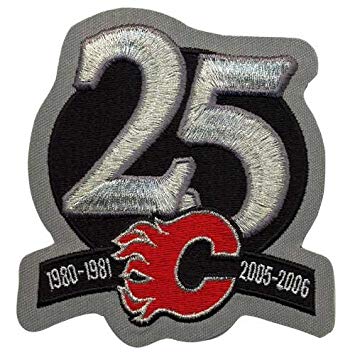
For reference, here are the other patches:
10th
15th (Credit to RM14)
20th
25th (Credit to smoggyflamesfan)
30th
40th
__________________
Go Flames Go!!
Last edited by Rhettzky; 08-19-2019 at 10:59 AM.
|
|
|
|
|
The Following 14 Users Say Thank You to Rhettzky For This Useful Post:
|
14,
apiquard,
Bill Bumface,
Bourque's Twin,
calgaryred,
christoph186,
FleurysOTGoalCelebration,
Gondi Stylez,
Itse,
MikePatton,
RM14,
SmoggyFlamesFan,
Stillman16,
vtec260
|
|
08-19-2019, 10:50 AM
|
#12
|
|
Taking a while to get to 5000
|
40th is the best of the bunch, but that's not saying much.
|
|
|
|
|
The Following 20 Users Say Thank You to Toonage For This Useful Post:
|
-TC-,
Bezer,
Brad Marsh,
christoph186,
Coach,
Domoic,
Fire,
Gondi Stylez,
icarus,
Itse,
jaikorven,
mac_82,
Mazrim,
mikephoen,
MrMike,
redflamesfan08,
RoadGame,
Sutter_in_law,
the_only_turek_fan,
Yrebmi
|
|
08-19-2019, 10:51 AM
|
#13
|
|
Franchise Player
|
I think it looks fine. The 30th anniversary logo just looked goofy.
|
|
|
|
|
08-19-2019, 10:51 AM
|
#14
|
|
First Line Centre
Join Date: Oct 2009
Location: Calgary
|
Is this 15th anniversary logo real??
|
|
|
|
|
08-19-2019, 10:52 AM
|
#15
|
|
Franchise Player
|
Considering the 40th patch is in retro colors, and the emphasis that this logo will be used "at centre ice", I'm guessing we won't see it on jerseys (i.e. the regular home reds and whites). Besides, there isn't a lot of room with the flag patches already on the shoulders; however, I'd be fine if they added them to the retro thirds just for fun...
|
|
|
|
|
08-19-2019, 10:54 AM
|
#16
|
|
Powerplay Quarterback
Join Date: Nov 2014
Location: Calgary, AB
|
I didn't hate the 25th anniversary ones in 05-06.
|
|
|
|
|
The Following 6 Users Say Thank You to SmoggyFlamesFan For This Useful Post:
|
|
|
08-19-2019, 10:57 AM
|
#17
|
|
Franchise Player
|
Quote:
Originally Posted by RM14
Is this 15th anniversary logo real??
|
Yes, they used it on the back hem of jerseys that year:

I don't recall them using the 20th; they definitely used the 25th and 30th patches. The 10th Anniversary patch was a smaller one on the shoulder.
|
|
|
|
|
The Following 5 Users Say Thank You to tvp2003 For This Useful Post:
|
|
|
08-19-2019, 11:00 AM
|
#18
|
|
First Line Centre
Join Date: Oct 2009
Location: Calgary
|
Quote:
Originally Posted by tvp2003
Yes, they used it on the back hem of jerseys that year:
I don't recall them using the 20th; they definitely used the 25th and 30th patches. The 10th Anniversary patch was a smaller one on the shoulder. |
that looks slick.
|
|
|
|
|
The Following User Says Thank You to RM14 For This Useful Post:
|
|
|
08-19-2019, 11:44 AM
|
#19
|
|
#1 Goaltender
Join Date: Feb 2014
Location: Uranus
|
Nice and clean. Stands well on its own too.
This logo would be perfect if they dropped the yellow and white stroke lines coming into the left side. Just a poor and unnecessary item that should have been omitted.
__________________
I hate to tell you this, but Ive just launched an air biscuit
|
|
|
|
|
The Following User Says Thank You to Hot_Flatus For This Useful Post:
|
|
|
08-19-2019, 11:51 AM
|
#20
|
|
First Line Centre
Join Date: Sep 2007
Location: Regina
|
I hope they wear retros but keep the Black C uni as a 3rd
|
|
|
|
|
The Following User Says Thank You to jlh2640 For This Useful Post:
|
|
 Posting Rules
|
You may not post new threads
You may not post replies
You may not post attachments
You may not edit your posts
HTML code is Off
|
|
|
All times are GMT -6. The time now is 06:15 AM.
|
|


