08-11-2015, 12:05 PM
|
#1
|
|
Some kinda newsbreaker!
Join Date: May 2004
Location: Learning Phaneufs skating style
|
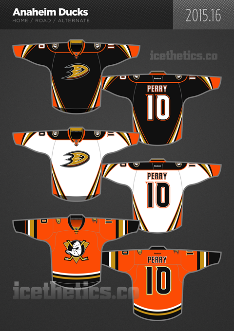
 Ducks and Avalanche 3rd jerseys leaked
|

|

|
|
The Following 5 Users Say Thank You to sureLoss For This Useful Post:
|
|
|
08-11-2015, 12:06 PM
|
#2
|
|
Crash and Bang Winger
|
Yuck!
|
|
|
|
|
The Following 3 Users Say Thank You to Passe La Puck For This Useful Post:
|
|
|
08-11-2015, 12:06 PM
|
#3
|
|
Franchise Player
Join Date: Aug 2007
Location: Vancouver
|
Finally they bring the Wildwing mask back! Such a great logo.
I like COL's third too. Both are well done.
__________________

|
|
|
|
|
The Following 8 Users Say Thank You to Coach For This Useful Post:
|
|
|
08-11-2015, 12:07 PM
|
#4
|
|
Powerplay Quarterback
Join Date: Jan 2012
Location: in the now
|
I love the old ducks logo... I really like the Ducks' third.
__________________
"The top three worst things I've seen in hockey? The invention of the trap. The invention of the morning skate. And the invention of the extremely ugly uniform."
-Brett Hull
|
|
|
|
|
08-11-2015, 12:07 PM
|
#5
|
|
Powerplay Quarterback
Join Date: Oct 2006
Location: Upstate NY
|
Pfft.
Who puts flags on the shoulders?
In all seriousness... I really like the Colorado 3rd jersey. Less maroon alone makes a huge improvement.
Last edited by Flame19,289; 08-11-2015 at 12:10 PM.
|
|
|
|
|
08-11-2015, 12:07 PM
|
#6
|
|
Franchise Player
Join Date: Jun 2009
Location: Thunder Bay Ontario
|
The Flames jersey may not be perfect but I'm liking it more and more compared to some of these other ones out there.
__________________
Fan of the Flames, where being OK has become OK.
|

|
|
|
08-11-2015, 12:08 PM
|
#7
|
|
Scoring Winger
Join Date: Aug 2007
Location: Dar es Salaam
|
I actually like both of them quite a bit, but I'm always a sucker for throwback styles. Both logos reach back in time. And I don't mind the color schemes at all. I think they look great.
|
|
|
|
|
The Following 2 Users Say Thank You to Brad Marsh For This Useful Post:
|
|
|
08-11-2015, 12:09 PM
|
#8
|
|
Franchise Player
|
The Ducks 3rd is a little too similar to our own home colour scheme for me.
I really like the Avs 3rd.
__________________
Quote:
Originally Posted by JobHopper

The thing is, my posts, thoughts and insights may be my opinions but they're also quite factual.
|
|
|
|
|
|
08-11-2015, 12:12 PM
|
#9
|
|
Franchise Player
Join Date: Oct 2006
Location: San Fernando Valley
|
Love the Rockies crest. Both look good IMO as the Ducks really don't have a lot to play with given their name and Colorado schemes. I will have too see the orange jerseys on ice however to make a final conclusion.
|
|
|
|
|
08-11-2015, 12:18 PM
|
#10
|
|
Scoring Winger
|
I have to admit that, I like both 3rd jerseys... also a fan of the throwback logos...
|
|
|
|
|
08-11-2015, 12:20 PM
|
#11
|
|
Scoring Winger
|
Quote:
Originally Posted by Poe969
The Flames jersey may not be perfect but I'm liking it more and more compared to some of these other ones out there.
|
That Avs third looks awesome. Much better than the flames' turd...err third.
|
|
|
|
|
The Following User Says Thank You to Haplo For This Useful Post:
|
|
|
08-11-2015, 12:20 PM
|
#12
|
|
Resident Videologist
Join Date: Mar 2002
Location: Calgary
|
I'm not crazy about the Colorado shoulders but like both jerseys and especially the logos overall.
|
|
|
|
|
08-11-2015, 12:28 PM
|
#13
|
|
Powerplay Quarterback
Join Date: Oct 2014
Location: Calgary
|
I like the Avs third.
The Ducks one, just gross. So much orange.
__________________
NHL Flames | Golden Knights | Cal Stampeders | Panthers | Chelsea FC | AVFC | Raptors | Orlando Magic | Blue Jays | Athletics | Inferno CWHL
|
|
|
|
|
08-11-2015, 12:28 PM
|
#14
|
|
In the Sin Bin
|
The Disney Ducks logo is one of the worst in NHL history as it is. Surrounding it with eye-bleeding orange makes it even worse. That is the kind of crap that the likes of Perry and Kesler deserve to wear, but not what we deserve to be subjected to.
|
|
|
|
|
The Following User Says Thank You to Resolute 14 For This Useful Post:
|
|
|
08-11-2015, 12:38 PM
|
#15
|
|
Franchise Player
|
Those Ducks jerseys are obnoxiously awesome!
They would be great on Halloween with an old school goalie mask.
|
|
|
|
|
08-11-2015, 12:40 PM
|
#16
|
|
Franchise Player
Join Date: Oct 2014
Location: Springbank
|
Quote:
Originally Posted by saillias
The Ducks 3rd is a little too similar to our own home colour scheme for me.
I really like the Avs 3rd.
|
Heh heh - I was waiting for some posters who hate the Flames home colours (which I don't mind) to chime in and say they loved the Ducks third.
I suspect the actual Ducks color is more orangey.
|
|
|
|
|
08-11-2015, 12:42 PM
|
#17
|
|
Franchise Player
|
Definitely prefer the mask over the letter "D"
|
|
|
|
|
08-11-2015, 12:42 PM
|
#18
|
|
Franchise Player
|
Both of those look fantastic.
...we really need a new set.
|
|
|
|
|
The Following User Says Thank You to ComixZone For This Useful Post:
|
|
|
08-11-2015, 12:43 PM
|
#19
|
|
Franchise Player
Join Date: Oct 2001
Location: Kalispell, Montana
|
Like them both.
First of all, the world needs more orange.
Secondly, anything you can do to bring the Rockies logo and color scheme into an Avs jersey is awesome. One of the best logos ever.
__________________
I am in love with Montana. For other states I have admiration, respect, recognition, even some affection, but with Montana it is love." - John Steinbeck
|
|
|
|
|
The Following 2 Users Say Thank You to Displaced Flames fan For This Useful Post:
|
|
|
08-11-2015, 12:43 PM
|
#20
|
|
Franchise Player
Join Date: Jan 2010
Location: Maple Bay, B.C.
|
Duck a l'orange
|
|
|
|
|
The Following User Says Thank You to dash_pinched For This Useful Post:
|
|
 Posting Rules
|
You may not post new threads
You may not post replies
You may not post attachments
You may not edit your posts
HTML code is Off
|
|
|
All times are GMT -6. The time now is 10:29 PM.
|
|