 06-04-2013, 11:16 AM
|
#1
|
|
Some kinda newsbreaker!
Join Date: May 2004
Location: Learning Phaneufs skating style
|
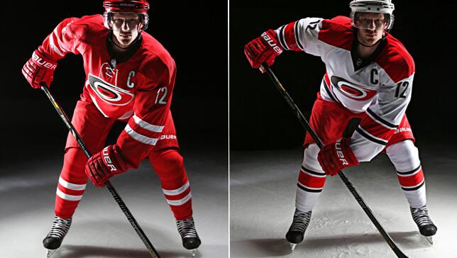
 Canes unveil new uniforms
Being streamed now got some screenshots


closeup shots here: http://instagram.com/nhlcanes?ref=badge#
Last edited by sureLoss; 06-04-2013 at 11:18 AM.
|

|

|
|
06-04-2013, 11:18 AM
|
#2
|
|
First Line Centre
Join Date: Oct 2002
Location: Turner Valley
|
Looks horrible from that one shot... that red bib on the away jersey looks especially bad.
|
|
|
|
|
06-04-2013, 11:18 AM
|
#3
|
|
Franchise Player
Join Date: Aug 2007
Location: Vancouver
|
Like em. Nice to see teams going with some tradition striping. Hoping the Flames follow suit.
__________________

|
|
|
|
|
The Following 5 Users Say Thank You to Coach For This Useful Post:
|
|
|
06-04-2013, 11:18 AM
|
#4
|
|
Franchise Player
Join Date: Oct 2001
Location: Singapore
|
Apart from using the Hockey Canada font, not sure what's so different about them?
__________________
Shot down in Flames!
|
|
|
|
|
The Following 2 Users Say Thank You to icarus For This Useful Post:
|
|
|
06-04-2013, 11:19 AM
|
#5
|
|
Franchise Player
Join Date: Jun 2011
Location: Calgary
|
How very Coyotes esque. Little too plain Jane.
|

|
|
|
06-04-2013, 11:22 AM
|
#6
|
|
#1 Goaltender
|
Home looks a lot like team Canada, but I really like them. Not a huge fan of the aways.
|
|
|
|
|
06-04-2013, 11:22 AM
|
#7
|
|
Franchise Player
Join Date: Nov 2003
Location: Calgary, AB
|
Kinda different. Don't mind them at all.
|
|
|
|
|
06-04-2013, 11:24 AM
|
#8
|
|
Official CP Photographer
Join Date: Sep 2003
Location: PL15
|
It's new? And different? Then I must hate it!!
|
|
|
|
|
The Following User Says Thank You to Neeper For This Useful Post:
|
|
|
06-04-2013, 11:26 AM
|
#9
|
|
Franchise Player
Join Date: Oct 2001
Location: Vancouver
|
I like them. Nice and simple.
__________________
"A pessimist thinks things can't get any worse. An optimist knows they can."
|
|
|
|
|
06-04-2013, 11:26 AM
|
#10
|
|
Franchise Player
Join Date: Mar 2007
Location: Income Tax Central
|
They seem pretty nice. Not too different though.
__________________
The Beatings Shall Continue Until Morale Improves!
This Post Has Been Distilled for the Eradication of Seemingly Incurable Sadness.
The World Ends when you're dead. Until then, you've got more punishment in store. - Flames Fans
If you thought this season would have a happy ending, you haven't been paying attention.
|
|
|
|
|
06-04-2013, 11:28 AM
|
#11
|
|
Franchise Player
Join Date: Feb 2006
Location: Calgary
|
lol:
Harrison Mooney@HarrisonMooney1m
I sometimes wonder if the Carolina Hurricanes' logo remembers how much power it held before the One Ring was destroyed.
__________________
The Quest stands upon the edge of a knife. Stray but a little, and it will fail, to the ruin of all. Yet hope remains while the Company is true. Go Flames Go!
Pain heals. Chicks dig scars. Glory... lasts forever.
|
|
|
|
|
06-04-2013, 11:32 AM
|
#12
|
|
Franchise Player
Join Date: Nov 2008
Location: the dark side of Sesame Street
|
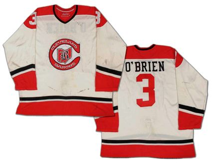
aways look like the old Cleveland Barons:
__________________
"If Javex is your muse
then dive in buddy"
- Surferguy
|
|
|
|
|
06-04-2013, 11:33 AM
|
#13
|
|
Some kinda newsbreaker!
Join Date: May 2004
Location: Learning Phaneufs skating style
|
|
|
|
|
|
06-04-2013, 11:34 AM
|
#14
|
|
Franchise Player
Join Date: Oct 2006
Location: Calgary
|
The home jersey looks like they have become the Carolina Coyotes rather than the Hurricanes. They are a bit plain as well. I think the home might be a 2-3 year jersey before switching again, sort of like when the Oilers practice style jersey came out. If it matched the road jersey, it would be better.
|
|
|
|
|
The Following User Says Thank You to Caged Great For This Useful Post:
|
|
|
06-04-2013, 11:36 AM
|
#15
|
|
First Line Centre
Join Date: Oct 2002
Location: Turner Valley
|
Is it really necessary to have the logo that high? The captains C and the logo almost touch and there is a bunch of room underneath. Took a unique uniform idea and made it look too generic.
|
|
|
|
|
The Following User Says Thank You to the-rasta-masta For This Useful Post:
|
|
|
06-04-2013, 11:38 AM
|
#16
|
|
Franchise Player
Join Date: Oct 2006
Location: San Fernando Valley
|
I like them. One of those rare occurances where the away 'white' jerseys look better than the home ones.
|
|
|
|
|
06-04-2013, 11:39 AM
|
#17
|
|
Ate 100 Treadmills
|
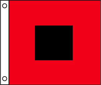
I actually like the hurricane warning logos they used to have all around the bottom of the jersey. I am probably in the minority on that one though.
|
|
|
|
|
The Following User Says Thank You to blankall For This Useful Post:
|
|
|
06-04-2013, 11:39 AM
|
#18
|
|
First Line Centre
Join Date: Sep 2012
Location: Calgary AB
|
I won't even bother commenting. This was done to get a spike in jersey sales: there was nothing wrong with the previous jerseys except the piping. I hate modern sports and the constant fan gouging.
|
|
|
|
|
The Following 2 Users Say Thank You to tvp2003 For This Useful Post:
|
|
|
The Following User Says Thank You to Canada 02 For This Useful Post:
|
|
 Posting Rules
|
You may not post new threads
You may not post replies
You may not post attachments
You may not edit your posts
HTML code is Off
|
|
|
All times are GMT -6. The time now is 03:58 PM.
|
|


