So I just looked at that report, and as near as I can figure they have this example:
"The bottom panels show estimates of attributable warming for extreme temperatures, including (d) annual highest daily maximum temperature, (e) annual highest daily minimum temperature, (f) annual lowest daily maximum temperature, and (g) annual lowest daily minimum temperature."
which only looks at the increase in the hottest day, which is more of an anomaly than a trend, so doesn't tell us much. Figure 4.10 shows this:
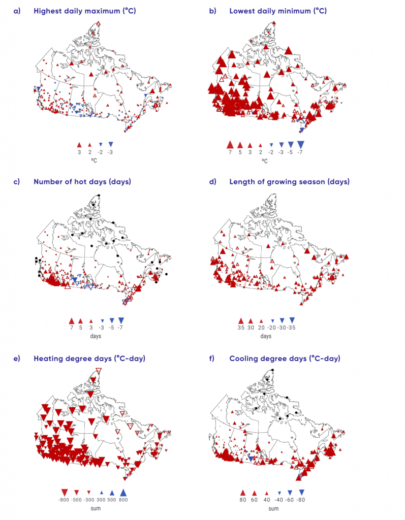
I find this confusing, as it doesn't appear to show the same thing the data I looked at shows(panel C).