Am I the only one who thinks colour team logos on rings look incredibly tacky?
I would want the Stanley Cup itself to feature most prominently and leave the team crap to the sides.
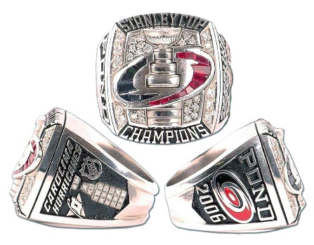
Spoiler!

Integrating the logo with the cup can work okay:
At least the Kings colours (or lack there of) work well:

Or making the logo look less like it belongs on a t-shirt
