Quote:
Originally Posted by getbak

I don't hate the Canucks green-blue gradient.
I don't like the logo choice the Leafs made...
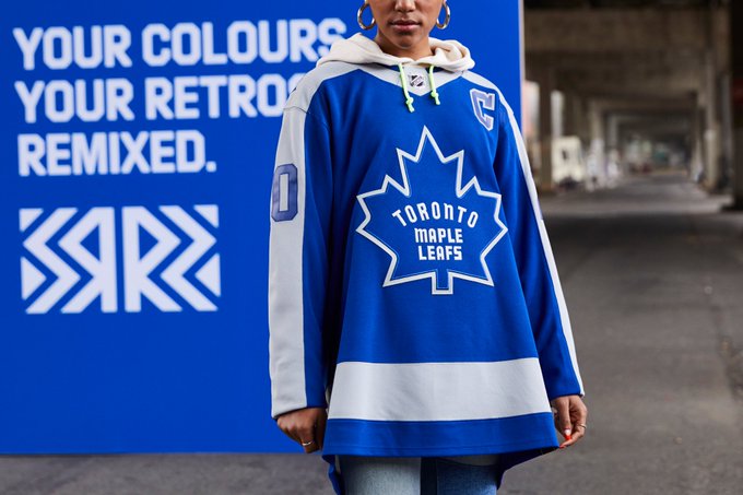
It looks very oversized and doesn't match with the logo on the 1970 version of their jersey. |
i've never understood why the 'N' in TOROnTO is lower case

and yea - that front logo looks massive!