Quote:
Originally Posted by Beaviwi


I'm not a huge fan... |
The back of the Jersey with the Flaming C on the shoulders looks so good. That 04 jersey style should just be reserved for the Flaming C in the front. Would be a much better 3rd jersey than the plan they have to keep the Red Flag jersey this year.
I do like the look of the Black Blasty jersey, however the Blasty logo in itself has always looked a bit cartoonish/unfinished to me. I think it is partly to do with the giant white outline around it. I think if they cleaned the logo up and modernized it a touch, it could look cool.
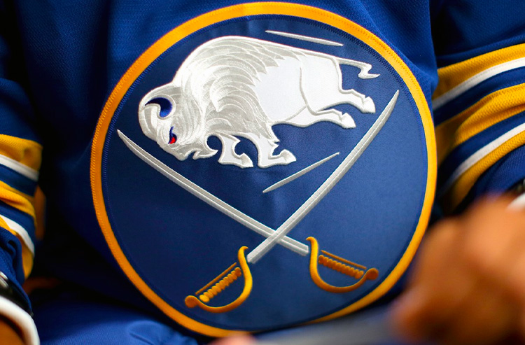
The league has seen some cool logo treatments in recent years with embroidered finishes really making them pop. I wonder if removing the white outline (or thinning it out, possibly a different colour to make it pop still?), and then doing some of the cool embroidery similar to the new Sabres logo would be pretty cool for Blasty? See below for what I mean with Sabres logo.