Quote:
Originally Posted by CorsiHockeyLeague

Your list makes no sense to me. The ones you have at the top are too similar to the current ones for the ranking to work.
|
With all due respect, I think you're dead wrong. The only similarities between the uniforms I have ranked dead last and the ones I have first are that they're red and white, they have the Mission: Impossible font, and, of course, the Flaming C. Everything else couldn't be more different. I'm not sure if you actually read the reasoning I gave (it's a pretty long post, so I don't blame you); in case you didn't, I'll condense it for you.
The Reebok Edge jerseys are messy, jumbled, and resemble cheap knockoffs of the '04 jerseys that came before them.
- They needlessly introduce asymmetrical shoulder patches, one of which is blue
- They took away the dynamic waist striping from the '04 jerseys
- They clutter up the front and back with ugly vertical piping
- They overstayed their welcome for almost a decade, and the basic idea for the jersey continued into the Adidas uniforms, which are also awful. I docked points for making me have to look at them for so long without changes.
Meanwhile, the '04 jerseys are clean and modern with contrasts. Nothing about them is busy, nothing about them looks silly*, and the shoulder patch is in line with the colour scheme. The waist striping almost looks like the mountains, or even a fiery volcano. But... they only lasted for three seasons, God knows why.
The reason I have the Reebok Edge jerseys so low is that they took a brilliant concept introduced in the 2004 jerseys and bastardized it.
*Depending on what you think about the shoulder patch
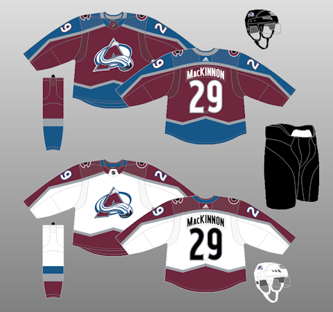
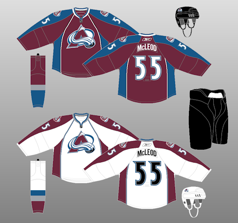
The same thing can be said about the Colorado Avalanche jerseys:
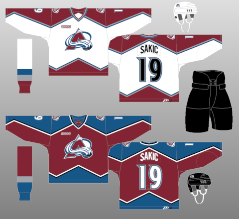
The top jerseys are what the Avs wore when they won the Stanley Cup in 2001. They're some of my favourite jerseys in all of sports. The striping is cool (it also looks like mountains!), the front is clean, and the shoulder patch works with the colour scheme of the jersey.
The bottom jerseys retain the same colour scheme, logo, and lettering, but they completely ruin it with terrible striping and a complete lack of personality. What used to be a clean-looking uniform now looks overly busy and the template resembles a default create-a-team jersey from NHL 13.
Edit: the Avs are also a good example of how those old jerseys can be beautifully repurposed for the Adidas template. Look at these: they're awesome.