Quote:
Originally Posted by PeteMoss

The wildfire chart clearly shows an increase in recent years if you disregard the giant outlier years.
|
Ignoring data on the assumption that they are "outliers" is also cherry-picking. Truncating data sets to hide earlier data that goes against the theory of things being worse than ever is cherry-picking And if you look at the US, in the 1920s, 30s and 40s, they were regularly experiencing area burn 5x what they are today.
https://www.nifc.gov/fireInfo/fireIn...otalFires.html
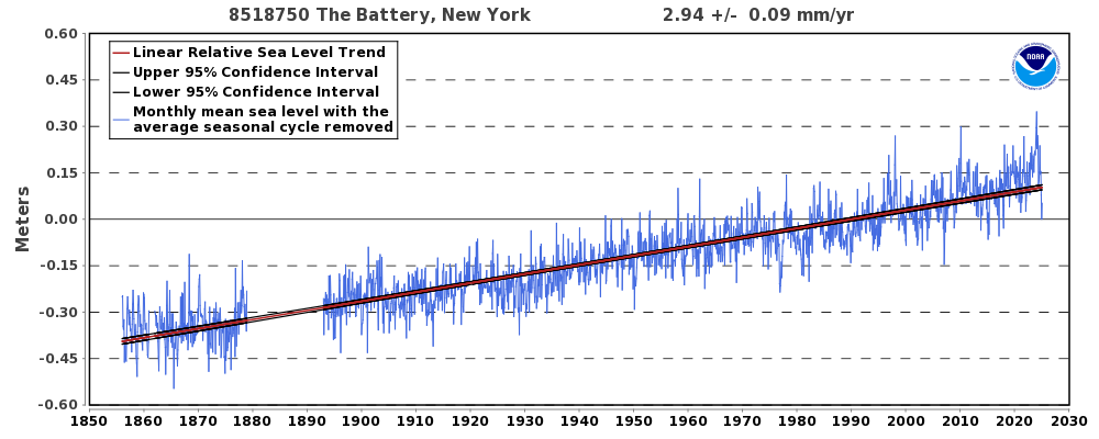
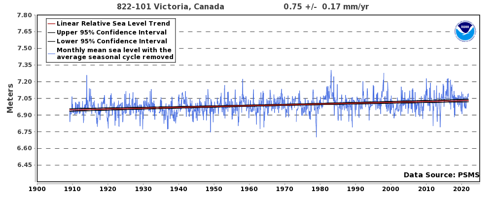
As for the only thing that I didn't go into detail, sea level I assume, where looking at the data for coastal areas, you find that the
local trend hasn't change since they started collecting data. For example Manhattan, Victoria (
https://tidesandcurrents.noaa.gov/sl...ltrends.html):

