Here's my new contribution ... As you might remember, I generally prefer Flames to go full retro with some minor tweaks
(see my original retro concept in Spoiler tags)
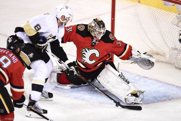
But now when the Flames are ditching the 3rd word-mark jersey away, I've thought maybe the concept could be revised by using the white flaming C which would provide much needed contrast. Although I wasn't a big fan of new 3rds mainly due to lack of identity and contrast, I think after this small change it doesn't look that bad.
What do you think, is it time to get rid of that style forever or does it deserve another chance? Is there really something intriguing or is it just me drinking too much beer?


As for the photo-editing - it's not perfect though I did my best to simulate perspective or distortions of the logo during a game.
Other than replacing the word-mark I gently outlined numbering with gold so that they match the logo outline (see Mony and Johnny goal celebration). Also, the bottom composition is supposed to illustrate how identifiable the team remains with the white flaming C even in very small images (or when seen from a distance). The team logo, in my opinion, is something to stand out rather than just be there, blent together with the rest of the uniform.