Quote:
Originally Posted by New Era

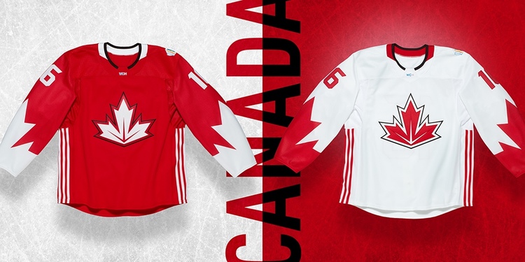
If the abominations that Addidas created for the World Cup are any indication, I don't want them rebranding anything for the Flames. I mean, what the heck is that thing on the front of the Canadian jersey??? How go you screw up a white maple leaf???
|
I dunno, I think it's awesome. I didn't like it at first, but I think that's because I had an expectation of how it should look.

The more I see it now, the more I love it. I actually could see this becoming a Canadian Hockey icon.
Edit:
Instead of creating a 3rd post on it... I'll put it here.
After the World Cup reveals, I actually feel quite the opposite from what I thought I'd feel. I assumed they'd be sublimated messes, but they actually look quite nice. I don't know how I feel about the NA colours yet, but overall they look pretty great when they aimed to create a classic and clean design.
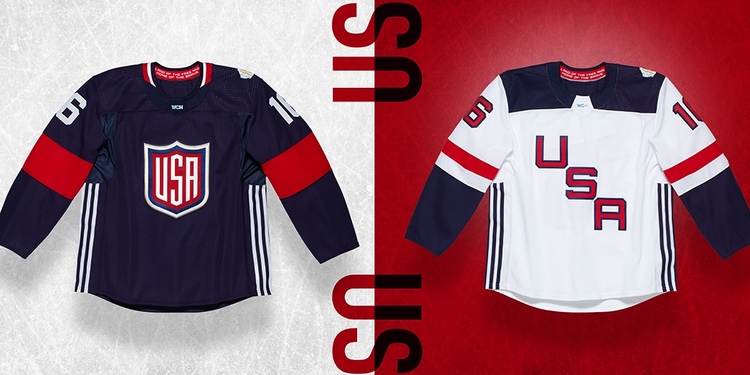
Team USA looks amazing:
Canada looks cool, and the risky design decision makes sense:
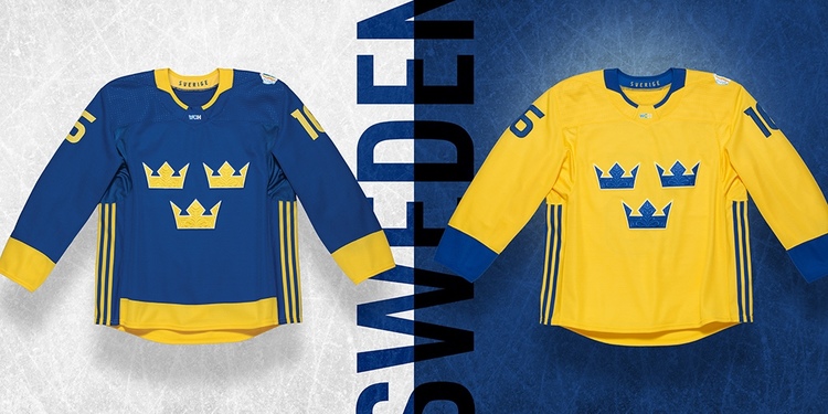
And Sweeden looks incredible:
I actually have hope. You can see the template they worked with on creating most of the jerseys, and the design language they tried to unify these teams with. It's a pretty classic style that they flourished with some modern touches; which are expected and allowed for limited edition jerseys, and something they can offer on NHL 3rds. Yet, a great starting point for solid primaries.