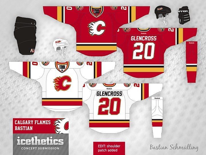
Wow - I'm not sure I've seen this concept before. Made even better by the addition of the new shoulder crest (really the only good thing to come out of the current 3rds - IMHO). Lots to like - as other posters have mentioned above. I would love to see these with a more traditional numbering / lettering font - with better outlining contrast, but other than that - yessssss. I know the Flames love the black C right now, but the red jersey with a black C would look good as a 3rd with this set. Hell - even keep the current 3rds for all I care if I get these as primary's. Beautiful.