Quote:
Originally Posted by SuperMatt18

Voted for K. Never been a big fan of B, and E wasn't may favorite speech bubble idea.
After sitting on it for a while now I actually think this was my favourite:
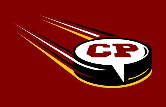
Call back to the current CP logo, clean and crisp, and probably the best at incorporating the speech bubble into the hockey puck concept. |
If we end up with E, it would be nice to have these puck proportions - it's much more correcter.