Quote:
Originally Posted by driveway

Sorry if this is a fata, but I couldn't find it in this thread.
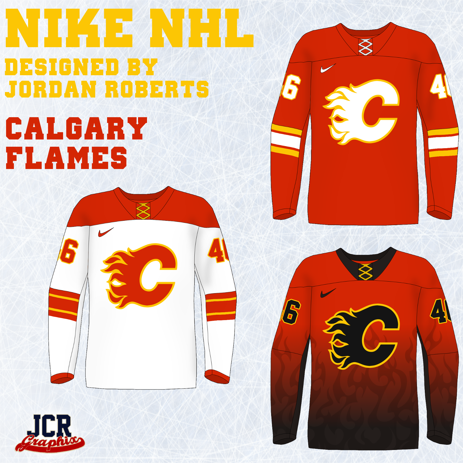
Jordan Roberts, of JCR Graphics did a redesign of the entire NHL based on the Nike Olympic jersey template. There are some really good ones in here, and some that are not so hot.
Here's the Flames:
Here's the Forum thread where he posted all his designs: http://boards.sportslogos.net/topic/...jackets-added/
I completely dig the home and away. Also, I'm kind of shocked that I don't hate that third Flames jersey. I feel like I should hate it, but ... somehow it works as a third for me.
I gotta say, I prefer the Nike straight bottom hem to the Reebok scalloped hem about a billion times more. I virulently hate the 'diaper' look that ends up on so many otherwise great jerseys like the Red Wings, Blackhawks, or Flyers. |
Some of those are actually better than I thought they would look. Calgary has one of the worst designs out of anybody though. That third is terrible and the home and aways remind me of the oilers first RBk jerseys