Sorry if this is a fata, but I couldn't find it in this thread.
Jordan Roberts, of JCR Graphics did a redesign of the entire NHL based on the Nike Olympic jersey template. There are some really good ones in here, and some that are not so hot.
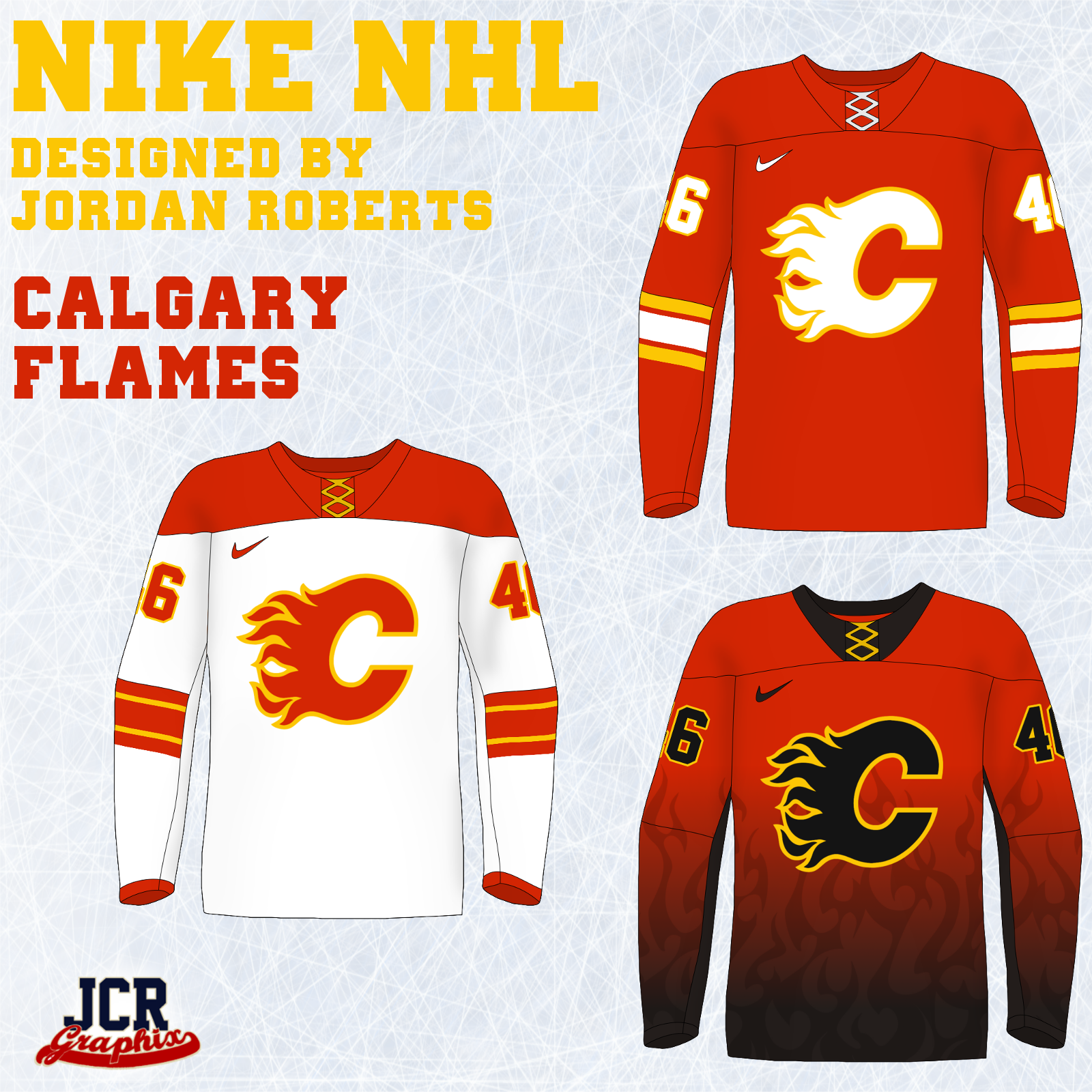
Here's the Flames:
Here's the Forum thread where he posted all his designs:
http://boards.sportslogos.net/topic/...jackets-added/
I completely dig the home and away. Also, I'm kind of shocked that I don't hate that third Flames jersey. I feel like I
should hate it, but ... somehow it works as a third for me.
I gotta say, I prefer the Nike straight bottom hem to the Reebok scalloped hem about a billion times more. I virulently hate the 'diaper' look that ends up on so many otherwise great jerseys like the Red Wings, Blackhawks, or Flyers.