Quote:
Originally Posted by Split98

COLOUR!
I love it. Not sold on it flying off the page, I kinda liked the puck flying into the page better and it would work better for other use cases as bingo mentioned.
But I love what you've done so far with the colour!
|
Well, that could work too but I found it difficult to align it with the content frame. The other way around would be to let the puck flying from top left corner as shown below. This would have an advantage of resembling the current logo (which may be a desired feature for some people)
I also think that it will look better when the yellow outline is not around the entire puck (again the resemblance to the current logo)
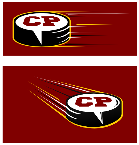
Some details (shades, reflections, etc.) still need to be polished though.